 Apollo Logo PNG
Apollo Automobil is a German hypercar manufacturer whose identity developed from the former Gumpert Sportwagenmanufaktur. The marque’s modern badge uses a sharply constructed letter A inside a shield-like outline, replacing the much more detailed griffin emblem associated with the original Gumpert company.
The change was part of a wider corporate transformation rather than a simple logo refresh. Roland Gumpert established the original sports-car operation in the 2000s, but the company later encountered financial difficulties and entered insolvency proceedings. Under new ownership, the business was relaunched as Apollo Automobil and presented the Apollo Arrow at the 2016 Geneva Motor Show. [1]
Apollo Automobil Logo Meaning and History
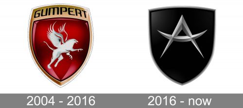
Apollo’s logo history is best understood as two distinct identities: the Gumpert era and the later Apollo Automobil era.
The earlier company used its founder’s surname and a traditional illustrated crest. After the business was relaunched under new ownership, Apollo became the marque name and the visual identity shifted toward a simpler monogram-based symbol.
There is no reliable evidence that every individual shape or color in either logo was assigned an official psychological meaning. The clearest documented change is therefore one of brand identity and corporate ownership, not a transition from one symbolic philosophy to another.
Gumpert: The Original Company
The sports-car project that became Gumpert was led by German engineer Roland Gumpert, a former Audi motorsport executive. The company developed the Gumpert Apollo, a road-legal supercar heavily influenced by racing engineering.
Gumpert Sportwagenmanufaktur filed for insolvency in August 2012 after planned sales, particularly in China, failed to meet expectations. Contemporary reporting confirmed that production and investor discussions continued during the insolvency process. [2]
The business and related rights subsequently passed through new investors before the marque was relaunched as Apollo Automobil.
The Gumpert Griffin Logo
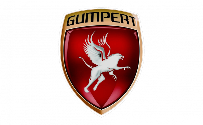
The Gumpert badge used a traditional crest containing a griffin, the mythological creature combining features of an eagle and lion. The Gumpert name appeared across the upper portion of the badge.
Visually, the emblem was considerably more detailed than the later Apollo identity, using red, metallic gold or silver effects, dimensional shading and an illustrated central figure.
Many secondary descriptions assign the griffin meanings such as courage, royalty or determination. Those are common interpretations of griffins in heraldry, but no authoritative Gumpert source located for this article confirms that these were the company’s intended meanings. They should therefore not be presented as the official explanation of the logo.
From Gumpert to Apollo Automobil
The transition to Apollo occurred after the troubled Gumpert business changed ownership.
Contemporary reporting in early 2016 described the revived company as Apollo Automobil GmbH and linked the relaunch to Hong Kong investor Ideal Team Ventures. The newly renamed manufacturer presented the Apollo Arrow at the Geneva Motor Show that year. [1]
A 2016 corporate report also identified Apollo Automobil GmbH as the company previously known as Gumpert Sportwagenmanufaktur GmbH and referred to the Gumpert Apollo as its retiring predecessor model. [3]
The new name also created a useful connection with the company’s history: Apollo had already been the name of Gumpert’s best-known supercar before it became the corporate marque.
2016 Apollo Automobil Logo
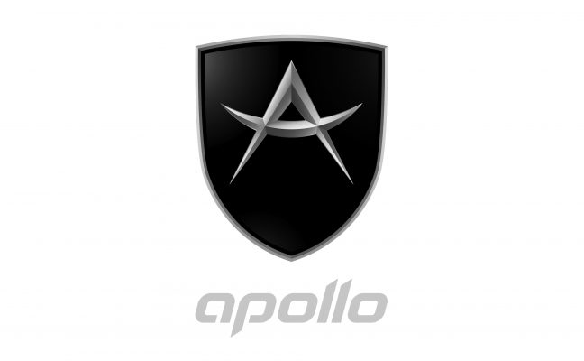
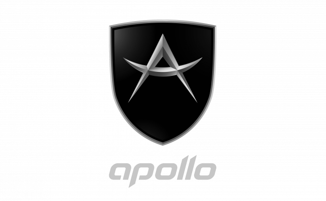
The Apollo identity introduced around the 2016 relaunch replaces the illustrated griffin with a much simpler construction: a stylized A set inside a narrow shield-like badge.
The central form can objectively be read as the initial of Apollo. Its angular construction and metallic treatment give the mark a technical appearance, but claims that the bars deliberately represent swords, speed, power or Greek mythology are not supported by authoritative evidence located for this article.
Similarly, the shield shape can be described visually without automatically assigning it meanings such as protection or strength.
Did Greek Mythology Inspire the Apollo Logo?
Apollo is also the name of the Greek and Roman deity associated with areas including music, prophecy and the sun in later traditions. However, that does not establish that Apollo Automobil’s badge was designed around specific mythological symbolism.
No primary company or designer source located for this article states that the stylized A represents the god Apollo, sunlight, truth or another classical attribute.
The safer conclusion is that the logo directly represents the A of the Apollo brand name. Any additional mythological reading should be clearly identified as interpretation unless future company documentation confirms it.
The Apollo Arrow and New Design Direction
The 2016 rebrand coincided with the reveal of the Apollo Arrow. Automotive designer Jowyn Wong’s WYN Design states that it was commissioned in 2015 to establish a new design language and identity for Apollo Automobil, with the Arrow forming the first foundation of that new generation. [4]
This provides stronger evidence for Apollo’s wider identity shift than generic logo symbolism. The company was intentionally moving away from the old Gumpert presentation toward a new, more exclusive hypercar design language.
Apollo Intensa Emozione
The next major chapter was the Apollo Intensa Emozione, commonly known as the Apollo IE. The limited-production V12 hypercar pushed the marque toward a much more extreme design philosophy and established the visual direction associated with modern Apollo.
Designer Jowyn Wong later served as Apollo’s chief designer and is credited in corporate filings with work on the Apollo Arrow, Apollo IE and Apollo EVO. [5]
It is important, however, not to transfer authorship of the vehicles automatically to the logo itself. No reliable source located here specifically identifies Wong or WYN Design as the designer of the shield logo.
Apollo Automobil Today
Apollo Automobil remains an active hypercar business. Its current official website presents the Apollo EVO as part of the brand’s ongoing development. [6]
The 2025 annual report of Apollo Future Mobility Group lists Apollo Automobil GmbH in Germany as a subsidiary engaged in the design, development and manufacturing of high-performance hypercars. It also lists Apollo Automobil Limited in Hong Kong for hypercar sales and Apollo Automobile Limited in the United Kingdom as the holder of trademarks. [7]
The same filing reports an 86.06% attributable interest in these Apollo entities, making the corporate relationship more precise than simply describing Apollo Future Mobility Group as a generic “parent company.” [7]
Apollo Typography
Apollo uses stylized contemporary lettering alongside its emblem in some applications. The wordmark has angular cuts and customized letterforms that visually relate to the geometry of the badge.
No authoritative source located for this article identifies the wordmark as Atures, Logic or another commercially available typeface. Those names appear to be visual comparisons rather than documented font sources, so they should not be presented as factual identification.
Apollo Logo Colors
The Apollo badge has appeared primarily in black and metallic silver, with some versions using red and orange gradient treatments.
These colors can be described objectively, but there is no reliable evidence that Apollo officially defines black as power, silver as precision or red as passion. Such color-psychology claims add little value unless they are documented by the company or designer.
What Changed From Gumpert to Apollo?
The most meaningful differences are structural rather than psychological:
- Name: Gumpert was replaced by Apollo as the marque identity.
- Ownership: the relaunch followed the financial collapse and transfer of the original Gumpert business.
- Logo: a detailed griffin crest gave way to a simplified A-based shield.
- Product positioning: Apollo moved toward ultra-low-volume hypercars such as the Arrow, IE and EVO.
- Design language: the revived marque commissioned a new visual and vehicle-design direction ahead of its 2016 Geneva return.