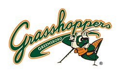
The Greensboro Grasshoppers’ logo history has two major identity stages: the green-and-orange grasshopper mark introduced for the 2005 season and a refreshed identity unveiled by Studio Simon in 2023. The club is a High-A affiliate of the Pittsburgh Pirates, a relationship that began in 2019; the Grasshoppers name followed earlier franchise names, Hornets and Bats. MLB.com’s account of the club and ballpark traces the name changes and affiliation.
 Greensboro Grasshoppers Logo PNG
The 2005 primary mark combines a sweeping green “Grasshoppers” wordmark, outlined in white and orange, with “GREENSBORO” laid across its lower portion. A cartoon grasshopper sits beside the lettering, bringing green, orange, white and black into the same lockup. A contemporary description recorded the wordmark and character arrangement, while the club palette also included ecru. The archived 2006 club entry contrasts those colours with the Bats’ black, teal and purple palette.
Meaning and history
The current franchise began as the Greensboro Hornets in 1979 and became the Greensboro Bats in 1994. The Grasshoppers name arrived in 2005 alongside the move to a new downtown ballpark. The insect theme links the Grasshoppers to the earlier Hornets name, though the 1994 Bats identity broke that visual thread. MLB.com’s 2024 visit with the club connects the Grasshoppers name to the ballpark move.

2005 – Today
This heading marks the archive’s 2005 identity stage; the identity was superseded by a refresh unveiled in 2023. In the earlier design, the handwritten-style wordmark and cartoon insect form one wide composition. The grasshopper also appeared within a G on the cap. A 2005-era article describes a throwing pose, while the 2023 announcement characterizes the outgoing primary mark as fielding-oriented, so the character is best identified by its artwork rather than a single definitive pose. The 2005-era description and the 2023 announcement document those accounts.

2023 identity refresh
Studio Simon unveiled the refreshed identity on 1 November 2023 for the club’s 20th season as the Grasshoppers. The redesigned character has human legs and heavier linework; the brighter palette emphasizes Kelly green and orange. The cap emblem changed from a playful script G to a Block G, and the new suite included alternate marks featuring a blade-of-grass G and a grasshopper in a throwing pose. The club’s announcement, published by MiLB, credits Studio Simon and describes the redesign.
Designer Dan Simon explained in that announcement that the earlier character was “true in too many ways to what an actual grasshopper looks like.” He also said the heavier black linework called for brighter supporting colours. The refresh retained the insect as the central figure while changing its proportions, outlines and supporting letterforms.
Character and colors
The 2005 character connected the team name to its cap emblem, where a grasshopper appeared inside a G. The mascot was named Guilford after Guilford County, with the name selected by fans. The club’s historical summary records the mascot name, while the 2023 refresh announcement documents the later Block G treatment.
Green and orange anchor both identity stages, but the refreshed mark uses brighter versions of those colours. The club palette also includes ecru and black; the 2023 announcement describes Kelly green and cream alongside gray and black in the uniforms. These colours support the contrast between the older outlined script and the heavier, more compact refreshed emblem.
View the Greensboro Grasshoppers logo archive entry.
Disclaimer
This article is part of the educational resources provided by Logo Index, an independent archive covering logos, visual identities and graphic design history. Greensboro Grasshoppers and associated trademarks and brand assets remain the property of their respective rights holders where applicable.