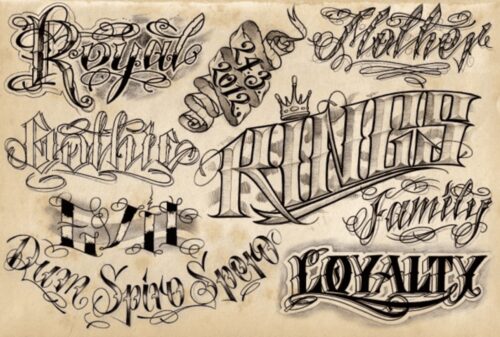
 Best Fonts for Tattoos
Choosing typography for a tattoo is different from selecting a font for a poster, logo or website. Lettering has to work at a specific physical size, follow the contours of the body and remain visually clear when reproduced by a tattoo artist rather than printed or rendered on a screen.
There is no single best tattoo font. Blackletter, script, sans-serif, ornamental, Victorian and monospaced designs can all work, but their suitability depends on the text, placement, scale and complexity of the letterforms. A tattoo artist may also redraw or simplify a digital font rather than reproduce it exactly.
What Matters When Choosing a Tattoo Font?
Start with the words themselves. Names, dates, initials and one-word tattoos create different typographic requirements from long quotations or multi-line passages.
Before tattooing any text, verify spelling, punctuation, capitalization and dates carefully. For another language or writing system, have the wording checked by someone genuinely fluent in that language rather than relying exclusively on machine translation.
The typeface should then be evaluated at approximately the size in which it will actually appear. Details that look clear at 100 pixels on a screen may become difficult to distinguish when reduced to a small tattoo.
Tattoo Typography Checklist
- Text length: Longer passages generally require simpler and more readable letterforms.
- Stroke width: Very fine details may not translate as clearly at small tattoo sizes.
- Letter spacing: Characters need enough separation to remain distinguishable.
- Internal spaces: Small counters inside letters such as a, e, o and R need careful attention.
- Capitalization: All caps, lowercase and mixed case can produce dramatically different proportions.
- Placement: The available space and shape of the body area affect line length and composition.
- Decorative details: Swashes, outlines and ornaments increase the amount of space the lettering requires.
- Artist adaptation: Allow the tattoo artist to adjust the digital reference when necessary for the final execution.
Major Tattoo Font Styles
Old English and Blackletter Fonts
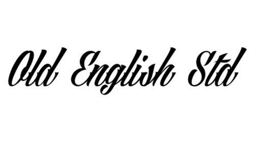
Blackletter is a broad historical category rather than one single font. Its forms developed from medieval manuscript writing and became important in early European printing. Monotype notes that early blackletter type was directly based on manuscript forms and became especially prominent through 15th-century printing. [1]
Typical features include compressed proportions, strong vertical strokes, angular construction and dense texture. These characteristics can create striking tattoo lettering, particularly for short words, initials or larger compositions.
Dense blackletter designs can become difficult to read when reduced too far, so the specific typeface matters considerably. “Old English” is often used casually as a label for this entire visual category, although blackletter includes multiple historical styles and modern interpretations.
Script and Calligraphy Fonts
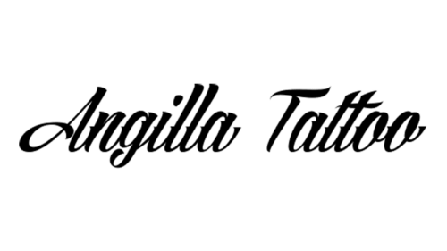
Script typefaces derive much of their structure from handwriting and calligraphy. They range from restrained connected lettering to highly decorative designs with loops, flourishes and exaggerated capitals.
This category is particularly varied. A simple script can remain highly readable, while an ornamental script with overlapping strokes may require considerably more space. Long ascenders, descenders and swashes also affect how closely multiple lines can be positioned.
For tattoo use, evaluate the actual word rather than relying on a font preview containing idealized sample text. Certain letter combinations can create awkward joins or intersections that need manual adjustment.
Sans-Serif Fonts
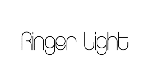
Sans-serif typefaces omit the projecting serifs found at the ends of strokes in many Roman type designs. The category includes geometric, grotesque, neo-grotesque and humanist styles, so not all sans-serifs look or behave alike. [1]
They can work particularly well for dates, coordinates, short quotations and simple lettering where a relatively uncluttered structure is useful.
Avoid assuming that a sans-serif automatically makes a tattoo “modern.” The important considerations are the proportions, stroke widths, character differentiation and how the specific design works at the intended size.
Decorative and Ornamental Fonts
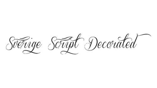
Decorative fonts deliberately emphasize distinctive forms over neutral text setting. They may incorporate swashes, engraved details, unusual terminals, inline decoration or exaggerated capitals.
These qualities can make them useful for a short focal word or monogram, but they also make scale especially important. Ornament that works in a large reference image may need to be simplified when translated into a smaller tattoo.
Instead of treating decorative lettering as automatically expressive or free-spirited, judge it by the actual letterforms required for the tattoo.
Victorian and Vintage Display Fonts
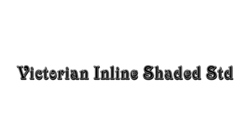
The 19th century produced an enormous expansion in display typography as posters, advertisements and other commercial printing demanded increasingly attention-grabbing letterforms. Designers experimented with bold faces, shadows, inline forms, decorative serifs and condensed or expanded proportions. [2]
Modern fonts inspired by that period can create highly distinctive tattoo lettering. However, inline shading and multiple contours require more physical space than a plain letterform, making these styles better suited to larger applications when their details are important.
Typewriter and Monospaced Fonts
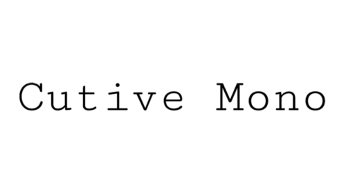
Monospaced typefaces allocate the same horizontal width to each character. This differs from proportional typography, where an “i” normally occupies much less space than an “m.”
Typewriter-inspired monospaced fonts often reproduce irregular or mechanical-looking details associated with historical typing. Other monospaced families are much cleaner and were developed for coding or technical use.
For tattoos, their regular rhythm can work effectively for dates, short quotations or compact sequences, but a monospaced design can also make longer phrases considerably wider than an equivalent proportional font.
Font Size and Tattoo Legibility
There is no universal minimum font size because letterforms vary dramatically. A simple sans-serif at one size may remain clearer than an ornate script at the same height.
Instead of choosing a numeric size in isolation, print or display the exact phrase at roughly the intended dimensions. Check whether similar characters remain distinguishable and whether small enclosed spaces and thin strokes are still clear.
The tattoo artist should make the final judgment about whether the design needs to be enlarged, spaced differently or redrawn. A font file is best treated as a starting point for lettering rather than an instruction that must be reproduced mechanically.
Should You Use a Font or Custom Lettering?
A digital font can provide a useful starting structure, especially when comparing styles quickly. Custom lettering allows the design to respond specifically to the words, placement and available space.
The two approaches can also be combined. A tattoo artist can begin with an existing typeface and redraw individual letters, alter spacing, simplify details or introduce custom flourishes.
This avoids one of the main weaknesses of simply typing a phrase and tattooing the resulting screenshot: typefaces were normally designed for other media and may benefit from adaptation before being transferred to skin.
Tattoo Font Licensing
Font licensing depends on the specific typeface and the way it is being used.
Google states that all fonts distributed through Google Fonts are released under open-source licenses and can be used in commercial and non-commercial projects. [3]
Commercial font libraries can use very different licensing models. Do not assume that purchasing a font automatically grants every possible usage right. If lettering is being used commercially, reproduced in merchandise, incorporated into branding or distributed as artwork, check the actual end-user license supplied by the type foundry.
For an ordinary personal tattoo, the practical licensing situation is different from redistributing font software or using typography commercially, but the license of the specific font remains the authoritative source.
How to Choose the Best Tattoo Font
A useful selection process is straightforward:
- Finalize and verify the exact wording.
- Choose two or three broad typography directions rather than dozens of random fonts.
- Set the actual phrase in each candidate typeface.
- Compare them at approximately the final physical size.
- Check spacing, small internal shapes and decorative details.
- Review the design with the tattoo artist.
- Allow the artist to redraw or simplify the lettering where necessary.
The best tattoo typography is therefore not necessarily the most decorative or distinctive font in a library. It is the lettering that works with the exact text, physical size, placement and execution of the final piece.