Can-Am is the powersports brand of BRP Inc., the Valcourt, Quebec manufacturer that became independent from Bombardier in December 2003. The name now covers off-road and on-road vehicles and, since 2024, an all-electric motorcycle line. Its visual identity is not a single mark: a slanted wordmark carries the brand, a yellow accent runs through livery and packaging, and a separate circular badge signals the parent company. Untangling those pieces is the main job of any serious look at the Can-Am logo.
What the Can-Am wordmark looks like
The working Can-Am mark is a wordmark. It is normally set as “Can-Am” with capital C and A around a hyphen, and it also appears in an all-caps “CAN-AM” treatment in some applications. The lettering reads as a heavy sans-serif with a slight forward slant, tightly spaced, which gives the name a sense of momentum even at small sizes.
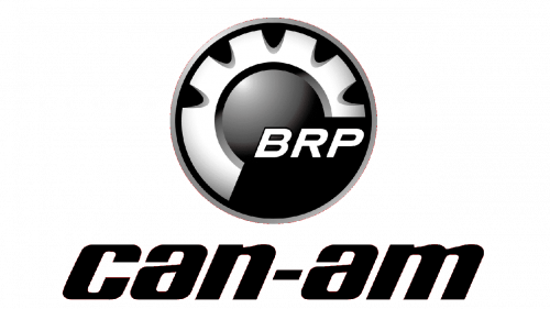 Can-Am Logo PNG
The weight and the lean are the parts most consistently described. Less reliable is the claim that the lettering is set “all lowercase”, since the wordmark is more often rendered with capitals, and readings of individual strokes, such as the curved upper lines of the N and M, belong to interpretive marketing copy rather than a documented design brief. BRP does not publish a public Can-Am logo kit, and no authoritative source sets out the typeface, Pantone values or hex codes behind the wordmark, so any precise font attribution should be treated as unconfirmed.
What can be said with confidence is structural. The brand is carried by letterforms rather than by a pictorial device, which is unusual for a powersports marque and one reason the Can-Am name reads cleanly on a mudguard, a helmet or a showroom wall.
The toothed wheel is BRP’s badge, not Can-Am’s
Several files that circulate as “Can-Am emblems” actually show the corporate badge of BRP: a black circle containing a silver-grey toothed wheel, a cog, with the letters BRP set in a thin italic sans-serif.
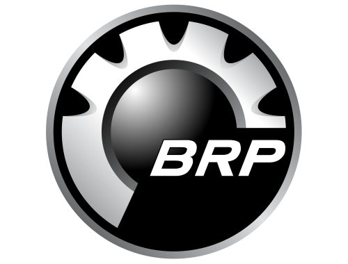
That cog is the parent company’s heritage symbol. BRP presented its own name and logo in February 2004 and described the mark as a “half toothed wheel”, a barbotin, referring to Joseph-Armand Bombardier’s first patented invention in 1937. A toothed wheel has formed part of the company logo since 1959, which is why the device turns up on everything from dealer signage to engine covers.
Calling it the Can-Am emblem is a category error, even though the two marks often sit in the same layout. When the cog appears beside a Can-Am wordmark it is identifying the owner of the brand, in the same way a group badge identifies the parent of a car marque. Pages that present the toothed wheel as Can-Am’s own symbol are mixing brand and company identities.
Colour, and the yellow diamond question
BRP’s corporate palette is black and white, supported by silver or grey and a yellow accent, a scheme documented in the company’s Red Dot Award entry. The 20-degree angle used across BRP’s graphic system is derived from the logo itself, which shows how closely the parent’s design rules and its product brands are tied together.
The yellow accent leads to a recurring question. Some third-party sources describe the current Can-Am logo as condensed uppercase CAN-AM lettering inside a yellow diamond, a square rotated 45 degrees and coloured close to Pantone 109 C. Only tertiary sources make this claim, and no BRP release confirms the diamond enclosure as an official lockup. The careful description is that a yellow diamond variant circulates as part of the current look, particularly in some markets and merchandising, while the plain wordmark remains the constant. Diamond-shaped emblems are common in the sector, as with the Borgward logo, but a shared shape is not evidence of shared intent.
What the name means
Can-Am is generally understood as a contraction of “Canadian-American”, reflecting the cross-border market the original motorcycles were built for. No authoritative source explains the hyphen, the colours or the toothed wheel as deliberate symbolism for the Can-Am brand itself, so interpretations that assign the dash a meaning of confrontation, or read the palette as a statement of courage, are marketing framing rather than documented design history.
How the brand’s history shaped the identity
Bombardier began developing Can-Am motorcycles in 1971, and the first production models, the MX and T’NT with Rotax engines, reached the market in May 1973, according to BRP’s own history of the brand. That date is the one BRP uses for the brand’s creation and for the 50th anniversary it marked in 2023. The name built its reputation in 1970s motocross and endurance racing rather than in showrooms.
In 1983 Bombardier licensed Can-Am to Armstrong-CCM Motorcycles of Lancashire, England, and motorcycle production ended in 1987. The brand lay dormant until BRP announced in May 2006 that its ATV line would be rebranded Can-Am for the 2007 model year, a change reproduced in contemporary coverage of the announcement. The revival was therefore an off-road one, not a motorcycle one. The Spyder three-wheeler extended the name onto the road from 2007, and an all-electric Can-Am motorcycle line followed for the 2024 model year, joining a small field of electric two-wheel brands such as Brammo.
Between those milestones, BRP went through corporate brand work of its own. Its Red Dot recognition in 2019 came from a brand evolution the company framed as not being about changing its logo. The parent mark and the Can-Am mark have therefore moved on separate tracks, which is why the brand’s identity is best read from its wordmark and livery rather than from the corporate cog. No authoritative source pins down when the Can-Am wordmark itself was first drawn or redrawn.
The 2026 refresh and Cossette
In February 2026 BRP unveiled a refreshed group identity called “Get Moving”, developed with the agency Cossette, explicitly intended to strengthen the link between BRP and its brands: Ski-Doo, Lynx, Sea-Doo, Can-Am and Rotax. As part of that programme, Cossette designed a modernised Can-Am identity. The agency’s own project page lists BRP as the client, and the work took a Silver award at the Concours Idéa 2026, where it is described as reviving the legend by returning to the brand’s racing origins, with a new inclined typeface evoking speed.
That is the clearest designer credit available for any modern Can-Am identity. The 2026 work is an official BRP project by Cossette, not a speculative concept. Earlier wordmark changes are not documented to the same standard, and no source dates the introduction of the classic-era Can-Am lettering or names the hand behind it.
FAQ
What does the Can-Am logo look like?
It is primarily a wordmark: “Can-Am” set in a heavy, slightly slanted sans-serif, sometimes shown in all capitals. A yellow accent appears in the brand’s broader palette, and a yellow diamond version of the mark circulates in some applications, though BRP has not published it as an official lockup.
Why is there a gear in some Can-Am logos?
That badge belongs to BRP. The toothed wheel, or barbotin, is the parent company’s heritage symbol, tied to Joseph-Armand Bombardier’s 1937 patent, and it appears beside Can-Am wordmarks to indicate ownership rather than as a Can-Am emblem.
What does the name Can-Am mean?
It is generally understood as short for Canadian-American. No authoritative source assigns a deeper meaning to the hyphen or to the brand’s colours.
Who designed the modern Can-Am identity?
The agency Cossette, working for BRP, designed the modernised Can-Am identity presented as part of the February 2026 “Get Moving” brand refresh. The project names BRP as client and won a Silver award at the Concours Idéa 2026.
Was Can-Am a motorcycle brand or an ATV brand?
Both, at different times. Bombardier’s Can-Am motorcycles launched in 1973 and ended in 1987. The name was then revived on BRP all-terrain vehicles for the 2007 model year, extended to the Spyder three-wheeler, and applied again to electric motorcycles from 2024.
Disclaimer
This article is part of the educational resources provided by Logo Index, an independent archive covering logos, visual identities and graphic design history. Can-Am and associated trademarks and brand assets remain the property of their respective rights holders where applicable.