Hispano-Suiza is the Spanish-Swiss luxury marque founded in Barcelona on 14 June 1904, and its identity has been carried by two visual anchors for more than a century: a winged shield and a stork. Both survived the company’s long dormancy and the 2019 revival of the name as an electric car maker, and both were deliberately kept during the corporate identity refresh the brand published in 2023. Reading them properly means starting with the company behind them.
 Hispano-Suiza Logo PNG
A name made of two countries
Hispano-Suiza means, quite literally, Spanish-Swiss. The firm was assembled around three people: the Spanish financier and industrialist Damián Mateu, his business partner Francisco Seix, and the Swiss engineer Marc Birkigt, who had already designed some of Spain’s earliest automobiles for the La Cuadra and Castro ventures. Those projects were reorganised into the new company, usually given in full as La Fábrica La Hispano-Suiza de Automóviles. Between 1904 and 1946 the marque built roughly 12,000 cars and about 50,000 aero engines, most of the latter during the First World War.
The car brand is now owned by the Suqué Mateu family, fourth-generation descendants of Damián Mateu, within Grup Peralada, with its headquarters, technical centre and plant in Barcelona. That ownership is worth noting because the aircraft and industrial business that also traded as Hispano-Suiza pursues a separate life and eventually became part of Safran. A different entity used the name for a concept presented at the 2010 Geneva show. It is not the Peralada marque, and its artwork does not belong to this logo’s lineage.
The emblem before the stork
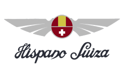
The earliest Hispano-Suiza emblem was not a bird. A peer-reviewed study of Spanish advertising history describes an earlier mark built from two outstretched wings, a steering wheel and a cross, and Spanish press coverage of the marque’s identity refers to a winged wheel device (a “rueda alada”) accompanied by a shield. The surviving early artwork bears this out: the company’s first marks were typographic frames, and the pictorial device that followed used spread wings as its base.
This framed two-line wordmark, reading “La Hispano-Suiza” with “Barcelona” set smaller beneath, is an early piece of the brand’s lettering. The artwork itself is undated; it is best treated as an approximately placed early wordmark rather than a precisely dated specimen.
A winged emblem of a different type: two spread white wings over a red circular field with yellow and white elements, paired with the cursive brand name. It shows the winged theme already firmly established, though the exact date of this rendering is not documented.
Why the stork
The stork came from the air, not from the road. During the First World War the Hispano-Suiza V8 aero engine powered SPAD fighters flown by Escadrille 3 of the French air service, known as Les Cigognes, the Storks. The stork was the personal emblem of the squadron’s ace Georges Guynemer, and it carried a tribute to Alsace, the contested region the unit honoured. The engine builder adopted the bird as its own. Louis Massuger, an engineer at the firm, is credited with the decision, and the radiator-cap ornament that carried the bird is attributed to a sculptor recorded as François or Frederick Bazin.
The adoption date sits somewhere in the 1916 to 1919 window rather than at a single fixed moment. Safran’s own company history places the stork on the emblem in 1916, the Irish Times marque history dates the branding to around 1918, and the advertising-history study points to 1919, when the bird appeared on cars around the H6 shown at the Paris Salon. Any source that puts a flying stork on a 1907 Hispano-Suiza badge is running ahead of the evidence.
Here the cursive wordmark sits beneath a flying stork, with a “Fabrica de Automoviles S.A.” line at the foot. The wordmark style is plausible for the marque, but a stork version cannot belong to 1907. The design is best placed in the post-1916 era.
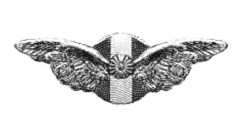
A three-dimensional treatment of the winged device, set on a rounded base with a bubble-like texture and a flower-shaped centre joining the two wings, rendered in black and white. Its shape and three-dimensional quality are consistent with a radiator-cap or ornament application rather than a flat printed mark. The surviving artwork is undated.
The stork and shield in the modern era
After the car business wound down in the late 1930s, the emblem sat dormant for decades. The name returned to cars when Hispano Suiza Cars unveiled the electric Carmen at the 2019 Geneva show, followed by the Carmen Boulogne in 2020 and the Carmen Sagrera in 2024, a car timed to the marque’s 120th anniversary. The revival also brought a fresh round of discussion about which company legitimately holds the name, a split documented in reporting on the brand’s return.
The documented identity work came in April 2023. According to Hispano Suiza Cars’ own account of the change, the shield and the stork were kept intact and “enriched” through monochrome adaptations and new typefaces, with creative work credited to the agency FutureBrand, part of the McCann group. The refresh also introduced a brand colour called Electric Red, chosen because it is the only colour the Spanish and Swiss flags share. A brand film was produced by Daughter in London with Untold Studios.
This revival-era emblem brings back the cursive name with sharper wings, a grey gradient and a red circular element. It sits in the same territory as the current identity, though the source artwork is undated and is best read as approximately placed.
Other artwork that circulates under this name
Not every winged Hispano-Suiza mark belongs to the same owner. This version abstracts the wings into a triangular composition and pairs them with a bold sans-serif “HISPANO SUIZA” in dark grey. Its geometry and lettering differ sharply from the Peralada marque’s cursive identity, and it is plausibly connected to the competing 2010-era rights-holder rather than to the Barcelona car brand.
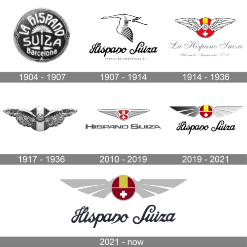
This graphic is a montage of several emblems rather than a single mark, useful as a visual overview of how the winged device and the stork recur, but not as evidence for any one dated logo version. Its provenance is unclear.
What the identity rests on now
The current Hispano-Suiza logo is not a reinvention. It is the historic combination of the winged shield and the stork, redrawn in monochrome variants with Electric Red as its accent and a set of typefaces the brand has not publicly named. Almost everything else that circulates, from the mislabelled 1907 stork to the triangular 2010 abstract, belongs to a different stage, a different owner, or a different company entirely.
FAQ
What does the Hispano-Suiza stork symbolize?
It refers to Escadrille 3 of the French air service, known as Les Cigognes or the Storks, whose SPAD fighters used Hispano-Suiza V8 engines during the First World War. The bird was the personal emblem of the squadron’s ace Georges Guynemer and carried a tribute to Alsace.
Why is the company called Hispano-Suiza?
The name combines “Hispano”, for Spain and the Spanish side of the founding group around Damián Mateu, with “Suiza”, for Switzerland and the Swiss engineer Marc Birkigt. The firm was founded in Barcelona in 1904.
When did Hispano-Suiza adopt the stork logo?
Sources place it between roughly 1916 and 1919. Safran’s company history gives 1916, the Irish Times points to around 1918, and a peer-reviewed advertising-history study dates the car application to 1919, around the H6 shown at the Paris Salon.
Disclaimer
This article is part of the educational resources provided by Logo Index, an independent archive covering logos, visual identities and graphic design history. Hispano-Suiza and associated trademarks and brand assets remain the property of their respective rights holders where applicable.