McLaren’s identity grew out of a racing team rather than a road-car company, and its marks have always reflected that origin. The British organisation began as Bruce McLaren Motor Racing, founded in 1963 by the New Zealander Bruce McLaren. Its visual identity has carried three recurring ideas since then: a kiwi, a chequered-flag reference and, from 1997, an abstract curved stroke known as the Speedmark. The same wordmark and Speedmark are used across McLaren Racing, McLaren Automotive and McLaren Applied, so the logo has to work as both a competition badge and a luxury-car signature.
 McLaren Logo PNG
Meaning and history
McLaren’s identity is much older than its road-car business. McLaren Automotive was only created in 2010 and started building cars the following year, as The National reported, while the first emblem belongs to the racing operation founded decades earlier. That split still shapes the McLaren identity: one badge has to serve a Formula One team and a supercar maker at the same time.
The first kiwi crest
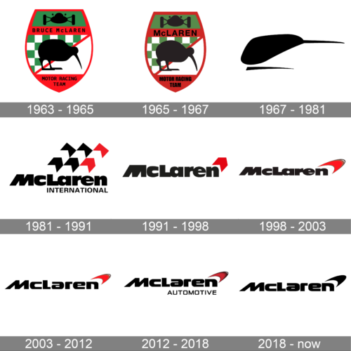
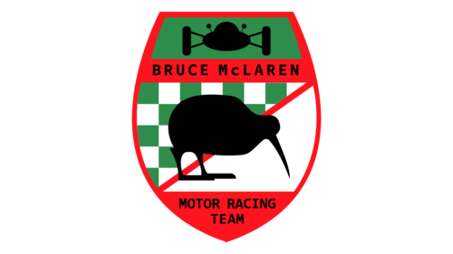
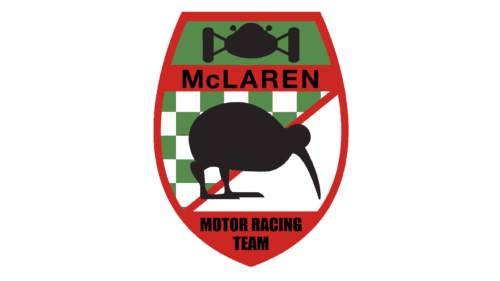
McLaren’s official heritage chronology dates its first crest to 1964 and credits the motorsport artist Michael Turner. The mark put a kiwi at its centre, a deliberate tribute to Bruce McLaren’s homeland, New Zealand. Early versions combined a shield treatment with a kiwi silhouette, placing a bird rather than a car at the heart of a motor-racing badge. McLaren has also published press material that frames Turner’s early work across a 1962 to 1966 period, so the very first appearance is more safely described as early 1960s than fixed to one year. Bruce McLaren died in June 1970 during testing at Goodwood, a loss reported by CarBuzz that turned the New Zealand motif into something closer to a memorial.
The Speedy Kiwi
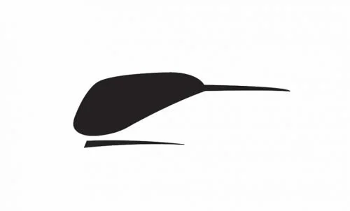
The crest was followed by a stylised kiwi, nicknamed the Speedy Kiwi, which reduced the bird to a fast, simplified form that could sit on car bodywork. McLaren’s heritage page credits it to Doug Eyre and dates it to 1971, while a McLaren press document and other accounts place a Turner kiwi closer to 1967. Those dates and credits disagree, and the conflict is more useful to note than to resolve. The mark coincided with papaya becoming the team’s signature racing colour.
1981: Loewy and the chevrons
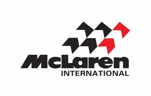
The Speedy Kiwi was retired in 1981 in favour of a McLaren International mark designed by the industrial designer Raymond Loewy and commissioned as a gift from the team’s sponsor Philip Morris, whose Marlboro brand was then closely tied to the cars. The design introduced chevron shapes that visually echo a chequered flag, alongside a red that matched the Marlboro livery. Both the attribution and the sponsor relationship are documented by McLaren and by Road & Track.
1991: a single chevron
In 1991 the row of chevrons was merged into a single one, with a slightly refined wordmark. The change simplified a busy emblem into one directional shape and is listed in McLaren’s own chronology of the marque.
1997: the Speedmark
The chevron gave way in 1997 to the Speedmark, a single open curved stroke. McLaren’s stated explanation is that the shape echoes the vortices trailing from a rear wing, as well as the aggressive markings of predatory animals and insects. It first appeared on the sidepods of the race cars and has remained the core of the identity since.
2007 and the rebrand that unified the group
A refined wordmark arrived in 2007 alongside the chrome-liveried cars. Some third-party accounts place another update around 2012, but McLaren’s official chronology moves from the 2007 refinement directly to the 2017 rebrand. That 2017 change turned the Speedmark monochrome black and was used to unify McLaren Racing, McLaren Automotive and McLaren Applied under a single “one McLaren” identity.
Intermediate versions from the 2000s are dated inconsistently between sources, so the artwork that survives from that period is best placed by era rather than by a specific year.
2021: papaya returns
For 2021 McLaren turned the Speedmark papaya for its racing team and introduced a slimmer wordmark, an evolution credited to the design agency Newlyn, which was engaged in late 2020. Papaya had long been the team’s heritage colour, so the change reconnected the modern identity with the cars of the 1960s and 1970s.
The Emblem
The Speedmark is an open curved stroke rather than an enclosed badge, and it sits above the final letter of the McLaren wordmark. McLaren’s own account links it to airflow and to sharp natural markings. A popular fan reading sees a stylised kiwi head inside the curve, but that interpretation comes from enthusiast discussion rather than from the company itself.
Font and color
The wordmark is set in a custom sans-serif with clean, slightly condensed letterforms, and the Speedmark carries the accent. Colour is where McLaren’s two sides part: the racing team uses papaya, while McLaren Automotive’s brand toolkit, developed with the agency Eight Inc, introduced a motion system and a signature “Velocity Orange”. These are related but distinct colours rather than one shared value. No official hex value for the papaya Speedmark is published; the widely quoted orange is an approximation rather than a brand standard.
The identity itself is owned by McLaren Group. Bahrain’s sovereign wealth fund Mumtalakat, an investor since 2007, took full ownership of the group in March 2024, according to a McLaren Group announcement. Later 2024 and 2025 transactions involving CYVN Holdings and a merger with Forseven have been reported, but they remain less firmly established in public records.
FAQ
Why does McLaren’s logo feature a kiwi?
The kiwi is a tribute to New Zealand, the homeland of the company’s founder, Bruce McLaren. The first crest from 1964 placed the bird at its centre, and a stylised Speedy Kiwi followed in the late 1960s or early 1970s.
What does the McLaren Speedmark represent?
Introduced in 1997, the Speedmark is a single open curved stroke. McLaren describes it as echoing the vortices trailing from a rear wing and the markings of fast predatory animals and insects.
Disclaimer
This article is part of the educational resources provided by Logo Index, an independent archive covering logos, visual identities and graphic design history. McLaren and associated trademarks and brand assets remain the property of their respective rights holders where applicable.