Olmeca is a tequila brand introduced in 1967. The brand’s name and emblem refer to the Olmec, an early Mesoamerican civilisation associated with colossal stone heads. Its logo brings an illustrated head together with the OLMECA wordmark and the descriptor “tequila.” Olmeca’s brand history describes the tequila as mixto, with at least 51% of its sugars from blue agave.
 Olmeca Logo PNG
Meaning and history
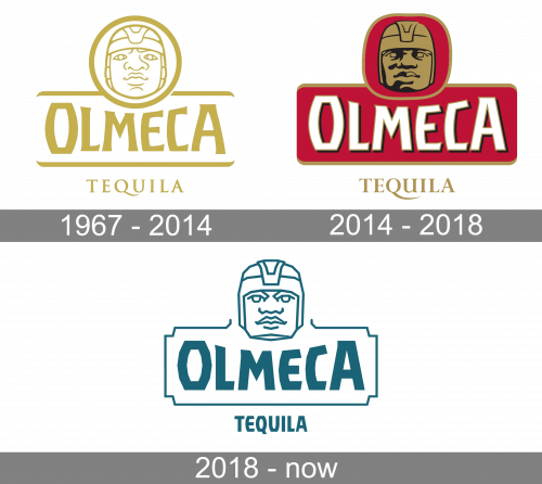
The emblem uses a stylised face rather than a photograph. The head sits above the name, while horizontal lines frame the wordmark and “tequila” appears below. The most noticeable changes are the badge’s color, the rendering of the face and the treatment of the lettering.
1967 – 2014
This stage uses a single gold-yellow color for the head, circular frame, rules and lettering. The face is drawn with outlined features inside a roundel. OLMECA appears in large serif lettering between two horizontal rules, with “tequila” below in a smaller, widely spaced serif. The brand dates its introduction to 1967, but that date alone does not establish when this particular logo artwork first appeared. The brand timeline gives the introduction date.
2014 – 2018
The next stage makes a strong color contrast: a red badge carries a white wordmark, while the head is shaded in dark tones and gold. The roundel remains above the name, but the overall mark is more compact and the lettering is more prominent than in the gold version. In 2014, Pernod Ricard commissioned Coley Porter Bell to redesign Olmeca’s packaging. Design coverage reports that illustrator Chris Mitchell redrew the Olmec-head icon for that work, while the wordmark was simplified. Design Week and Mitchell’s portfolio document the redesign and illustration credit.
2018 – Today
This stage returns to a restrained, single-color treatment. The face is drawn with thin teal lines, and the angular OLMECA lettering sits within an outlined rectangular badge. “TEQUILA” is set in matching block lettering below. The open-ended heading is an archive label, not proof that this version remains current. Separately, The Spirits Business reported that Olmeca’s 2018 50th-anniversary campaign introduced an updated logo and visual identity.
Later packaging and identity
In February 2022, Olmeca introduced a redesign of its core-range bottle and label. The new two-piece label paired a circular Olmeca logo with a rectangular information label, and the packaging used a dark-blue cap with electric-blue details. The redesign covered Silver, Gold, Reposado, Añejo and Dark Chocolate; trade coverage also reported that Blanco was renamed Silver. Pernod Ricard’s House of Tequila and The Drinks Business describe the updated pack. This later documented logo-on-label treatment superseded the earlier packaging stage as the reference for the core range.
The 2022 bottle design also refreshed the engraved glyphs and included blue-agave imagery. A 2024 limited edition used separate Alebrijes and Tonas y Nahuales artwork; it was a special edition, not evidence of another general change to the core mark. Pernod Ricard’s announcement describes that release.
Lettering and color
The historical stages show different lettering styles: a serif wordmark and descriptor in the gold design, a bold white wordmark against red in the 2014 stage, and more angular block lettering in the teal stage. The images show those visual differences, but do not establish a named typeface. Color likewise changes from gold-yellow to red, white and gold, then to teal. The blue details documented in the 2022 bottle redesign belong to the packaging update, rather than establishing that every version of the logo uses blue.
Disclaimer
This article is part of the educational resources provided by Logo Index, an independent archive covering logos, visual identities and graphic design history. Olmeca and associated trademarks and brand assets remain the property of their respective rights holders where applicable.