 Poland Spring Logo PNG
Poland Spring is a bottled spring water brand named for the spring in Poland, Maine. The brand traces its origins to 1845, while commercial water sales began in 1859, according to the brand’s history and a Sun Journal timeline. Today it is part of Primo Brands, formed in 2024 through the merger of Primo Water and BlueTriton Brands, as the merger announcement states.
The identity’s recurring cues are deep green lettering and images associated with the Maine landscape. The stages below preserve the timeline’s labels, but those labels should not be read as independently verified dates for logo launches. The documented redesign work is clearer: Ocean Branding describes a 2019–20 simplification, while Interact Brands later applied a heritage landscape logo to Poland Spring Sparkling.
Meaning and History
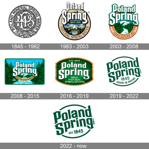
The logo shifts from an early circular seal to illustrated badges, a rectangular forest scene, a wood-textured plaque, and finally simpler green lettering. Spring and landscape imagery recur, but the marks are not identical across the sequence.
1845 – 1982
This image shows a circular seal with “POLAND MINERAL SPRING WATER” around its edge and a central monogram. It differs sharply from the later wordmarks and illustrated scenery. The 1845 in the heading is the brand’s origin year, not a documented date for this particular logo; the brand’s own history describes its origins in 1845 and commercial sales beginning in 1859.
1983 – 2003
The badge pairs a stacked Poland Spring name with a small “Since 1845” panel and a landscape illustration. “Natural Spring Water” curves along the lower rim, making the lettering and scene part of one circular composition.
2003 – 2008
Here the name is larger and more prominent above a forest-and-water scene. The lower arc carries “Natural Spring Water” and “From Maine Since 1845,” adding product and place information to the illustrated badge. The image differs from the preceding badge, though the round composition remains.
2008 – 2015
This version expands the illustration into a rectangular panel: the wordmark sits above a waterfall, framed by evergreen trees. Bright blue sky and water contrast with the surrounding green forest, while a curved ribbon carries the spring-water wording.
2016 – 2019
The mark returns to a compact plaque shape with a wood-grain effect and gold-toned border. Large white lettering dominates the green field, with “Est. 1845” above and “100% Natural Spring Water” below. The added text and textured frame make this a denser treatment than the later simplified mark.
2019 – 2022
Ocean Branding says it was engaged in 2019 to simplify the identity: its redesign removed the faux-wood effect and the “100% Natural Spring Water” wording from the roundel, and recreated the Maine landscape behind the logo. The image here shows a different, pared-back treatment: green stacked lettering, “1845,” and “Born in Maine” within partial circular arcs. Ocean Branding’s case study documents the redesign work.
2022 – Today
This stage image shows a green stacked wordmark with “Est. 1845” beneath it and curved strokes above and below; unlike several earlier stages, it has no landscape illustration. The current identity is described as a streamlined green-and-white mark, and Interact Brands’ case study says its later Poland Spring Sparkling work restored a heritage logo depicting the spring, pines, and rolling Northeast landscape for use across the Primo portfolio. The core wordmark and the heritage landscape treatment are related parts of the identity, rather than evidence that every package uses the same version.
Disclaimer
This article is part of the educational resources provided by Logo Index, an independent archive covering logos, visual identities and graphic design history. Poland Spring and associated trademarks and brand assets remain the property of their respective rights holders where applicable.