Pure Leaf is a ready-to-drink tea brand marketed by the Pepsi Lipton Tea Partnership, a joint venture between PepsiCo and Unilever. The partnership’s portfolio also includes Lipton Ice Tea and Brisk, according to FoodNavigator.
 Pure Leaf Logo PNG
Meaning and history
Before the standalone Pure Leaf name, the partnership used “Lipton PureLeaf” for a ready-to-drink tea line. In May 2012, it reintroduced Pure Leaf in the US with a redesigned look and squared PET bottles. The launch release also described a multi-serve carafe and the “For the Love of Leaves” campaign (BevNET).
Around 2015, the brand’s “Follow the Leaf” television campaign was created by Anomaly. That campaign is separate from a documented logo redesign; Adweek’s report quotes a partnership marketing executive describing the 2012 relaunch.
In 2019, London agency PB Creative refreshed the brand and packaging for the premium tea relaunch in the UK and the Netherlands. The work moved that range from plastic jars and glass to carton and paperboard packaging, while retaining black as the brand’s “original core” colour, as Packaging News and Packaging Insights reported. This was a premium tea identity and packaging refresh, not evidence of a redesign to every ready-to-drink pack.
The wordmark and its black plate
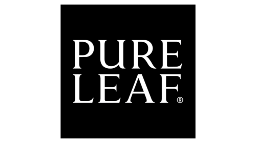
The logo shown here pairs a black rectangular field with light lettering. “PURE” sits above “LEAF,” with the lower word filling much of the width. The lettering and background make a strong contrast, while the standalone plate leaves out the additional imagery and product information that can appear on packaging.
Black has a documented role beyond the standalone mark: PB Creative described it as Pure Leaf’s original core brand colour. The agency said the 2019 work used it to give the range a premium feel and stand out on shelf. The available reporting does not identify the wordmark’s typeface or designer, so those details are not attributed here.
Packaging formats have varied across the brand’s history. The 2012 US relaunch featured squared PET bottles, while the 2019 UK and Netherlands premium tea refresh introduced carton and paperboard formats. These changes show how the wordmark has appeared within different product presentations without establishing a separate logo for each package.
The Logo
The black-and-white plate is the logo form represented in both archive images; their differing image framing does not show a distinct wordmark version. FoodNavigator reported in 2026 that Pure Leaf remained part of the Pepsi Lipton Tea Partnership, which was excluded from Unilever’s agreed McCormick foods transaction. The report supports the brand’s current partnership context, while the 2019 coverage documents black as a core identity colour.
Disclaimer
This article is part of the educational resources provided by Logo Index, an independent archive covering logos, visual identities and graphic design history. Pure Leaf and associated trademarks and brand assets remain the property of their respective rights holders where applicable.