 Royal Crown Cola Logo PNG
Royal Crown Cola’s identity is built around the RC initials, with changing frames, lettering and color treatments. The cola dates to 1934, when chemist Rufus Kamm reformulated Chero-Cola and released it as Royal Crown Cola, according to the Smithsonian National Museum of American History. The company began earlier: Union Bottling Works was founded in Columbus, Georgia, in 1905, and its first product was Royal Crown Ginger Ale, as the New Georgia Encyclopedia reports.
Meaning and history
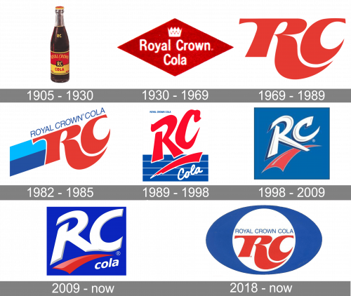
The collage shows a varied identity rather than a simple sequence of redraws: a bottle label and diamond badge give way to large RC lettering, framed versions and a compact mark on a blue field. The headings below are the archive’s timeline labels; they should not be read as independently verified redesign dates.
1905 – 1930
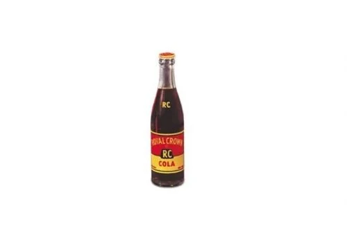
This image shows a bottle with a red-and-yellow label, small RC lettering and a crown near the top. It is an early-era product image, not evidence of a Royal Crown Cola logo in 1905: the cola was introduced in 1934.
1930 – 1969
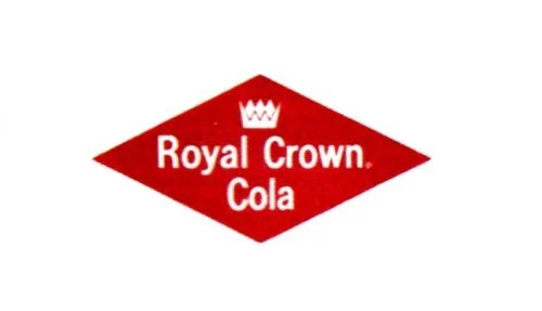
A white crown sits above the words “Royal Crown Cola” inside a red diamond. The compact, high-contrast badge differs sharply from the bottle label in the preceding image.
1969 – 1989
The diamond and full name give way to oversized red RC initials. The monogram is shown on its own here, without the blue oval described in some accounts of this stage.
1982 – 1985
This artwork pairs large red RC letters with a long, angled blue trail and “ROYAL CROWN COLA” lettering above. In its 2024 refresh announcement, RC Cola International said it reimagined the swoosh as a mnemonic, connecting that newer identity to a trail-like feature without establishing the origin of this earlier artwork (Transform Awards announcement).
1989 – 1998
Red, stylized RC lettering dominates a rectangular design. Blue horizontal bands fill the lower portion, where a red sweep sits above the white script “Cola.” This is a visual change from the preceding slanted trail treatment; the archive label does not establish a 1989 redesign date.
1998 – 2009
Here, the initials appear in white and pale gray against a blue square, with a red curved shape beneath them. The framed composition is simpler than the striped design in the previous stage.
2009 – Today
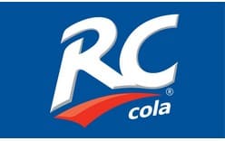
The blue field returns behind large white RC lettering, with a red sweep below and the word “cola” in white. This stage is historical in the international timeline: RC Cola International announced a refreshed identity with a rollout beginning in the first half of 2024 (RC Cola International).
2018 – Today (secondary)
This secondary badge places red RC lettering and the full name inside a white circle, surrounded by a dark-blue oval. Its media label says 2019 while the archive heading says 2018; both identify the item as a secondary treatment, not proof of a dated global redesign.
Color and composition
Red, white and blue recur across several of the pictured designs, but the layouts shift from a red diamond to standalone initials, stripes, trails and oval framing. The images show those formal differences; they do not establish official symbolism or a typeface attribution.
Current international identity
RC Cola International announced a refreshed identity and packaging system rolling out across more than 65 countries from the first half of 2024. The company’s announcement describes the new system’s treatment of the swoosh, while its Transform Awards announcement reports recognition for the refresh. This international rollout does not by itself establish which identity is used in every territory.
Disclaimer
This article is part of the educational resources provided by Logo Index, an independent archive covering logos, visual identities and graphic design history. Royal Crown Cola and associated trademarks and brand assets remain the property of their respective rights holders where applicable.