Tropicana’s identity has appeared in several forms, from ribboned green wordmarks to white lettering in a green panel. The orange pierced by a striped straw is a signature brand symbol, while the logos vary in whether they feature a leaf, a ribbon, or lettering alone.
 Tropicana Logo PNG
Meaning and history
Anthony T. Rossi founded the Florida orange-juice business in 1947. Its visual identity has included varied wordmarks and packaging treatments. Seagram acquired Tropicana in 1988, PepsiCo agreed to buy it in 1998, and PAI Partners acquired a majority stake in the juice business in 2021, with PepsiCo retaining a 39 percent non-controlling stake (Los Angeles Times; PepsiCo’s 1998 announcement; PAI Partners).
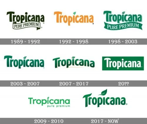
The Tropicana logo history includes green and orange lettering, versions with a leaf above the “i,” and banners carrying “Pure Premium.” The dates below follow the labels attached to these logo stages.
1989 – 1992
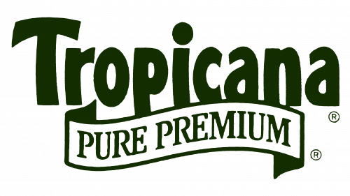
This dark green wordmark is paired with a curved “Pure Premium” ribbon. The ribbon gives the design a broader, more elaborate outline than the simpler wordmarks in other stages. “Pure Premium” was a Tropicana product family; PepsiCo’s 1998 announcement identified it as a trademarked brand.
1992 – 1998
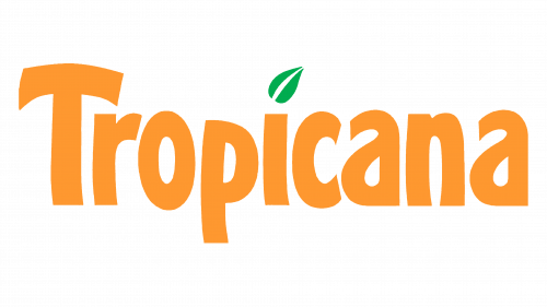
The lettering changes to orange, and a green leaf sits above the “i.” With the ribbon removed, the wordmark has a simpler silhouette and the leaf becomes its main decorative detail.
1998 – 2003
Green returns, along with a broad “Pure Premium” banner beneath the name. The leaf remains above the “i,” making the return of the ribbon and the change in color the most visible differences from the orange version.
2003 – 2007
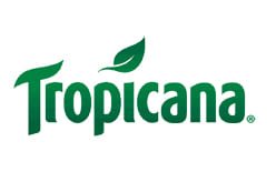
The banner is absent in this stage. The green wordmark and leaf stand alone, giving the mark a more compact outline than the ribboned versions.
2007 – 2017
Gold-colored outlines and a sweeping underline frame the green lettering. Gold also appears in the leaf detail, adding ornament to the wordmark compared with the simpler green treatment shown in the previous stage.
2010 – Today
This version places white lettering inside a green rectangular panel. Its block-like shape contrasts with the outlined wordmark in the preceding stage. Tropicana’s European identity was refreshed in 2024, while the US update that year focused on packaging rather than a worldwide logo replacement (Fast Company; ProFoodWorld).
2009 – 2010
The image shows a green wordmark with “Pure Premium” set beneath it. Separately, Tropicana’s North American Pure Premium packaging received a redesign by the Arnell Group in January 2009, and the change was reversed on 23 February after consumer backlash, as reported by The New York Post and NPR. The wordmark shown here is not a complete depiction of that packaging redesign.
2017 – Today
This stage shows a green wordmark with a leaf above the “i,” without the gold detailing or banner found in other versions. A later documented development was Tropicana’s 2024 European identity refresh; US changes that year concerned bottle and label design (Fast Company; ProFoodWorld).
2024 identity and packaging updates
In 2024, Tropicana Europe worked with UK agency Sunhouse on an identity refresh. Reported elements include a horizon arch, an orange in place of the dot over the “i,” and a roundel reading “The original since 1947,” alongside hand-drawn oranges and a photograph of the original grove. Sunhouse described the arch as suggesting uplift and the orange with a straw as representing juice straight from the source; these are the agency’s explanations of its design choices. The refresh was for Europe, not a worldwide redesign (Packaging of the World; Fast Company).
In the United States, the 2024 changes were packaging-led: the multi-serve bottle went from 52 to 46 ounces and single-serve bottles from 12 to 11 ounces, alongside label and cap changes, as ProFoodWorld reported. The US packaging changes and the Europe-specific identity refresh were distinct developments.
Lettering, color, and recurring details
Across these stages, the lettering appears in green, orange, or white. Ribbons and panels change the wordmark’s outline, while a leaf above the “i” recurs in several versions but is absent from others. Color and surrounding shapes are as noticeable as the lettering itself in the sequence.
Disclaimer
This article is part of the educational resources provided by Logo Index, an independent archive covering logos, visual identities and graphic design history. Tropicana and associated trademarks and brand assets remain the property of their respective rights holders where applicable.