 Zevia Logo PNG
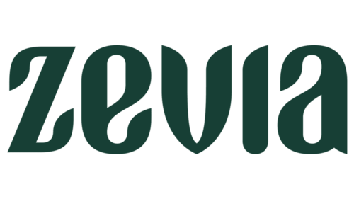
Zevia’s logo is a wordmark: the brand name is the central feature, with leaf forms worked into the lettering. In the current documented design, the leaf-like edges shape the letters rather than appearing as a separate symbol.
Meaning and History
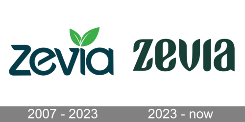
The earlier wordmark has a leaf placed above the “i,” while the later lettering integrates leaf-like forms into the name. Zevia says the 2023 redesign was the first update to the brand’s entire look and feel, making it a useful dividing point in the logo’s history. The company’s announcement also identifies Turner Duckworth as the design agency behind that work.
Zevia launched in 2007 as a beverage brand, and its 2023 announcement described the redesign as its first full look-and-feel update. The logo story is therefore a shift in how the leaf appears: a separate accent in the earlier wordmark, then part of the letterforms in the newer one. Zevia’s announcement connects the leaf-inspired design to the brand’s agricultural roots.
2007 – 2023
The earlier wordmark, shown here in dark lettering with green leaves above the “i,” places the plant motif apart from the name’s letterforms. The image makes the contrast clear: the leaf is a distinct accent, while the name remains a single line of lettering. Zevia characterized its 2023 project as the first time it had updated the brand’s entire look and feel, placing this earlier identity before that redesign. The company’s announcement provides that context.
2023 – Today
Turner Duckworth developed the 2023 identity, announced by Zevia on March 6 of that year. The wordmark keeps the brand name prominent but incorporates leaf-like edges into its letters, replacing the earlier design’s separate leaf accent. Turner Duckworth’s case study describes the scalloped edge of a leaf as inspiration for the lettering; the company announcement credits creative director Daniel Ioannou with that design rationale.
The redesign extended beyond the wordmark: Turner Duckworth describes a fluid graphic language across five product ranges. Zevia said the identity debuted at Natural Products Expo West on March 9–11, 2023, with the retail rollout beginning later that month and national distribution planned by summer. The agency’s case study and Zevia’s announcement describe the design and rollout.
Lettering and Color
The 2023 wordmark is custom lettering, not an identified off-the-shelf typeface; neither the agency case study nor Zevia’s announcement names a typeface or specifies a color value. The stage image shows the newer lettering in a dark green tone. That visible color is a feature of the artwork, not evidence of a published color specification.
This additional artwork shows the Zevia name in red with a white outline and green leaves above the “i.” It differs visually from the dark-green wordmark above, but the image alone does not establish when or where this treatment was used.
Disclaimer
This article is part of the educational resources provided by Logo Index, an independent archive covering logos, visual identities and graphic design history. Zevia and associated trademarks and brand assets remain the property of their respective rights holders where applicable.