 Mitsubishi Electric Logo PNG
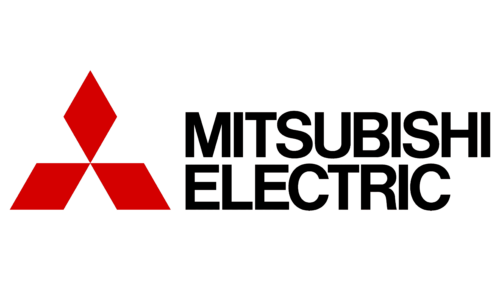
Mitsubishi Electric Corporation, established in 1921 as a spin-off of Mitsubishi Shipbuilding’s Kobe electric works, is part of the Mitsubishi group. Its current corporate identity pairs the group’s red three-diamond mark with the words “MITSUBISHI ELECTRIC.” The company unified its Japanese and international identities on this version in 2014, according to its corporate logo history.
Meaning and history
The name Mitsubishi combines mitsu, meaning “three,” and hishi, meaning “water chestnut,” a term also used for a diamond or rhombus. The group describes its emblem as combining the Iwasaki family crest of three stacked rhombuses with the three oak leaves of the Tosa Yamanouchi clan crest. A triangular water-chestnut emblem appeared on the founder’s shipping firm’s flags in the 1870s; the three-diamond mark was registered as a trademark in 1914. The Mitsubishi group explains the mark’s origins and its shared administration on its mark information page; the 1914 registration is also recorded in a specialist archival account.
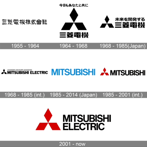
The stages show the identity’s changing balance of symbol and lettering: Japanese company-name characters first, then region-specific slogan and wordmark arrangements, and eventually the shared red emblem with the full English company name.
1955 – 1964
In 1955, Mitsubishi Electric chose a formal company-name logotype in the Japanese Mitarashi-ryu style. The company’s history says it was used until 1963, so this archive heading extends one year beyond the documented end of that logotype. The stage is typographic: the company name appears in Japanese characters, without the later Latin-letter wordmark. Mitsubishi Electric’s logo history documents the style and dates.
1964 – 1968
In 1964, the Japanese identity paired the three-diamond emblem with the Japanese company name and the slogan “with you today and tomorrow.” This is a slogan-era change, not the introduction of the three-diamond mark: the Mitsubishi group dates the mark’s trademark registration to 1914. The Japanese slogan is recorded in the company’s logo history, while the mark’s background appears on the Mitsubishi group page.
1968 – 1985 (Japan)
The Japanese design paired the emblem with Japanese lettering and the slogan 未来を開発する三菱電機. The English slogan used overseas was different. Mitsubishi Electric’s English logo history places the change in 1968, while its Japanese history gives 1969; the transition is therefore best read as occurring around 1968–69. The English history and the Japanese history show the distinction.
1968 – 1985 (International)
The international lockup used the English slogan “ADVANCED AND EVER ADVANCING,” with the emblem and English company name arranged in a horizontal line. This contrasts with the Japanese slogan and Japanese lettering in the corresponding domestic stage. The company recounts the overseas identity and slogan in its corporate logo history.
1985 – 2014 (Japan)
A 1985 corporate identity programme introduced the blue “MITSUBISHI” wordmark in Japan, known as Blue MITSUBISHI, to distinguish the electrical business within the wider Mitsubishi group. The Japanese identity also used the slogan SOCIO-TECH. This blue wordmark differed visibly from the red-symbol international design of the period, as the company’s English and Japanese histories explain.
1985 – 2001 (International)
For international use, the 1985-era design placed the red three-diamond mark beside the single word “MITSUBISHI.” Unlike Japan’s blue wordmark, this version retained the red emblem; it did not yet use the full “MITSUBISHI ELECTRIC” wording. The company records the international change and its end in 2001 on its logo history page.
2001 – Today (International), 2014 – Today (Japan)
In 2001, Mitsubishi Electric introduced “Changes for the Better” as its corporate statement. The international identity adopted the red three-diamond emblem with “MITSUBISHI ELECTRIC,” while Japan retained Blue MITSUBISHI. In 2014, the company unified the corporate logo worldwide on the red emblem and full English name. That remains the corporate identity shown in the company’s logo history and Japanese history.
The 2021 centennial mark
For its centenary, Mitsubishi Electric introduced a commemorative mark made of slanted red and white lines that form “100” and can also read as “100” when turned upside down. The anniversary mark accompanied a revised corporate philosophy; it was not a replacement for the three-diamond corporate logo. The distinction is described in the company’s centennial announcement and a centennial release from Mitsubishi Electric New Zealand.
Disclaimer
This article is part of the educational resources provided by Logo Index, an independent archive covering logos, visual identities and graphic design history. Mitsubishi Electric and associated trademarks and brand assets remain the property of their respective rights holders where applicable.