MTN’s visual identity centers on its three-letter name and an oval. Across the stages shown here, the oval changes from a solid container to an outline, while yellow becomes a prominent part of the later identity. MTN’s account credits advertising agency Hunt Lascaris with developing the original identity and client-services lead Dané Osborne with choosing a yellow surround and blue oval after earlier concepts were rejected. The same MTN retrospective describes the yellow as warm and approachable.
MTN Logo PNG
Meaning and history
MTN won one of South Africa’s national cellular licences in September 1993 and began commercial service on 1 June 1994, according to MTN’s journey timeline. The listed parent was incorporated as Investment Facility Company Two Six Five in 1994, renamed M-Cell in 1995, and became MTN Group Limited effective 14 October 2002, according to MTN’s corporate records and the name-change notice.
1994 – 2002
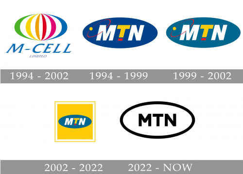
This stage shows the M-Cell name beneath a multicolour, globe-like emblem made from curved bands. Its layered colours and italic lettering contrast with MTN’s later, compact oval wordmark. The archive labels the stage 1994–2002; MTN’s corporate records state that the M-Cell name was adopted in 1995.
1994 – 1999
The image shows italic MTN capitals inside a wide, solid blue oval on yellow. A red curved line and small yellow dot cross the left side of the oval. MTN credits Hunt Lascaris with the original identity in its account of the brand’s early design.
1999 – 2002
This stage image shows the same blue oval, italic lettering, red curve and yellow dot as the preceding image. The repeated design makes the oval-and-wordmark combination clear across both archive stages.
2002 – 2022
Here, the blue oval and italic MTN lettering sit within a yellow square framed in white, creating a larger block than the standalone oval. The archive labels this stage from 2002; MTN’s newsroom says changes made to the brand in 2004 resulted in MTN taking ownership of the colour yellow. The dates therefore describe different milestones: the archive’s visual-stage label and MTN’s account of the yellow association.
2022 – Today
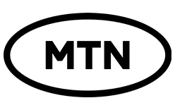
The 2022 mark replaces the filled oval with a black outline and uses upright block capitals instead of the earlier italic lettering and red curve. It was first seen on 16 February 2022 and officially launched on 27 February, according to TechCabal and MyBroadband. MTN frames the refreshed identity with “Opportunity + Energy = Progress” and the question “What are we doing today?” on its brand refresh newsroom page.
MTN describes the mark for use on sunshine yellow or plain white, with black or yellow lettering. Business Day reported that Omnicom agencies, including TBWAHuntLascaris, worked on the identity and that its rollout would follow a replenishment cycle rather than a fixed completion date.
Wordmark and color
The stages retain the three-letter name while changing how it is framed: italic letters sit in a filled oval in earlier versions, while the 2022 mark uses upright capitals inside an outline. Yellow is prominent in the later identity. MTN calls it its “distinctive sunshine yellow” and describes the 2022 mark for use on both yellow and white backgrounds.
View the MTN logo archive entry.
Disclaimer
This article is part of the educational resources provided by Logo Index, an independent archive covering logos, visual identities and graphic design history. MTN and associated trademarks and brand assets remain the property of their respective rights holders where applicable.