 Neff Logo PNG
NEFF is a German kitchen-appliance brand founded in Bretten in 1877 by Carl Andreas Neff as Carl Neff Herd- und Ofenfabrik. NEFF GmbH has been a wholly owned subsidiary of BSH Hausgeräte since 1982, according to BSH’s history of the brand.
The logo’s visual history includes early wordmarks, a circular N emblem and, since the 2023 relaunch, an open C-shaped symbol integrated with the NEFF name. BSH’s account dates the trademark mark to a filing on 22 November 1941; NEFF introduced a redesigned identity in 2023, as its relaunch announcement records.
Meaning and history
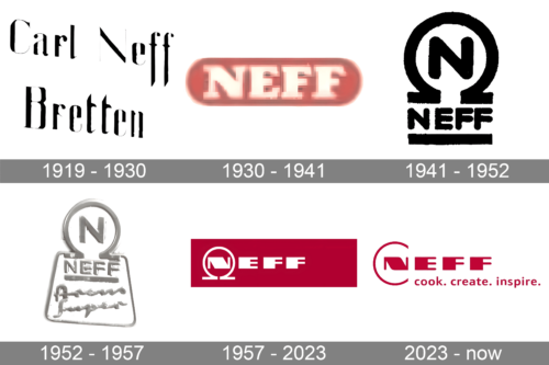
The composite brings together several distinct treatments of the name and emblem. The dates below follow the labels used for the individual archive images; the visual comparisons describe what each image shows, while the 1941 filing and 2023 relaunch are separately documented milestones.
1919 – 1930
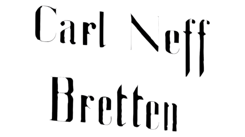
This version spells out “Carl Neff” above “Bretten” in decorative lettering. The two-line arrangement gives the founder’s name and town equal prominence.
1930 – 1941
Here, the name appears in large capitals inside a rounded rectangular panel. Compared with the previous wordmark, this is a compact, single-line design.
1941 – 1952
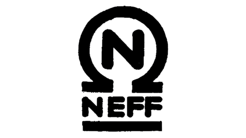
The image shows an N inside a circular emblem, with NEFF below and a horizontal rule at the base. BSH dates the filing of the trademark mark to 22 November 1941, making that year a documented point in the emblem’s history. This is a historical stage, not the present-day logo.
1952 – 1957
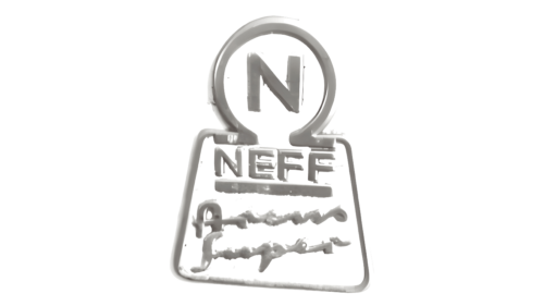
This dimensional composition keeps the circular N emblem above the NEFF name and adds further lettering beneath it. Its stacked layout differs from the simpler mark in the preceding stage.
1957 – 2023
The image pairs a circular N symbol with a wide, geometric NEFF wordmark. The emblem sits to the left of the name, creating a horizontal lockup that contrasts with the stacked 1941-stage design.
2023 – Today
NEFF’s 2023 relaunch introduced the current identity. The ring around the N opens into a C-shaped arc, and the logo places the wordmark above the claim “cook. create. inspire.” The relaunch was announced by NEFF; Küchen-Design-Magazin reported that the open shape refers to founder Carl Neff and recalls the Twist Pad dial. The new claim replaced “Kochen aus Leidenschaft seit 1877,” as möbelmarkt.de reported.
Wordmark and symbol
The earlier stages pair the NEFF name with a closed circular N emblem in different layouts. The current version makes the symbol part of the wordmark: the N sits within an open arc beside the remaining letters. The 2023 logo also includes the lowercase claim beneath the name, giving the identity a compact stacked format.
The supplied versions use different treatments and backgrounds, so colour varies across the timeline. In the current logo, the name, open arc and claim share a red tone; the image also shows a white-background version.
NEFF’s brand page presents “cook. create. inspire.” as part of its current identity.
Disclaimer
This article is part of the educational resources provided by Logo Index, an independent archive covering logos, visual identities and graphic design history. NEFF and associated trademarks and brand assets remain the property of their respective rights holders where applicable.