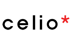
Celio’s logo is a lowercase wordmark: the name appears in simple lettering, with a red asterisk after the final letter in the advertising form celio*. The asterisk also appears in the brand’s 2019 baseline, “Twist it*.” Celio’s brand site uses “be normal” as its signature. Celio’s brand page shows the lowercase name and signature.
 Celio Logo PNG
Meaning and history
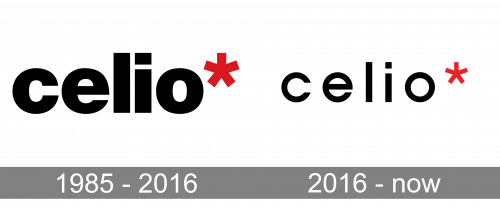
The images show two clear typographic treatments: an earlier, heavier setting and a lighter version with more open spacing. The comparison makes the change in weight especially noticeable, while the lowercase name and trailing asterisk remain consistent. Celio’s 2016 identity refresh was reported as using finer typography by FashionNetwork; a later rollout report also described the logo as airier (Amos News).
The company’s brand history begins with a women’s ready-to-wear boutique called Cleo 3000, opened in Paris in 1970 by Maurice Grosman and his wife. It shifted to menswear and took the Celio name in 1978, according to Celio’s account. The brand’s own history and some trade coverage use different dates for the company’s beginnings; the 1970 and 1978 dates refer to the boutique and its change of name.
1985 – 2016
This stage image presents a bold version of the wordmark: the thick strokes and close spacing make the letters read as a compact unit. The red asterisk sits directly after the name. The heading’s date range is an archive label; the documented 2016 update establishes a finer typographic treatment, not the precise date of this particular artwork.
2016 – Today
Here the strokes are visibly finer and the letters more open than in the preceding stage. FashionNetwork reported the finer-type refresh in March 2016, with Amos News covering its rollout that May. The brand’s 2019 “Twist it*” baseline continued the trailing asterisk, and Celio’s brand page continues to show the lowercase wordmark. The supplied “Today” heading is retained, but the later baseline is a separate identity development, not proof that every detail of this image remained unchanged.
Wordmark and asterisk
The asterisk is both a red graphic accent and the closing mark in “celio*”; the separate image isolates that same form. Celio’s 2019 “Twist it*” baseline also places an asterisk at the end of the phrase. The documented sources describe these uses but do not assign the asterisk a symbolic meaning.
Celio’s identity has broadened with the brand: in 2026 it launched Celio Women and repositioned itself as mixed-gender, as France Info reported. The lowercase name and asterisk remain useful visual identifiers across the wordmark and its related phrases.
Disclaimer
This article is part of the educational resources provided by Logo Index, an independent archive covering logos, visual identities and graphic design history. Celio and associated trademarks and brand assets remain the property of their respective rights holders where applicable.