What is Everlast?
Everlast is a sporting-goods brand known for boxing equipment, with apparel and footwear also in its range. Jacob Golomb founded the business in the Bronx in 1910. The company’s history says it began with swimwear and entered boxing equipment in 1917, when boxer Jack Dempsey sought headgear built to last. (Everlast company history)
 Everlast Logo PNG
Meaning and history
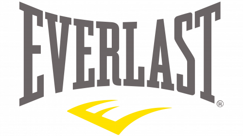
The identity is led by a condensed, all-capitals EVERLAST wordmark whose letters narrow toward the centre. Its most recognizable recent arrangement pairs the name with a separate, sweeping E emblem. The archive groups earlier artwork into dated stages, but those labels do not establish when every pictured version first appeared.
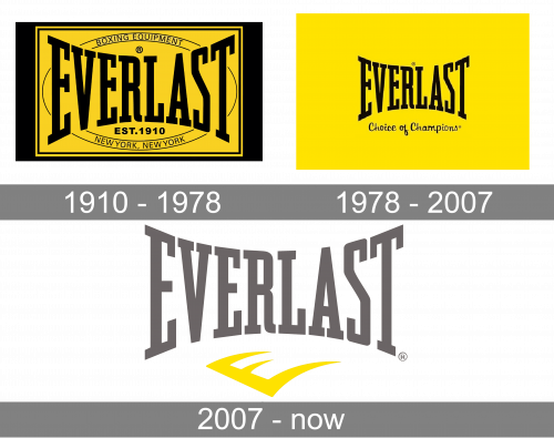
The sequence shows a change from a framed equipment label to a more stripped-back wordmark and, later, the wordmark-and-emblem combination. Trade coverage of Everlast’s design history gives firmer milestones for the border, redraw and refresh. (MediaPost)
1910 – 1978
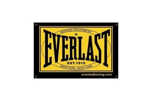
This artwork places the EVERLAST name in a gold panel, surrounded by a black rectangle. An oval carries “Boxing Equipment” and the New York address; “EST. 1910” appears below the wordmark. The “1910” in the archive heading is not proof that this exact bordered design dates from that year: Everlast’s then creative director, Brandon Emerson, said the border was added in the mid-1970s, initially as a sewing-label guide. (MediaPost)
Emerson also described earlier variations, including lettering with a flat top and arched bottom, and both modern-serif and slab-serif forms. The border gave the name a more compact, rectangular outline.
1978 – 2007
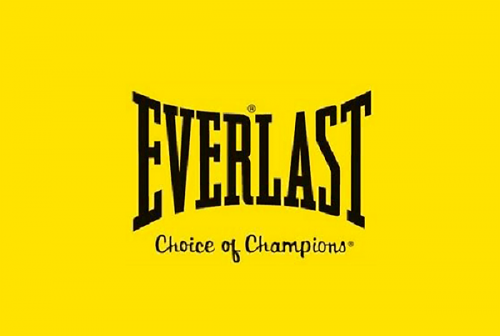
Here the wordmark stands alone against yellow, with “Choice of Champions” beneath it. Its tall, narrow capitals retain the pinched-in sides of the established Everlast lettering. This image does not show the later standalone yellow E emblem: trade coverage places that emblem with the 2007 refresh, rather than confirming it as part of this archive-labeled stage.
In 2000, the classic ascending-and-descending logo shape was redrawn in-house. Everlast’s creative director also described a separate logo for professional equipment. In 2006, the box around the logotype was removed, bringing the mark closer to its earlier unboxed form. (MediaPost)
2007 – Today
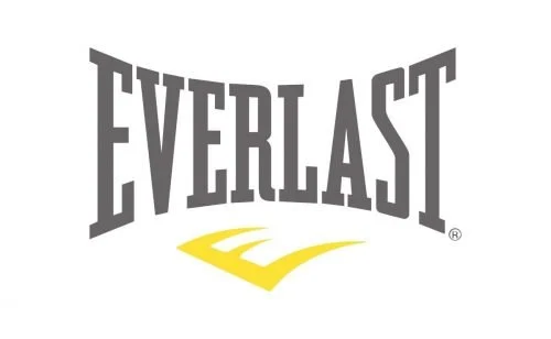
The 2007 refresh introduced a new logotype, a yellow swerving E emblem and the tagline “Greatness is Within.” The launch covered print, outdoor advertising, packaging and online use. In the reprinted launch statement, Everlast described the icon’s vanishing perspective as a reference to infinity and “never stopping.” (MediaPost; reprinted Everlast launch statement)
The wordmark-and-E arrangement remains part of Everlast’s current identity. The identity suite also shows separate Authentics and Choice of Champions marks for specific contexts. The tagline appeared in Scandinavian licensee marketing in 2024. (Everlast identity suite; 2024 licensee material)
Font and Color
The identity suite names Trade Gothic as the brand typeface; the logo itself has distinctive condensed, concave capitals. The monochrome logo shows the wordmark in white with a registered symbol, without the yellow E. The suite says Everlast has no fixed main brand colors, while identifying packaging grey and an optional highlight called Patch Yellow. It describes Patch Yellow as a reference to the brand’s yellow glove patches. (Everlast identity suite)
Everlast is now owned by Frasers Group, and the brand works with licensees in regional markets. Local collections and campaigns can therefore vary without representing a redesign of the global wordmark. (Health Club Management; Everlast México)
View the Everlast logo archive entry.
Disclaimer
This article is part of the educational resources provided by Logo Index, an independent archive covering logos, visual identities and graphic design history. Everlast and associated trademarks and brand assets remain the property of their respective rights holders where applicable.