 Oakley Logo PNG
Oakley’s identity is built around a broad, flattened O, often paired with the brand name in uppercase lettering. The emblem and wordmark can be seen together in several distinct forms in the visual history below. Oakley designer Peter Yee is credited with creating the O logo; he joined the company in 1993 as its first formally trained industrial designer (Lifestyle Asia).
Meaning and history
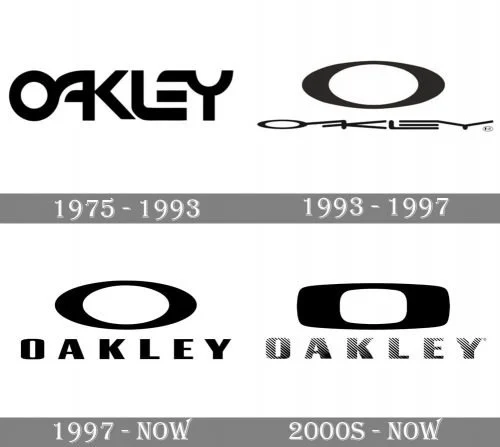
Those labels provide a visual sequence, but the design changes should not be read as independently established redesign dates. The examples show shifts in the relationship between the name and the emblem, as well as changes to the lettering.
1975 – 1993
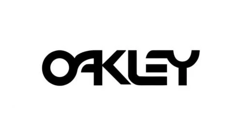
This example uses a connected wordmark: the letters in OAKLEY link together into a compact, continuous shape. There is no separate ellipse above or beside the name in this version. Oakley was founded by Jim Jannard in 1975, initially selling motorcycle grips; its official heritage account traces the company’s move into eyewear products (Oakley Heritage).
1993 – 1997
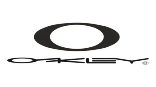
Here, the identity is arranged in two parts: a large, filled ellipse sits above a very fine, extended wordmark. The contrast in scale and weight makes the emblem the immediate focal point. Peter Yee is credited with designing Oakley’s O logo, though the years printed in this timeline are not, by themselves, confirmation of when a redesign occurred (Lifestyle Asia).
1997 – Today
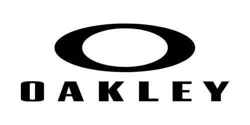
This example keeps the prominent ellipse but sets OAKLEY beneath it in widely spaced, heavy capitals. Compared with the previous fine lettering, the wordmark is easier to read at a glance and has more visual weight. The date range is the label used for this image; it does not establish that this exact lockup remains in use today.
200? – Today
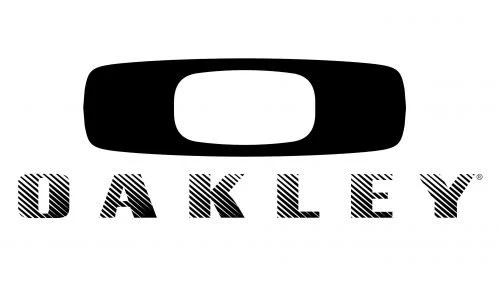
This stage shows a thick, rounded rectangular O above a letterspaced wordmark with diagonal striping. It differs visibly from the open ellipse and plain lettering in the preceding example. Oakley’s 2025 anniversary material again treated the oblong O as a defining identity element, using it as the inspiration for the limited-edition Ellipse eyewear, which the brand described as shaped like its iconic logo (Oakley’s anniversary announcement).
The emblem and wordmark
The emblem is a horizontally stretched O with a wide, low opening. Its simple outline creates a strong contrast with the space inside it, allowing the symbol to read clearly on its own. The 2025 Ellipse eyewear made that shape more than a graphic accompaniment: the product itself drew on the logo’s oblong form, as described in Oakley’s anniversary announcement.
The wordmark is set in uppercase letters and appears alongside the emblem in multiple treatments. The examples range from thin, extended lettering to heavier capitals and striped letters. Rather than treating these as one unchanged font, it is more useful to note how the visual balance shifts: some versions foreground the emblem, while others give the brand name greater weight.
This comparison brings together a connected wordmark, a thin wordmark beneath the ellipse, and the bold emblem-and-name arrangement. The examples are predominantly black on a light background, but they do not support a claim about why a particular color was chosen. Their clearest common feature is the recurring O shape and its changing relationship to the Oakley name.
Disclaimer
This article is part of the educational resources provided by Logo Index, an independent archive covering logos, visual identities and graphic design history. Oakley and associated trademarks and brand assets remain the property of their respective rights holders where applicable.