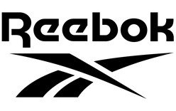
Reebok’s current core identity pairs the Vector with a lowercase wordmark featuring a distinctive descending stroke on the “R.” Reebok announced the return of the Vector in November 2019 and said the identity would be unified from January 2020. Marketing-Interactive reported the announcement and rollout. The visual history below shows how the mark changed over time.
 Reebok Logo PNG
Meaning and history
Reebok was founded in 1958 by Joe and Jeff Foster. Their family’s earlier Bolton running-shoe business, J.W. Foster and Sons, dates to around 1895; the two businesses should not be confused. Reebok takes its name from the rhebok, an African antelope, according to Reebok’s brand history page.

1958 – 1977
This early design places a fine, open wordmark on either side of a tall zigzag device. The repeated angular strokes create a strong central divider, unlike the later standalone emblems.

1977 – 1993
The lettering becomes heavier and dark blue, with a Union Jack set beside the name. The flag gives this version a direct British visual reference that the later abstract Vector does not make as literally.

1993 – 1997
The flag gives way to the Vector, a compact streak-shaped emblem placed beside the wordmark. The dates for this transition differ: the timeline labels this stage 1993, while the commonly cited brand history dates the Vector change to 1986. That history describes the mark as an abstract Union Jack and racetrack streak linked to shoe side-flashes. The Reebok history account gives the 1986 date.

1997 – 2000
The Vector moves above the wordmark in a vertical arrangement. Both elements appear in gray, making the emblem’s sweeping angles and the letterforms, rather than bright color, define the lockup.

2000 – 2005
This version places a blue Vector in a gray panel beside a red italic wordmark, all within a rounded blue outline. The enclosing frame makes the horizontal design more compact and self-contained than the earlier open lockups.

2005 – 2008
The full name is replaced by “RBK,” set in red beside a blue Vector inside a rounded rectangular frame. Reebok shortened the name for this identity; the brand history account notes the Arnell Group’s involvement in developing the Rbk identity.

2008 – 2014
The emblem disappears from this version, leaving a simple black Reebok wordmark. Compared with the framed RBK design before it, this is a clear shift to a name-only signature.

2014 – 2019
A red triangular Delta appears beside a black wordmark, replacing the Vector as the prominent emblem in this stage. Reebok described the Delta’s three arms as physical, mental and social change, as reported by Marketing-Interactive. The symbol appeared on fitness apparel earlier, was announced in a broader repositioning in 2013 and was promoted as the primary mark in 2014; trade coverage of the rollout distinguishes these milestones.

2019 – Today
Reebok’s announced return pairs the Vector with a lowercase wordmark whose “R” has a descending stroke. The arrangement restores an emblem-and-name lockup after the wordmark-only and Delta-led stages. Reebok announced the change in November 2019 and planned to unify the brand under it from January 2020; the Delta remained on selected CrossFit and UFC lines, according to trade coverage.

Symbols, lettering and color
The Vector’s long, intersecting strokes contrast with the Delta’s three separated arms. The Vector has an abstract quality, while the Delta forms a simple triangle; Reebok’s reported interpretation of the Delta connected its three arms with physical, mental and social change. The Delta’s role as primary mark ended when Reebok announced the Vector’s return in 2019.

The Delta also appeared beside the wordmark in a horizontal lockup. Its red emblem and dark lettering created a different visual contrast from the blue-and-red Vector combinations shown in earlier stages.

Across the sequence, Reebok’s lettering ranges from the thin, open early wordmark to bold geometric forms, the abbreviated RBK, and simpler later lettering. Reebok’s Vector-era lettering is associated with Motter Tektura, though the identification is approximate. The supplied type specimen shows letterform shapes rather than documenting a particular logo’s design process. The brand history account also describes the Vector as an abstract Union Jack and racetrack streak connected to shoe side-flashes.

Color changes reinforce the shifts in form: the sequence includes blue lettering with a flag, colored Vector lockups, a gray vertical version, a black wordmark and red Delta, and the Vector’s return. These comparisons describe the visible variations; they do not establish that every version appeared in only one color.

View the Reebok logo archive entry.
Disclaimer
This article is part of the educational resources provided by Logo Index, an independent archive covering logos, visual identities and graphic design history. Reebok and associated trademarks and brand assets remain the property of their respective rights holders where applicable.