 Peoria Rivermen Logo PNG
Meaning and history
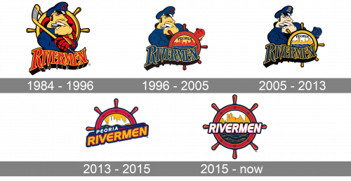
The Peoria Rivermen name has belonged to several minor-league hockey clubs, rather than one continuous franchise. The team that began as the Peoria Prancers adopted the Rivermen name for 1984–85, according to the club’s hall of fame history and USA Today. The IHL club became the San Antonio Dragons in 1996; later Peoria teams included a separate ECHL expansion club, a relocated AHL team and the SPHL club that began play in 2013, as summarized in the Peoria Rivermen team history. Across these versions, the imagery returns to the riverfront city’s wheel, skyline and river, while The Captain provides a recurring character mark.
1984 – 1996
The first Rivermen mark, introduced for 1984–85, used a ship’s wheel framing the Peoria skyline, as the Peoria Journal Star reported when the wheel motif returned. The illustration shown with this stage instead depicts The Captain, a steamboat-pilot character launched on May 27, 1995, for the 1995–96 season. The Aledo Times Record reports that Michigan firm McNamara & Associates created the character mark for about $7,000.
The two designs use different approaches: the early wheel is a compact circular badge, while The Captain is a figure in uniform posed with a stick against a wheel backdrop. The stick would return in the character’s later redesign.
1996 – 2005
The Captain continued with the ECHL Rivermen, a separate club from the IHL team that had left Peoria. This version places the character behind a wheel bearing “Peoria,” with the Rivermen wordmark across the lower part of the emblem. The Captain was modified and recolored for the ECHL years, according to the Aledo Times Record.
2005 – 2013
In 2005, the AHL Rivermen recolored the Captain mark to align it with the St. Louis Blues, their NHL affiliate. The AHL’s announcement specified navy (PMS 282) and gold (PMS 123): the wheel changed from red to gold and the glove from red to navy. The character and overall composition remained recognizable, but the palette shifted to the Blues-associated colors.
2013 – 2015
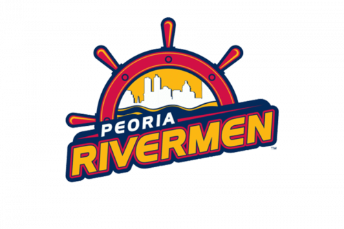
The SPHL club introduced a new wheel-based identity in May 2013. Designer Carie Hanawalt brought the skyline and Illinois River into the badge and set a tilted block “Rivermen” wordmark across it, using red, white, blue and gold, as the Journal Star reported. The first primary crest used only part of the wheel; the full wheel served as a secondary mark, according to the newspaper’s 2015 report.
2015 – Today
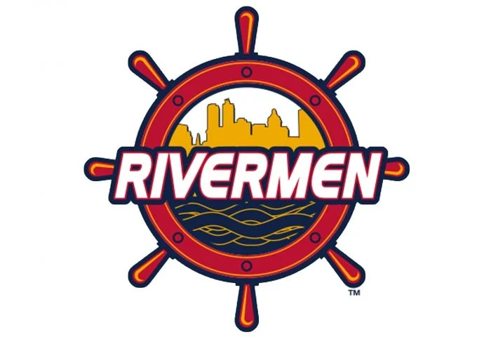
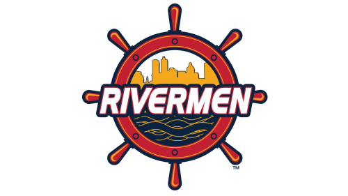
In 2015, the full wheel became the primary crest. The skyline sits inside the complete rim, with “Rivermen” in serif lettering across its center. This gives the badge a more balanced, circular outline than the earlier half-wheel version. The 2015 design was superseded in 2021.
Current identity
In 2021, the club introduced a modernized paddlewheel mark and brought The Captain back as a co-primary logo, the club announced. Designer Eric Dunkel of eDunkel Designs updated the character in a white coat, retained the red body and added a stick, according to the Aledo Times Record. The current identity therefore pairs the simplified wheel with the returning character.
Wheel, skyline and river
The wheel and river imagery connects the team name to Peoria’s setting on the Illinois River. The 2013 identity’s stated colors are red, white, blue and gold, and its launch carried the slogan “History and traditions meet again,” as the Journal Star reported. Across the marks, the skyline anchors the design to Peoria, while the wheel and river provide a consistent visual theme.
Disclaimer
This article is part of the educational resources provided by Logo Index, an independent archive covering logos, visual identities and graphic design history. Peoria Rivermen and associated trademarks and brand assets remain the property of their respective rights holders where applicable.