Ad Age began as Advertising Age, a Chicago trade newspaper whose first issue appeared on January 11, 1930. In September 2017, the publication adopted the shorter Ad Age name and a new wordmark. The 2017 design remains its current identity, according to the project page from design studio Champions Design. Crain’s timeline records the 1930 launch, while the studio’s project page describes the redesign.
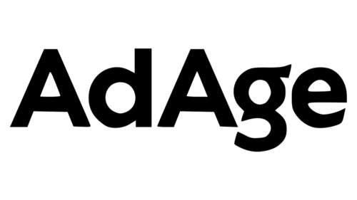 AdAge Logo PNG
Meaning and History
The identity is built around the publication’s name in lettering. The full Advertising Age title gives way to the compact Ad Age wordmark. The 2017 redesign drew on the original 1930s masthead rather than simply retaining the earlier full-name treatment, as Champions Design explains. The studio’s account also describes the descending “g” as a deliberate visual clip and a marker of editorial importance.
1930 – ????
The first-stage image shows “Advertising Age” in sans-serif lettering. The original masthead is identified as a source for the later wordmark, and the descending tail of the “g” is a notable feature of the lettering. Ad Age’s history and Crain’s timeline place the publication’s launch in Chicago in 1930. Ad Age’s account of its history dates the first issue to January 11.
???? – 2018
This stage shows the full Advertising Age name in a heavier, serif-style treatment, visually distinct from the sans-serif lettering in the 1930-stage image. The heading’s 2018 endpoint does not match the documented rebrand date: Ad Age announced the shorter name and new identity in September 2017. A separate print redesign was announced for the September 10, 2012 issue, as The New York Times reported; that redesign provides context for the publication’s print presentation, not a confirmed date for this pictured mark.

2018 – Today
The image in this stage shows the compact “Ad Age” wordmark, with a prominent descending “g”. The change from Advertising Age to Ad Age was announced on September 25, 2017, not 2018. Type designer Tobias Frere-Jones drew the lettering, and Original Champions of Design developed the broader identity system, according to the studio’s project page and Crain’s announcement. The heading is retained as shown, but the documented redesign date is 2017. Champions Design describes the descending “g” as a purposeful clip within the system.
Lettering and Color
The 2017 wordmark was drawn by Frere-Jones and was based on the publication’s original 1930s masthead. Fonts In Use describes it as a bespoke cut of Retina, with Exchange used for body text. Its account of the Ad Age Brand Book places that system in the 2018 publication.
The redesign also introduced bands of color drawn from a seventeen-color palette. These bands extend the identity beyond the wordmark and serve as a recurring device across the design system, as Champions Design describes.
The tagline “Important to Important People” returned with the rebrand. Accounts differ on its earlier origin: launch coverage associates it with the publication’s early years, while the design studio traces it to a 1950s in-book advertisement. MediaPost’s coverage and the studio’s project page provide those differing accounts.
This final graphic places the words “Ad Age” in white inside a rounded square, unlike the plain wordmark shown in the preceding stage. It is a distinct visual treatment; the documented 2017 identity description focuses on the wordmark and color-band system.
Disclaimer
This article is part of the educational resources provided by Logo Index, an independent archive covering logos, visual identities and graphic design history. AdAge and associated trademarks and brand assets remain the property of their respective rights holders where applicable.