 Ansaldo STS Logo PNG
Meaning and history
Ansaldo STS was an Italian engineering company focused on rail signalling, train control and transportation systems. Hitachi’s 2015 joint release identifies 9 June 1995 as the legal establishment date and Genoa as its headquarters. The name had an older lineage: Gio. Ansaldo & C., a separate Genoese engineering firm, was constituted in 1853 by four partners, as Ansaldo Energia’s company history records.
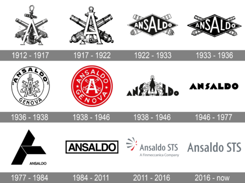
Its inherited date labels organize a visual comparison, but the dates are not independently established by the company-history sources. Across the images, the designs move from detailed pictorial emblems toward simpler lettering.
1912 – 1917

A large capital A sits in front of crossed cannons, with an anchor and gear worked into the detailed composition. The letter and surrounding objects form a tightly layered emblem.
1917 – 1919

The A and crossed cannons remain prominent, while the anchor and gear are less visually dominant than in the preceding image. The overall design is still a detailed, compact emblem.
1919 – 1922

A long black diamond bearing the Ansaldo name becomes the main feature. The cannons remain behind it, but the anchor and gear are no longer visible.
1922 – 1933
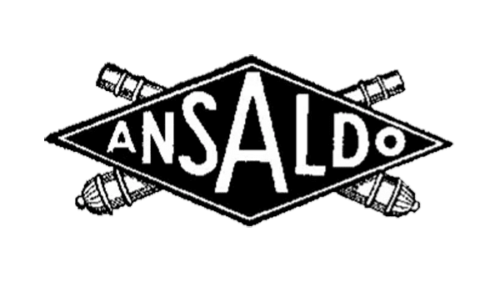
This version keeps the diamond and crossed cannons, with a more pronounced outline around the central shape. The name remains the clearest element.
1933 – 1936
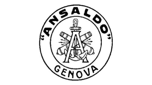
The mark becomes a circular seal. Ansaldo curves around the top, Genova appears below, and the A, anchor and cannons are grouped in the centre.
1936 – 1938
The circular layout returns in red, with white lettering and a central A-and-cannons motif. Compared with the previous image, the strongest change is the shift from black and white to a vivid single-color field.
1938 – 1946
The name stretches across the design in bold lettering, integrated with a central pictorial motif. The result is wider and less contained than the circular emblems.
1946 – 1977
The central imagery disappears. Ansaldo stands alone in a distinctive, angular wordmark, returning the emphasis to the name.
1977 – 1984

A large angular symbol takes the leading position, with a much smaller Ansaldo inscription beneath it. This reverses the previous wordmark’s emphasis on the name.
1984 – 2011
The supplied stage image has very low contrast, so its details are difficult to make out. The logo shows an Ansaldo wordmark inside a rectangular frame, a return to a name-led design with a clear boundary.
2011 – 2016
The Ansaldo STS name appears beside a red-and-grey symbol, with “A Finmeccanica Company” beneath it. Finmeccanica was a shareholder before the 2015 sale of its stake to Hitachi, as Finmeccanica’s closing announcement records.
2016 – now

This stage shows the Ansaldo STS name without a separate symbol or descriptor. The heading is part of the inherited sequence, not evidence that the mark is still current: the company name changed to Hitachi Rail STS effective 1 April 2019, according to the Osservatorio DNF report.
From Ansaldo STS to Hitachi Rail
Hitachi and Finmeccanica announced an agreement in February 2015 covering Finmeccanica’s stake in Ansaldo STS. The sale closed on 2 November 2015, when Hitachi Rail Italy Investments acquired 40.07% of the company, according to Finmeccanica’s closing announcement. The later change to Hitachi Rail STS marked the end of the Ansaldo STS corporate name. In 2021, Hitachi Rail S.p.A. merged into Hitachi Rail STS S.p.A., which became the surviving entity, as Hitachi Rail’s directors’ report states.
Disclaimer
This article is part of the educational resources provided by Logo Index, an independent archive covering logos, visual identities and graphic design history. Ansaldo STS and associated trademarks and brand assets remain the property of their respective rights holders where applicable.