Kansai Nerolac Paints Limited, one of India’s largest paint companies, traces its origins to 1920 when Gahagan Paints and Varnish was founded in Lower Parel, Mumbai.[1] The company’s visual identity has undergone two significant transformations in the modern era, first in 2006 and again in 2020, with the latter marking its centenary year.
Design and History
In August 2006, the company introduced a new logo, “KN Nerolac,” in blue and red, replacing the long-running “Goody” the painting tiger mascot that had been the brand’s face since the early 1970s.[2] The new identity was described as “in the shape of a flowing image, which represents the outlook of the company towards a bright future.”[2] The 2006 change coincided with the company’s name change to Kansai Nerolac Paints Ltd.[3]
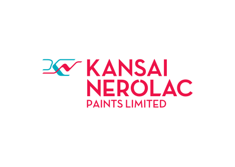
In September 2020, commemorating its centenary, Kansai Nerolac unveiled a new corporate identity under the brand expression “Colours that Care.”[4] The company described the new logo as reflecting and symbolising the brand expression, “while also embodying the connect between Change and Care through the ‘Swirl’ design.”[4] The refresh was part of a broader strategic initiative to plan for the next 100 years.[5]
Meaning and Symbolism
The 2020 visual identity was inspired by the concept of “Manthan,” described as “the churning of every element of nature to isolate the purest, freshest and most vital elements.”[5] This symbolism was intended to reflect what Nerolac aims to deliver to its customers and stakeholders going forward, particularly in the context of the brand’s positioning as a pioneer of healthy home paints with ultra-low VOC and ultra-low odour formulations.[5]
The current logo uses a cyan and red colour scheme, with the cyan shade identified as approximately #00ABBF and the red as approximately #ED1248.[6] The “Swirl” design element connects the ideas of change and care central to the brand’s centenary positioning.[4]
Logo Index is an independent educational archive covering logos, visual identities and graphic design history. All trademarks and brand assets remain the property of their respective owners.