 AMC Logo PNG
AMC, short for American Motors Corporation, was an American automaker created in 1954 through the combination of Nash-Kelvinator Corporation and Hudson Motor Car Company. The company became one of the best-known independent challengers to General Motors, Ford and Chrysler, producing cars including the Rambler, Javelin, Gremlin, Pacer and Eagle while also owning Jeep from 1970. [1]
AMC used several corporate identities during its history, but its best-known logo is the geometric red, white and blue mark introduced around 1970. The design remained closely associated with American Motors until Chrysler acquired the company in 1987.
AMC Logo Meaning and History
American Motors Corporation formally came into existence on May 1, 1954, following the merger of Nash-Kelvinator and Hudson. The combination created what was then the fourth-largest American automaker and was intended to give the remaining independent manufacturers greater scale against Detroit’s Big Three. [1]
The company’s visual identity evolved from a detailed corporate seal toward increasingly compact and geometric branding. The most important change came in 1970, when American Motors adopted the abstract red-and-blue emblem that became synonymous with AMC’s later decades.
1954: The Original American Motors Logo
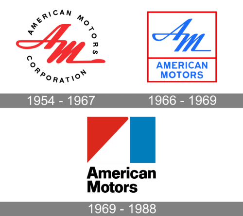
The early American Motors identity used a circular badge carrying the full American Motors Corporation name around a central monogram.
This type of formal corporate seal was appropriate for a newly created company that needed to establish one identity above the existing Nash and Hudson marques. The central lettering created a shorter visual identifier while the outer ring communicated the complete corporate name.
The red, white and blue treatment also established colors that would continue to appear in later American Motors identities. It is reasonable to observe their resemblance to the United States national palette, but there is no reliable primary source located for this article confirming an official patriotic meaning for each color.
Mid-1960s American Motors Identity
American Motors also used a more compact rectangular identity during the 1960s. It combined a stylized AM monogram with the words AMERICAN MOTORS beneath it.
The design represented a substantial simplification compared with the circular corporate seal. Instead of containing the full legal name inside several concentric rings, it emphasized the shortened American Motors identity and a more compact monogram.
Published logo timelines frequently assign this version to approximately 1966–1969, but authoritative corporate documentation confirming those exact start and end dates is limited. It is safer to treat it as a documented mid-1960s identity rather than assume every application changed simultaneously.
1970: The Geometric AMC Logo
By 1970, American Motors had adopted the geometric logo most closely associated with the company today. A period emblem preserved by The Henry Ford is dated 1970–1971 and identifies American Motors Corporation as its creator. [2]
The mark combines simple red and blue geometric forms separated by white negative space, accompanied in many applications by the words American Motors.
The abstract shapes are visually distinctive, but no reliable company source located for this article states that the red element officially represents growth or that the blue element represents stability. Those interpretations should therefore not be presented as factual logo meaning.
What Does the AMC Logo Represent?
The safest interpretation of the 1970 mark is that it functions as a compact corporate identifier for American Motors rather than as a pictogram with a documented narrative.
Its significance comes primarily from:
- Geometric simplification: it replaced the more detailed earlier corporate identities with a mark that could be recognized quickly.
- Red, white and blue: these colors remained strongly associated with American Motors, although specific psychological meanings are undocumented.
- American Motors wordmark: the accompanying name made the abstract symbol clearly identifiable even before the graphic itself had accumulated recognition.
Unlike logos based on animals, products or historical emblems, AMC’s later symbol is fundamentally abstract. Without an authoritative explanation from its creators, assigning exact symbolic meanings to its individual shapes would be speculation.
AMC, Jeep and the 1970s
The year 1970 was important for more than AMC’s visual identity. American Motors also acquired Kaiser Jeep, bringing Jeep into the company. The Henry Ford notes that this acquisition gave AMC control of what would become an especially valuable automotive brand. [2]
During the 1970s AMC developed a reputation for unconventional products, including the Gremlin, Pacer and later the Eagle, while Jeep gave the company an increasingly important position in four-wheel-drive vehicles.
Renault and AMC
AMC developed a close relationship with French automaker Renault during its later years. Renault began investing in the company and ultimately obtained a major ownership interest as AMC faced growing financial pressure.
The partnership produced vehicles including the Renault Alliance built in the United States and helped support AMC financially during the early 1980s.
It is more accurate to describe Renault as a major shareholder and strategic partner than simply to say that AMC was permanently a Renault subsidiary throughout this period.
Chrysler Acquires American Motors
Chrysler purchased American Motors in 1987. The Jeep business was one of the most strategically important assets included in the transaction, and Jeep continued under Chrysler ownership. :contentReference[oaicite:2]{index=2}
The American Motors corporate identity was then phased out. The company was reorganized under Chrysler, while some former AMC products continued under the new Eagle marque.
For logo-history purposes, 1987 is the most useful endpoint for AMC as an independent automotive identity, even though corporate restructuring and legal entities continued beyond the acquisition.
AMC Typography
The later American Motors identity used straightforward sans-serif lettering alongside the geometric emblem. The restrained typography kept the company name legible while allowing the red-and-blue symbol to serve as the main visual feature.
No authoritative source located for this article identifies the lettering as NeoGram Black, Samplex Black or another specific commercial typeface. Those names should therefore be treated as visual comparisons rather than actual font identification.
AMC Logo Colors
Red, white and blue appeared prominently throughout much of AMC’s corporate identity. A surviving 1970–1971 emblem in The Henry Ford collection is documented as using ivory, blue, red, black and silver. [2]
The palette clearly fits an American corporation called American Motors, but claims such as red representing ambition, blue representing reliability or black representing authority are not documented in the historical sources located for this article.