Bellier Automobiles is a French builder of voitures sans permis, the license-free microcars and quadricycles that can be driven in France without a full driving licence. The firm works out of Talmont-Saint-Hilaire in the Vendée, and its badge has appeared in at least two clearly different forms: an early pictorial emblem built around a winged animal, and the spare, largely typographic mark used today.
 Bellier Automobiles Logo PNG
The company behind the badge
Jean Bellier arrived in the vehicle business from electric accumulators. He built a miniature car powered by a Solex engine in 1968, and the model that established the brand, the Veloto, was shown at the 1976 Paris Motor Show as a voiture sans permis. The company itself, J. Bellier, was founded in 1980, which is why the maker’s corporate history and the first appearance of a Bellier vehicle are usually given as two separate dates (French Wikipedia, Global Auto Index).
Production has stayed in the Vendée. In 2010 the business was taken over by Groupe Neuvessel, and that period also brought the Jade into the range; electric versions of the microcars are documented from 2018, although for most of its history the company built small petrol-engined quadricycles and sans-permis cars (Assuronline, France 3 Régions).
That background matters for the logo story mainly because it explains the scale of the operation: a small manufacturer whose identity has been shaped by local production and one product category rather than by a large corporate design programme.
How the Bellier identity changed
Surviving material shows the two marks alongside each other. The earlier one is pictorial and heraldic; the later one is abstract and relies almost entirely on a wordmark.
The historical Bellier emblem
The older badge is a circular one. Inside it sits a winged sheep or ram with its wings spread, the lower part of the circle picked out in a dark tone, and the Bellier name running through it in white capitals. It is an unexpected device for a car maker, and one reason the mark is remembered at all: a ram with wings sits closer to a crest or a mascot than to the plain lettering most microcar brands of the same period used.
No company statement, press release or interview has been traced that explains the winged sheep, so any reading of it is interpretation rather than brand history. The same caution applies to how long the badge stayed in use.
The current Bellier logo
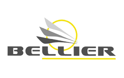
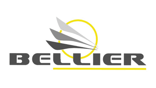
The identity in use today makes the name the main event. Three curved strokes, readable as feathers or as a simplified pair of wings, sit above the word Bellier, and a ring-shaped element holds the composition together. The lettering is a clean modern sans serif, and the mark as a whole is far lighter than the old roundel.
The feather strokes visually echo the wings of the historical emblem, giving the two mark generations a family resemblance even though they share no literal element. Whether that echo reflects a deliberate design brief or simply a recurring idea of flight in the brand is not something the available sources settle.
Font and colour identifications of this mark circulate widely in logo round-ups, including claims about a specific typeface and about grey gradations with a yellow accent. None of that is documented by the company, and the safest way to describe the current logo is by its shapes and structure rather than by named fonts or exact colours.
Why the Bellier badge is worth a second look
Microcar brands in France and elsewhere generally stick to plain, functional lettering, since the design language of the category tends to be practical rather than expressive. Bellier is unusual in having started with an animal emblem inside a roundel and then moved to an abstract device, which gives the company a logo history with a genuine before and after rather than one mark that has simply been tidied up over the years.
Comparing the two designs, the modern identity is much easier to reproduce at small sizes, on a vehicle or on a screen, than a detailed winged ram inside a circle. That practical difference is the most concrete change between the two marks, and it stands on its own without needing a documented redesign story behind it.
FAQ
Who founded Bellier Automobiles?
Jean Bellier. He worked with electric accumulators before building his first small vehicle with a Solex engine in 1968, and the company J. Bellier was founded in 1980.
When did Bellier change its logo?
The current mark is the one in recent use, but the redesign year is not well documented. Dates sometimes printed alongside the two emblems have not been confirmed by company material or by French regional reporting on the firm.
What does the old Bellier logo show?
A winged sheep or ram set inside a circular badge, with the company name in white capitals over a dark lower section. It is the more pictorial of the two Bellier identities.
What does the current Bellier logo look like?
Three curved, feather-like strokes above the word Bellier, held together by a ring-shaped element. The design is typographic and considerably simpler than the historical roundel.
Is there a documented meaning behind the Bellier logo?
The two marks are visually related, but no company statement sets out what either element was intended to represent.
Disclaimer
This article is part of the educational resources provided by Logo Index, an independent archive covering logos, visual identities and graphic design history. Bellier Automobiles and associated trademarks and brand assets remain the property of their respective rights holders where applicable.