Benelli is the Italian motorcycle marque founded in Pesaro in 1911, and its badge is one of the more recognisable emblems in motorcycling: a green laurel wreath wrapping a silver medallion, a white lion below, three stars above and the Benelli name across the middle. The core elements have stayed remarkably consistent, even as the lettering, finish and print quality around them changed.
 Benelli Logo PNG
The current Benelli emblem

The primary logo is a circular medallion. A laurel wreath rendered in green frames the inner field, a walking lion occupies the lower part of the circle, three five pointed stars arc above it, and the wordmark runs through the centre. Recent versions of the mark place the whole composition on a silver or gradient silver ground, with the lion and stars drawn in white and outlined in black.
The make up of the badge is not a matter of guesswork. A European Union figurative trade mark for Benelli (application 018317655, filed on 7 October 2020 and registered on 6 May 2021) records design codes for three stars, a lion, crossed branches or wreath, and circles containing inscriptions. An associated international registration, 1640339, lists three or more stars, a lion, garlands and wreaths, and circles. Between them they confirm which elements the company itself treats as the protected core of the identity.
What the lion and the three stars mean
Benelli describes the lion as “one of the most identifying iconographic elements of Benelli” and refers to the company as the Casa del Leoncino, the House of the Little Lion. Italian motoring coverage notes that two lion statues stood on the columns of the historic factory entrance on Viale Mameli in Pesaro, and that the animal went on to become the marque’s distinctive symbol. The German magazine Motorrad traced the motif back further, reporting that a lion was already present at the entrance of the predecessor Molaroni works before being carried into Benelli’s own badge.
The three stars are usually read as a reference to the racing record of Antonio “Tonino” Benelli, who took Italian championships in 1927, 1928, 1930 and 1931. That explanation appears in specialist press coverage, and it lines up neatly with the documented results, though Benelli’s own brand writing does not repeat it. The same specialist source describes the lion, stars, wreath and green colour together as standing for courage and strength. These are plausible readings rather than official statements, and they are worth treating as such.
The marque in brief
The business began in 1911, when Teresa Benelli invested the family’s money in a workshop for her six sons: Giuseppe, Giovanni, Filippo, Francesco, Domenico and Antonio, known as Tonino. The shop repaired machinery and vehicles at first. Benelli built its first engine in 1919, its first complete motorcycle, the Velomotore, in December 1921, a 147cc version in 1923 and Giuseppe’s influential 175cc four stroke in 1926, all of which is set out on the company’s own history page. A larger factory followed in 1934, a date worth noting because 1932 is sometimes given for the move.
Ownership changed hands more than once in the 1990s and 2000s. In 2005 the brand was acquired by Keeway and Qianjiang: Qianjiang took charge of production, while Keeway led management, design and marketing from Pesaro. Benelli Q.J. SRL is still based in Pesaro, where design, engineering and the Benelli Style Center remain, even though most volume production now takes place in China. The badge reflects that arrangement more than it reflects the change of owner.
How the badge changed over time
A sequence of dated Benelli logos circulates widely, running from an early circular badge through mid century wordmarks to the modern roundel. The exact year ranges attached to those stages are not set out in Benelli’s own history material, and the trademark records covering the emblem describe its components rather than a chronology. The artwork itself shows more continuity than the sequence implies, which is why the stages below are presented as commonly published attributions rather than confirmed redesign dates.
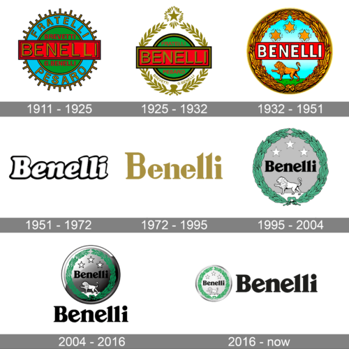
Early circular badge, claimed 1911 to 1925
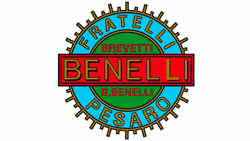
The earliest badge in the sequence is a circular one: a green centre, a blue outer ring, a red horizontal band carrying the lettering, and gold accents and outlines. The words “Benelli”, “Fratelli” and “Pesaro” appear together, which is plausible for an Italian family workshop of the period, though the 1911 attribution itself is not documented.
Claimed transitional badge, 1925 to 1932
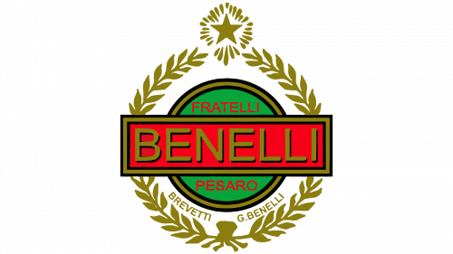
In this stage the blue ring is replaced by a gold laurel wreath standing slightly clear of the green and red centre, with a single star closing the wreath at the top. The lettering stays in the same palette. It reads as a refinement of the earlier badge rather than a break from it.
Claimed lion and stars emblem, 1932 to 1951
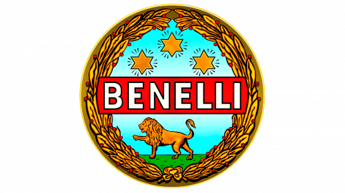
The best known early composition brings the motifs that still define Benelli into one frame: a blue field, a lion, three stars above, and a banner carrying the wordmark across the circle. Whatever the precise date, this arrangement is the visual ancestor of the logo in use today.
Wordmark only stages, claimed 1951 to 1995

The mid century entries in the sequence drop the emblem altogether and rely on lettering alone. One is a bold white italic script with a thin black outline, set in title case, which gives the brand a lighter, more commercial look.

A later wordmark is a gold serif logotype with distinctive cut details, including open contours on the E and diagonally cut L terminals. These shapes are visible in the artwork, but the lettering has not been documented as an official brand specification, so the fine details are best described rather than explained.
Return of the roundel, claimed 1995

The familiar flat roundel returns here: a silver disc inside a green leafy wreath, with the lion at the bottom, three stars above and the wordmark in the centre. The animal in this badge is consistently identified by reliable sources as a lion. Ownership did change in 1995, during the Merloni era of the business, but no authoritative source ties this particular design to that year.
Three dimensional roundel, claimed 2004

This version adds silver gradients and gloss, moves the wreath slightly inside the medallion and places the whole emblem above a bold black Benelli wordmark. The silhouette stays the same; what changes is the finish.
The Benelli logo in use today

The current badge is the circular medallion described at the top of this page, and it is the version found on dealer signage, tank decals and the company’s own channels. It is often labelled as a 2016 design, but the mark appears in essentially this form before that year, and the emblem is documented in trademark records only from 2020 onward, so a 2016 redesign is not supported by the available evidence.
Lettering and colour
The wordmark set inside the medallion is a heavy title case serif with angular cuts and sharpened terminals, and it is the most consistent typographic element across recent versions of the badge. Font identifications circulating online, such as Verona TS Bold or Bookmania Black, are suggestions rather than confirmed matches; Benelli has not published a typeface credit and no foundry record was located. Readers should treat those names as approximations.
The palette is built on green, silver and white, with black used for outlines and the lettering. Motorrad noted that the green in particular was retained across the brand’s changes, which is one reason the badge still reads as the same identity. Official colour values are not published in a form that can be quoted, and simple colour psychology claims, such as green meaning growth or silver suggesting confidence, are best left out of any serious reading of this logo.
The 110th anniversary logo
In June 2021 the Benelli Style Center presented a special mark for the company’s 110th anniversary, built around a stylised lion and the dates 1911 and 2021. It was a celebratory identity for the milestone year rather than a replacement for the regular badge, and it is worth separating from the primary logo when dating the brand’s visual history.
FAQ
What does the Benelli logo symbolise?
Benelli itself calls the lion one of its most identifying iconographic elements and refers to the company as the Casa del Leoncino. Specialist press links the three stars to Tonino Benelli’s racing championships of 1927, 1928, 1930 and 1931, and reads the lion, stars, wreath and green colour together as a statement of courage and strength.
Why does the Benelli logo have three stars?
The three stars are commonly explained as a tribute to Antonio “Tonino” Benelli’s four Italian titles, with the stars standing in for the marque’s racing heritage. The reading is widely repeated in motorcycle media and matches the documented race record, although Benelli’s own brand text does not spell it out.
Did Benelli introduce a new logo in 2016?
No clear evidence supports a distinct 2016 redesign. The circular medallion with the wreath, lion and three stars appears in this form before 2016, and the emblem’s protected elements are documented in trade mark filings from 2020 and 2021 rather than a 2016 launch.
Where is Benelli based today?
Benelli Q.J. SRL is based in Pesaro, Italy, where design, engineering and the Benelli Style Center are located. Volume production moved largely to China after the 2005 acquisition by Keeway and Qianjiang, but the brand’s design work has stayed in its home city.
Disclaimer
This article is part of the educational resources provided by Logo Index, an independent archive covering logos, visual identities and graphic design history. Benelli and associated trademarks and brand assets remain the property of their respective rights holders where applicable.