Bobcat Company is one of the most recognisable names in compact equipment. It builds skid-steer loaders, compact excavators, telehandlers, utility vehicles and attachments, and it now sits inside Doosan Bobcat Inc., part of the Doosan Group, after Doosan Infracore bought the construction equipment business from Ingersoll-Rand in 2007. What makes its identity unusual for heavy machinery is that the central element is not a machine, an initial or an abstract device but an animal: a stylized cat’s head that has outlasted every change of owner.
 Bobcat Company Logo PNG
The current Bobcat logo sets that cathead to the left of a compact, condensed wordmark. The head does the recognition work at long distance, on a machine or a dealer sign, while the type carries the name. The two elements are treated as a fixed pair across loaders, excavators, parts packaging and workwear, which is why the mark reads as one unit rather than as a symbol with an optional wordmark attached.
The Bobcat logo: history and design
The business behind the brand began as Melroe Manufacturing Company, founded in 1947 in Gwinner, North Dakota, by Edward Gideon “E.G.” Melroe. Its first products were agricultural, including the Melroe pickup and the harroweeder. The loader line grew out of a three-wheeled machine demonstrated to Melroe by the Keller brothers at the 1958 Minnesota State Fair, then the four-wheel M-400 in 1960 and the M-440 Melroe Bobcat in 1962. Ownership followed a long chain: Clark Equipment bought Melroe in 1969, Ingersoll-Rand bought Clark in 1995, and Doosan Infracore acquired the construction equipment group in 2007.
That chain matters for the logo, because two of its most important changes were driven by a parent company’s identity system rather than by the loader business itself. The brand’s own branding and trade dress timeline is unusually specific about stages, dates and typefaces, and it is the basis for the sequence below.
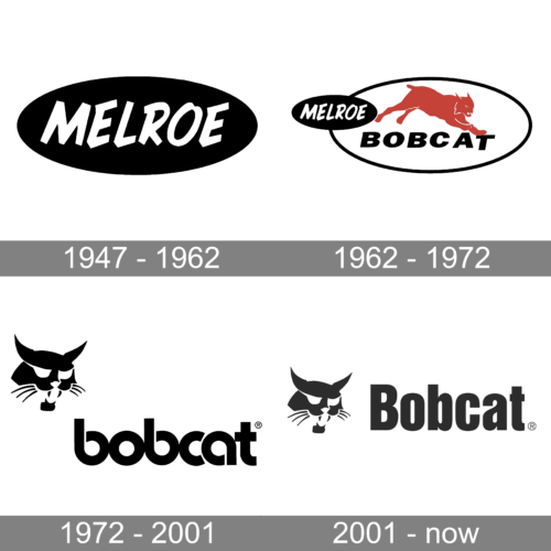
1947–1962: the oval Melroe logo
Before there was a cat, there was a name in an oval. The branding timeline states that the oval Melroe logo was used on products starting with the founding of Melroe Manufacturing Company. It appeared on Melroe’s agricultural equipment and on early loaders such as the M60 and M200, and the M-400 carried both the Melroe oval and Farmhand branding, a reminder that Melroe’s loaders were distributed through Farmhand for a period. The exact creation date of the oval is not separated from the company’s founding in the official account, so it is more accurate to say it was in use from the late 1940s than to pin it to a particular year.
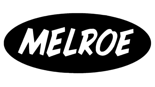
Surviving artwork shows a straightforward oval wordmark rather than anything pictorial, which fits a company selling implements to farmers before it had a machine to advertise. The public brand history does not give a colour specification, a typeface name or a designer credit for this mark, so descriptions of it beyond what the images show are visual observation rather than documented fact.
1962–1977: Melroe Bobcat and the first cat mark
The M-440 Melroe Bobcat of 1962 is where the brand name and the first cat identity arrive together. Bobcat’s timeline records that the machine was painted white with red trim, and that the logo introduced with it would not change until 1977. The name came from the animal rather than the other way around: it was a product nickname applied to a loader, while the company selling it was still Melroe. The Plains Humanities encyclopedia entry on the machine, published by the University of Nebraska–Lincoln, describes the Bobcat logo as featuring the head of “that tough, agile Plains animal.”
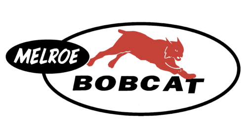
Period images of this stage show a red and black badge rather than the single-colour cathead in use today, and the Melroe name was still part of the presentation. The official timeline does not describe the internal composition of the 1962 mark in detail, so finer claims about how the animal was drawn or how much of it was shown are better left to the images themselves.
1977 to around 2000: the cathead arrives
The logo most people would sketch from memory turned up with a new generation of loaders. Bobcat’s timeline ties a new Bobcat logo to the “New Breed” 30 Series loaders and names the logotype’s typeface as Bauhaus Bold. It also states that the stylized cathead symbol has been unchanged ever since. Some retellings place this redesign in 1972; the company’s own account attaches it to the 30 Series, which followed the 1976 520 model, pointing to 1977.
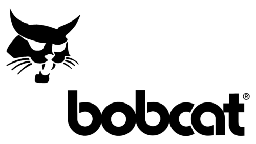
Structurally it is a head-only mark. There is no body, no machine and no enclosing frame, just an angular silhouette of an animal’s face set beside a lowercase wordmark. That pairing is what made the identity portable: it works on a decal the size of a hand and on the side of a dealer’s building, and it separates Bobcat from the letter-based identity systems typical of other equipment makers.
Around 2000 to today: new type, same cat
Around 2000, Ingersoll-Rand updated its corporate identity, and the Bobcat logo was updated with it. The cathead survived untouched; the wordmark moved to the Impact Bold Condensed family. The same period brought the corporate name change. In October 2000, Bobcat confirmed the move from Melroe Company to Bobcat Company and presented two new marks: the cathead logo and an “IR Bobcat” lockup. The IR version was created to tie sub-brands to Ingersoll-Rand’s own symbol, appeared on tailgates and elsewhere, and was retired after a couple of years in favour of the Bobcat mark alone.
Ownership changed again in 2007 without disturbing the core identity, and the cathead carried over into the Doosan era. Later trade dress has stayed inside the same system: a special gold logo for the 500,000th loader, commemorative branding for the 750,000th and one-millionth machines, larger model decals introduced with the M2 Series and the styling applied to R-Series excavators. Those are applications of the brand rather than new corporate logos, and they are the reason the mark can look slightly different from machine to machine without changing what it is.
What the Bobcat logo means
The documented meaning of the mark is in the name. The animal gave the loader its identity in 1962, and the choice rested on the cat’s reputation for agility and toughness in open country rather than on a graphic concept. Beyond that, the brand’s own history does not set out a symbolic programme for the shape of the head or for the colour of the wordmark, and colour values and designer or agency credits for the various marks are not part of the published brand record. Reading a specific message into the angle of an ear or the weight of the type is interpretation rather than brand documentation.
FAQ
When was the Bobcat cathead logo introduced?
The stylized cat’s head arrived with the “New Breed” 30 Series skid-steer loaders in 1977, according to Bobcat’s branding and trade dress timeline. The company states that the symbol has been unchanged since then, which makes it the oldest fixed element in the identity.
What font does the Bobcat logo use?
The company’s own brand history names two typefaces. The 1977 logotype was set in Bauhaus Bold, and the wordmark updated around 2000, when Ingersoll-Rand revised its identity system, uses Impact Bold Condensed.
Why is the company called Bobcat?
The name was taken from the animal for the M-440 Melroe Bobcat loader introduced in 1962. At that point Melroe was still the company and Bobcat was a product name; it later became the corporate name as well.
When did Melroe become Bobcat Company?
The change was announced in October 2000, when the company confirmed the move from Melroe Company to Bobcat Company and unveiled the cathead logo and an “IR Bobcat” mark. The Melroe name had been in use since 1947.
What was the IR Bobcat logo?
Around 2000, Ingersoll-Rand tried to link its sub-brands to its own corporate symbol, which produced an “IR Bobcat” lockup used on tailgates and other surfaces. It was dropped after a couple of years in favour of the Bobcat mark on its own.
Disclaimer
This article is part of the educational resources provided by Logo Index, an independent archive covering logos, visual identities and graphic design history. Bobcat Company and associated trademarks and brand assets remain the property of their respective rights holders where applicable.