Foton Meaning and History
 Foton was formally established in 1996 through a shareholding structure involving nearly 100 legal entities. The company focused on commercial vehicles from the beginning and later expanded across trucks, buses, vans, pickups and construction-related products. [1]Its development included several major industrial partnerships. Foton established a joint venture with Cummins in 2008, a 50:50 joint venture with Daimler in 2012 for AUMAN heavy trucks, and transmission joint ventures with ZF in 2017. [1]These partnerships helped Foton expand its technical capabilities while the company continued to develop its own commercial-vehicle brand internationally.
The Foton Logo
The modern Foton identity is centered on a geometric emblem combined with the FOTON wordmark.The emblem is based on a faceted diamond-like construction made from three internal sections. Foton officially refers to this concept as the “Brilliant Diamond” logo. The company announced this brand image globally in September 2010. [1]This is important because the older claim that Foton has used the same logo continuously since 1996 is not supported by the company’s own history.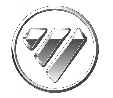
What Does the Foton Logo Mean?
Unlike many logo histories where symbolism has to be inferred, Foton provides an official explanation for the Brilliant Diamond concept.The company says the emblem represents three ideas:- Innovative technology
- Humanistic care
- Beauty of harmony
The Brilliant Diamond Symbol
The emblem uses a rounded outer form containing three angular internal elements that together create a diamond-like visual structure.The three-piece construction gives the logo a technical and modular appearance, while the overall badge remains compact enough to function on vehicle grilles, steering wheels, body panels, signage and digital materials.The official “Brilliant Diamond” name also makes the geometric structure more meaningful than a purely decorative interpretation. The mark is intended to communicate a refined, engineered identity rather than simply acting as an abstract symbol. [1]Foton Wordmark
The emblem is typically paired with the uppercase FOTON name.The lettering uses a wide, heavy sans-serif style with softened corners and custom proportions. Its broad geometry visually matches the mass and symmetry of the emblem.There does not appear to be reliable public documentation naming the exact commercial typeface used for the Foton wordmark. Similar-looking fonts may exist, but visual resemblance alone is not enough to identify the actual source typeface.Foton Logo Colors
Foton commonly uses combinations of blue, silver, white and dark gray in its identity.The emblem is often rendered in a metallic or silver treatment, while the wordmark appears in blue or dark gray depending on the application. These combinations are easy to observe in company materials and vehicle badging.However, there does not appear to be strong public documentation assigning exact psychological meanings to these colors. Statements such as “blue means responsibility” or “silver represents innovation” should therefore be treated as interpretation rather than fact.Foton Brand Development
Foton’s branding has continued to evolve after the introduction of the Brilliant Diamond identity.In 2023, the company launched what it described as a new phase of brand rejuvenation, tied to a wider strategy centered on greener and smarter commercial vehicles. Foton said the initiative marked its fourth brand-rejuvenation journey in China and was expanded globally later that year. [2]This does not necessarily mean the core Brilliant Diamond emblem was replaced. Rather, it shows that Foton continues to update the way the broader brand is positioned and presented while retaining its recognizable central symbol.Foton Today
Foton remains focused on commercial vehicles, with products spanning heavy trucks, light trucks, mini trucks, pickups, vans, buses and new-energy vehicles. [3]The company has also invested heavily in electric, hybrid and hydrogen technologies. Its official materials state that new-energy vehicles now cover a broad range of commercial-vehicle categories, including trucks, vans and buses. [1]Foton also maintains international industrial partnerships with companies such as Cummins, Daimler and ZF, supporting engine, heavy-truck and transmission development. [3]Why the Foton Logo Works
The Foton identity is effective because the emblem is compact, distinctive and easy to apply across a very broad commercial-vehicle portfolio.The main strengths are:- Recognizable geometry: the faceted Brilliant Diamond shape works independently from the wordmark.
- Vehicle-friendly form: the badge is suitable for physical use on trucks, vans and buses.
- Consistent naming: the FOTON wordmark stays visually simple and easy to identify.
- Documented symbolism: the company itself explains the ideas behind the emblem.
- Long-term continuity: the Brilliant Diamond concept has remained central since its global introduction in 2010.
FAQ
What is Foton?
Foton is a Chinese commercial-vehicle manufacturer founded in Beijing in 1996. Its products include heavy trucks, light trucks, vans, pickups, buses and construction-related vehicles. [1]
When was Foton founded?
Foton was formally established on August 28, 1996, in Beijing, China. [1]
What does the Foton logo mean?
Foton calls its emblem the “Brilliant Diamond.” The company says the concept represents innovative technology, humanistic care and the beauty of harmony. [1]
When was the current Foton logo introduced?
Foton states that the Brilliant Diamond logo image was announced globally in September 2010. [1]
What font does the Foton logo use?
The FOTON wordmark uses a broad, custom-looking sans-serif design. No reliable public source identified for this article confirms a specific commercial typeface.
What vehicles does Foton make?
Foton produces medium- and heavy-duty trucks, light trucks, mini trucks, vans, pickups, buses and other commercial vehicles, with both combustion and new-energy powertrains. [3]
Disclaimer
This article is part of the educational resources provided by Logo Index, an independent archive covering logos, visual identities and graphic design history. Foton and all associated trademarks and brand assets remain the property of their respective owners.