Hennessey Performance Engineering (HPE) is a Texas tuning house and hypercar builder whose visual identity has two clearly readable phases: a circular badge with a script wordmark that served the brand for years, and the angular H monogram that arrived as the company entered its fourth decade. The company was founded in 1991 by John Hennessey with his wife Hope Hennessey, originally as Hennessey Motorsports, and it has kept the Hennessey name at the center of every mark it has used.
 Hennessey Performance Logo PNG
The current identity is built around a stylized H. The mark is geometric and symmetrical: a central vertical rectangle is crossed by two pairs of triangular, arrow-like forms that point outward along the horizontal axis. The resulting H is simple enough to work as a small badge or a large graphic, and its outward-facing geometry gives it a sense of direction. Hennessey has not published a detailed official statement explaining the symbol, so interpretations of expansion or forward motion are best treated as visual readings rather than confirmed brand doctrine.
Meaning and history
Hennessey’s logo history runs alongside its move from a performance tuner to a manufacturer of extreme vehicles. The company began in 1991, and by the 2000s it had become known for modifying American muscle cars and supercars. A move to a 51,000-square-foot headquarters in Sealy, Texas, in 2006 gave it a permanent base beside its own test track. The 2010 launch of the Venom GT hypercar pushed the brand further into the spotlight, and a 2014 run at Kennedy Space Center produced a 270.49 mph top speed, a record for a two-seat sports car. That hypercar era is the context in which the newer, more modern H emblem makes sense.
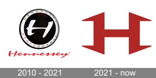
A composite history graphic associated with Hennessey shows more than one emblem, but the individual dates and source context of those marks are not confirmed. What is clear is that the brand has not relied on a single unchanging symbol; it has moved from a traditional round performance badge to a cleaner monogram.
The round badge and wordmark
The older Hennessey mark is a circular badge. Its outer white ring carries the name HENNESSEY across the top and PERFORMANCE across the bottom in uppercase sans-serif letters. Inside, a black center holds a stylized white H. The badge is paired with a red, italic script Hennessey wordmark and a registered trademark symbol.
The round badge is often dated to 2010 in logo summaries, but no authoritative source establishes that it was introduced in 2010. The available evidence points to a long-standing emblem used through 2021, with its exact start date not well documented. It should be described as the pre-2021 badge rather than confidently assigned to a 2010 redesign.
The 2021 H emblem
A new H emblem was reported around December 2020 and into 2021, timed to Hennessey’s 30th anniversary and slated for 2021 models. The Venom F5 was reported as the first vehicle to carry it. Automotive outlet Motor16 credited the design to Nathan Malinick, Hennessey’s design director. That designer credit comes from secondary reporting, and no primary Hennessey announcement confirming the logo’s authorship or symbolism was located.
The new mark abandons the circular badge format. Instead of a ring of text, it reduces the identity to the H alone, built from straight lines and outward-pointing angles. The monochrome treatment is typical of the versions seen in public, though the current identity’s color specifications are not independently verified.
What the Hennessey logo represents
The name itself carries the identity. Hennessey is a surname-driven brand, and both the round badge and the current H keep that name or its initial at the center. The older badge reads as a classic performance-shop roundel: circular, bordered, and lettered around the edge. The current emblem reads more like a modern automotive monogram, with no words and a more abstract construction.
The outward arrows in the current H are sometimes interpreted as a reference to expansion or pushing limits. Hennessey’s own descriptions of its work, including its ‘making fast cars faster’ motto, fit that reading, but the company has not published an official explanation of the symbol. The mark’s visual link to speed and engineering is therefore contextual rather than confirmed by a design statement.
How the identity changed
The shift from badge to monogram is the clearest design change in Hennessey’s public identity. The round badge did the work of a traditional tuner mark: it identified the company, named it, and placed the H inside a formal frame. The 2021 H does the opposite. It removes the words, strips the design to a single letter, and relies on symmetry and negative space. For a company now selling hypercars as well as tuning services, that simplification helps the mark function as an automotive emblem rather than only a workshop logo.
The red script wordmark from the older identity has not been fully documented as retired or retained in every context. The current primary symbol is the H monogram, while the script wordmark remains part of the longer visual history.
FAQ
When did Hennessey introduce its current H logo?
The new H emblem was reported around December 2020 and into 2021, tied to Hennessey’s 30th anniversary and planned for 2021 models. The Venom F5 was reported as the first model to carry it. No primary Hennessey release confirming the exact rollout date was located.
What did the older Hennessey logo look like?
The older mark was a circular badge with HENNESSEY at the top and PERFORMANCE at the bottom of its outer ring. A white H sat on a black center. It was paired with a red italic script Hennessey wordmark and a registered trademark symbol. The badge was used through 2021, though its exact introduction date is not well documented.
Who designed the Hennessey H emblem?
Secondary reporting credits Nathan Malinick, Hennessey’s design director, with the current H emblem. That attribution has not been confirmed in a primary Hennessey announcement.
Disclaimer
This article is part of the educational resources provided by Logo Index, an independent archive covering logos, visual identities and graphic design history. Hennessey and associated trademarks and brand assets remain the property of their respective rights holders where applicable.