Grant’s is a blended Scotch whisky produced by William Grant & Sons. The company’s official history says its first spirit ran in 1887, while Grant’s blended whisky was first marketed in 1898, according to Scotch Whisky. That distinction matters when reading the dates used on the brand’s packaging.
The identity brings together a wordmark and heraldic imagery, with the family motto and a date appearing on some packaging. Its visual history also includes campaign lettering and changes to the bottle and label.
 Grant’s Logo PNG
Meaning and history
Grant’s packaging uses the motto “Stand Fast,” associated with the Clan Grant war cry “Standfast Craigellachie!” Scotch Whisky records the blend’s earlier name, Grant’s Standfast, and its later renaming as Grant’s Family Reserve. The crest and dates such as “Est. 1887” or “Since 1887” provide heraldic and historical cues; the date refers to the first spirit at the family’s distillery, not the first marketing of Grant’s blended whisky.
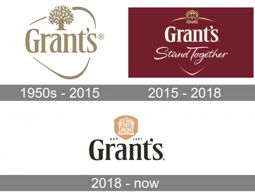
1950s – 2015
The stage image shows a gold-toned wordmark paired with a tree and sweeping outline. A separate, well-documented identity feature from this broader period was the triangular bottle: the brand’s history credits Hans Schleger with its design in 1957 and notes its efficient stacking and packing for export. A company-sourced trade release gives November 1956 as the introduction date, so published accounts differ slightly on the year (Grant’s history; Talking Retail).
Around 2002, the bottle and label gained an embossed coat of arms and “Stand Fast,” along with “Est. 1887.” In a later redesign, agency LFH retained heraldic cues while simplifying the label and moving to a taller, rounder bottle across the range; the project was briefed in 2006 and launched in 2007 (DBA Design Effectiveness).
2015 – 2018
The artwork shown here places the Grant’s wordmark beneath a crest and pairs it with “Stand Together.” That wording should be read as campaign language rather than the brand’s established “Stand Fast” motto: a 2015 report describes the #Standtogether campaign launch in India with SapientNitro (BestMediaInfo). In the image, the script sits across a shield-like outline beneath the wordmark.
2018 – Today
The image for this stage shows a dark wordmark beneath a gold crest, with a date set between them. Separately, reporting on the 2018 global refresh describes a maroon crest label, white and gold typography, a shield device, and “Since 1887” and “Stand Fast” embossed on the glass. Here Design created the refresh, which retained the triangular bottle footprint while changing its proportions (World Brand Design; Packaging News).
The 2018 launch also renamed the signature blend Grant’s Triple Wood. Its documented packaging uses the crest, motto and date as distinct elements alongside the wordmark; the stage image above has a simpler visible arrangement. The supplied heading is retained, but the image alone does not establish present-day use.
Wordmark, crest and color
Across the supplied images, the Grant’s wordmark remains the central element, while the crest appears above it in some versions and is joined by different surrounding forms. The 2018 refresh provides a documented palette of maroon, white and gold, and made use of a shield device. The triangular bottle is a separate, three-dimensional identity feature rather than part of the printed wordmark.
The phrase “Stand Together” belongs to the documented 2015 campaign, while “Stand Fast” is the motto used on packaging. Grant’s history is also conveyed through dates: 1887 marks the family distillery’s first spirit, and 1898 marks the first marketing of Grant’s blended Scotch.
Disclaimer
This article is part of the educational resources provided by Logo Index, an independent archive covering logos, visual identities and graphic design history. Grant’s and associated trademarks and brand assets remain the property of their respective rights holders where applicable.