
The International Harvester Company (IHC, usually shortened to IH) built farm machinery, trucks, construction equipment and household appliances, and for much of the twentieth century its badge was among the most widely seen industrial marks in the United States. The best-known version, a red lowercase “i” set inside a black capital “H”, still appears on tractors today, though it now belongs to a different company from the one that created it.
 IH Logo PNG
That block IH, with “International Harvester” set in capitals beneath it, is the mark most people mean when they say “IH logo”. It descends from a design drawn in the mid-1940s by the industrial designer Raymond Loewy, and it has outlasted the corporation that commissioned it.
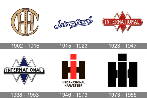
A composite strip such as the one above gathers several of the company’s marks into a single view. Its grouping is illustrative rather than chronological: the surviving artwork for the earlier emblems does not carry reliable dates.
Company background behind the name
International Harvester was formed in 1902, when the McCormick Harvesting Machine Company and the Deering Harvester Company merged with three smaller firms: Milwaukee Harvester, Plano Manufacturing, and Warder, Bushnell & Glessner. The deal was financed by J.P. Morgan, put together by George W. Perkins, and initially managed by Charles Deering and Cyrus McCormick Jr. The McCormick side of the business traced back to Cyrus H. McCormick’s reaper, patented in 1834 and built in Chicago from 1847. The Farmall, the all-purpose row-crop tractor that made the company a familiar name in rural America, arrived in 1924.
That history explains the naming logic of the badge. “International” came from the merged identity rather than from any single predecessor, and the mark had to work across tractors, trucks, engines and refrigerators alike.
Early emblems
Before the Loewy-era monogram, the company used several different marks. One common family was a monogram of the letters I, H and C worked into a circular device, with the H and I enclosed by a “C” that reads almost as a closed ring. The artwork below belongs to that early IHC-in-a-C tradition; the drawing itself carries no date, and reliable sources do not establish a debut year for it.
A second recurring form was the word “International” alone, set in a flowing script above a ruled baseline. It appears on early advertising and vehicle badges.

A third was a horizontal banner carrying the same word in bold capitals, accompanied by three vertically stretched diamond or rhombus shapes. Two pieces of banner artwork survive in the record: one with red-and-white rhombuses, and a closely related white banner with blue-and-white rhombuses. The blue version is essentially the same layout with a recoloured device rather than a separate structural design. Neither banner can be tied to a documented launch date, so both are best described as undated emblem variants.
Raymond Loewy and the “man on a tractor”
IH engaged Raymond Loewy in 1935 to restyle its product line, though some accounts place the commission in 1936 or 1937. His work covered the TD-18 crawler, launched in 1938, and the Farmall letter-series tractors (A, B, H and M) introduced in 1939. The Farmall H was built from 1939 to 1953, with production of roughly 390,000 units.
The emblem that came out of that relationship is the one still in use. Loewy’s own account, quoted by Hemmings, is that he sketched it on a dining-car menu between Chicago and New York and described the result as “reminiscent of the front end of a tractor and its operator”. Read that way, the two upright strokes of the black capital “H” become the front and rear tyres seen head-on, the red lowercase “i” is the operator, and the square that replaces the usual dot is his head.

Visually the mark is straightforward: a heavy black capital “H” with a red lowercase “i” overlaid, the dot squared rather than round, and “International Harvester” set below in black capitals in a plain sans-serif. The red is not a later addition. USPTO trademark drawings for IH marks, including serials 71667238 and 72331896, were filed “lined for the color red”, which corroborates the palette.
When the mark entered use
Dating the switchover precisely is harder than the familiar story suggests, because the change was gradual. USPTO records put first use of the IH monogram at 30 June 1945, with an apparel first use of 1 June 1946 and a machinery first use of 23 December 1953. Farm Collector and other industry accounts describe the logo as adopted in 1946, while a Wikipedia source list dates the “man on a tractor” mark to 1952. The evidence points to a mid-1940s introduction rolled out across products over several years, with decals on some tractors appearing around 1947 and the transition substantially complete by about 1949.
What happened in 1986
The 1986 event is often described as a redesign. It was a corporate rename. After the 26 November 1984 agreement to sell the agricultural division to Tenneco, IH announced the name change on 7 January 1986 and became Navistar International Corporation on 20 February 1986, adopting an entirely new corporate identity: a “Navistar” wordmark with an orange double-diamond “Diamond Road” symbol. The IH name and the IH logo were sold to Tenneco along with the agricultural business and continued under Case IH in a slanted form. Earlier divestments were part of the same retreat: the refrigeration and appliance division went to Whirlpool in 1955, and the Cub Cadet lawn and garden line went to MTD in 1981. Tractor production at the Farmall Works ended in May 1985.
Navistar itself later merged with Traton SE in 2021 and rebranded to “International” in 2024. The IH mark in its modern form is now used by CNH, whose trademark for “IH INTERNATIONAL HARVESTER” was filed on 11 July 2023 and registered on 1 July 2025; the USPTO describes the registered mark as a square design with a stylised “I” held within the “H” above the words “INTERNATIONAL HARVESTER”.
Fonts and colours
The “International Harvester” line beneath the monogram is set in narrow, uppercase, sans-serif capitals that carry no decorative detail. The palette is red and black, and the surviving trademark drawings describe the colour by reference to red rather than to any specific ink standard. The exact typeface used for the inscription is not documented, and font names sometimes attached to the mark in logo listings are not supported by the surviving evidence.
FAQ
Who designed the IH logo?
Raymond Loewy, who was engaged by International Harvester in 1935 to restyle its products and its identity. His red-and-black monogram, described in his own account as reminiscent of the front end of a tractor and its operator, entered use in the mid-1940s.
What does the IH logo mean?
Loewy described it as evoking a tractor’s front end and its driver. The two upright strokes of the black “H” read as the front and rear tyres, the red lowercase “i” as the operator, and the square dot as the operator’s head.
Does International Harvester still exist?
Not under that name. The company announced its change of name on 7 January 1986 and became Navistar International Corporation on 20 February 1986, while the IH name and logo were sold to Tenneco with the agricultural division and continued under Case IH. Navistar merged with Traton SE in 2021 and rebranded to “International” in 2024.
Disclaimer
This article is part of the educational resources provided by Logo Index, an independent archive covering logos, visual identities and graphic design history. IH and associated trademarks and brand assets remain the property of their respective rights holders where applicable.