Isuzu is a Japanese manufacturer of commercial vehicles and diesel engines headquartered in Tokyo, and its visual identity has moved through a small number of documented stages rather than a steady stream of quiet revisions: a river emblem in 1934, a two-pillar mark tied to the General Motors partnership in 1974, and a lettering-only wordmark in 1991. A separate corporate-philosophy identity, ISUZU ID, arrived in 2023.
 Isuzu Logo PNG
The name and the 1934 river emblem
Isuzu’s roots go back to 1916, when Tokyo Ishikawajima Shipbuilding & Engineering and Tokyo Gas and Electric Industrial planned automobile production. The first car, a Wolseley A9 built with Wolseley Motors, followed in 1922, and the first truck, the CP, in 1924. The automotive business was spun off as Ishikawajima Automotive Works in 1929 and merged with DAT Automobile Manufacturing in 1933 to form Automobile Industries. A later official timeline sets out the same sequence, with the founding date Isuzu observes being 9 April 1937, when the company became Tokyo Automobile Industries.
The name Isuzu arrived in 1934, applied to a government standard-model vehicle and taken from the Isuzu River that flows past Ise Shrine in Mie Prefecture, as Isuzu’s own history records. The characters 五十鈴 are commonly translated as “fifty bells,” and the more poetic gloss of fifty bells ringing in harmony is a later reading rather than the company’s stated explanation.
The first emblem, dating from 1934 and later adopted as the corporate mark, sets the characters いすゞ in flowing script inside a ring of twelve ripples standing for the river. Japanese-language sources credit the design to Shima Kin’ichi of the Ginza firm Shimatanseido, though Isuzu’s own materials do not name a designer. On the number of ripples, the company has described twelve as a neutral, basic choice rather than a coded figure.
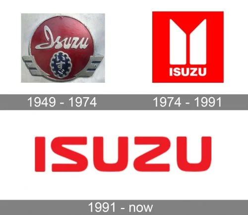
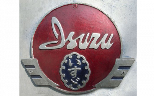
Some collections of marque badges present an ornate shield or medallion-style Isuzu mark as a 1949 design, and the artwork below is archived under that label. Isuzu’s documented emblem stages are 1934, 1974 and 1991, and the 1949 attribution does not appear in those records, so that surviving artwork is undated.
1974: two pillars and the colour red
On 20 September 1974 Isuzu introduced its second-generation mark alongside a new corporate colour, red. The emblem is built from two upright pillars. According to Isuzu’s own account, the pillars stand for “ISUZU growing together with customers” and “ISUZU growing in harmony with society,” and the mark expressed the determination to move from Japanese Isuzu to global ISUZU through the General Motors partnership. Red was themed on the flames of the burning sun and was described as representing the passion and progress of the company’s employees.
The partner in that alliance was General Motors. GMC is a truck division of GM and is not the company Isuzu signed with. Secondary accounts commonly date the GM alliance to 1971, while Isuzu ties the new mark specifically to 1974. GM’s holding was later unwound, with Toyota subsequently taking a stake and 2006 widely reported as the point at which the GM relationship ended; those dates come from secondary sources rather than Isuzu’s own material.
1991: a lettering-only wordmark
In September 1991 the identity changed again. The third-generation mark reduced the corporate signature to “ISUZU” set in simple, modern lettering, with the S and Z drawn as mirror images flanking the U. Isuzu describes the lettering as a symbolic expression of its corporate philosophy of creating products and services that satisfy customers worldwide, and the Japanese automotive association’s survey of Isuzu’s logo transitions covers the same sequence of 1934, 1974 and 1991.
The change concerned the corporate mark rather than a single sweeping clean-up of every application. Sources do not document one moment at which the two-pillar badge disappeared from all remaining uses, and the red corporate colour established in 1974 continued in use.
ISUZU ID and market-level identities
In May 2023 Isuzu introduced ISUZU ID, a corporate-philosophy identity built around a ribbon logo that ties the company’s purpose, vision, mission and core value together, as set out in Isuzu’s integrated report. It is a philosophy identity rather than a replacement for the vehicle wordmark.
Several changes since then have been local rather than global. A Vietnam dealer standard under the name I.VIS was introduced from August 2023, Isuzu Mexico announced a corporate identity change in 2025, and SML Isuzu in India was rebranded as SML Mahindra in 2025 after the change in its ownership. None of these replaced the company’s international wordmark.
The lettering itself
No reliable source identifies a named typeface or licensing arrangement behind the ISUZU wordmark. It is best described as custom, undocumented lettering rather than an off-the-shelf font, and treating it as a known commercial typeface misstates what the available documentation supports. For comparison, another commercial-vehicle identity with its own documented evolution is the UD Trucks logo.
FAQ
Was there an Isuzu logo in 1949?
Isuzu took the name Isuzu Motors Ltd. in 1949, but the documented emblem stages are 1934, 1974 and 1991. No emblem change is recorded for 1949 in the company’s own timeline, and badge artwork circulating with a 1949 label is not supported by that record.
Does the Isuzu logo use a specific font?
No source identifies a typeface or licensor for the ISUZU wordmark. It functions as custom corporate lettering, with the mirrored S and Z introduced in the 1991 mark as its most distinctive feature.
Disclaimer
This article is part of the educational resources provided by Logo Index, an independent archive covering logos, visual identities and graphic design history. Isuzu and associated trademarks and brand assets remain the property of their respective rights holders where applicable.