NIO is a Shanghai-headquartered maker of premium electric vehicles, and its badge is one of the more considered pieces of automotive branding to come out of China in the past decade. The company was founded in November 2014 as NextEV, but the name NIO and the emblem that belongs to it appeared only on 21 November 2016, when the firm held its first press conference at the Saatchi Gallery in London and presented the brand, the logo and the EP9 electric supercar in one sitting. NIO’s own account of the event treats that date as the emblem’s birthday.
 Nio Logo PNG
The emblem and what it represents
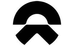
NIO describes the symbol in unusually concrete terms. The upper half is the sky, and with it openness, vision and the future. The lower half is the earth, and with it direction, action and forward momentum. Where the two meet is the horizon, which the brand calls a symbol of hope, possibility and new beginnings. That reading comes from NIO’s official brand pages and is repeated across its regional sites.
Formally, the mark is a two-part abstract figure: a rounded upper element above a shallower, more directional lower one, with the gap between them doing as much work as the shapes themselves. It is a symbol rather than a picture, and it has kept that form since launch. No typeface, colour specification or outside design studio for the 2016 emblem is documented in reliable sources.
The name itself carries two readings. NIO renders its English name as “A New Day,” while its Chinese name 蔚来, Weilai, is given as “Blue Sky Coming,” the phrase the logo is built around. More of the company’s visual identity is collected in the NIO brand profile.
Where the name came from
Kris Tomasson, NIO’s design chief, has explained the choice of name in an interview with Automobilwoche: three letters that a wide range of speakers can pronounce, with the N carried over from NextEV and the I and O readable as the computing shorthand for input and output. That rationale concerns the name, and the authorship of the emblem itself is not established by the sources available.
From NextEV to NIO
For its first two years the company traded as NextEV, and that is the only earlier naming stage that is documented. Its motorsport effort began as the Team China Racing entry in Formula E and later raced under the NEXTEV TCR banner, before the NIO name took over on the car side of the business, as summarised in this brand overview.
The London unveiling is recorded in Chinese coverage too, including Jiemian’s report of the 21 November 2016 event, which describes the mark’s sky-and-road imagery in much the same terms the company still uses on its own pages.
Dating is sometimes muddled in circulation. 2014 is the year the company was founded under the NextEV name; the NIO name and the two-part emblem both belong to November 2016, and every documented account of the launch places them there.
Since then the corporate symbol has not been redrawn. Wordmarks, vehicle badging and regional artwork have evolved around it, and the company has been listed on the New York Stock Exchange since its September 2018 IPO, but the core mark has remained the same two-part figure that was shown in London.
Commemorative and variant marks
NIO’s tenth anniversary in 2024 brought a commemorative logo that fuses the IO of the wordmark with the number 10 and renders it in a gradient drawn from the colours of the wider NIO brand family, as Bitauto’s note on the anniversary mark records. It was issued as an anniversary artwork rather than a replacement for the corporate identity, and it appears in campaign material rather than on the cars themselves.
Variants of that kind sit alongside the main identity in the same way race liveries and special editions do: they signal an occasion without disturbing the primary symbol. For anyone trying to date a piece of NIO artwork, the two-part sky-and-earth figure has been the constant since 2016.
FAQ
Is the NIO logo the same as the NextEV logo?
No. NextEV was the corporate name the company used from its 2014 founding until the rebrand announced in London in November 2016, when the NIO name and the current emblem were introduced together. No earlier NIO logo is documented.
Did NIO change its logo in 2024?
NIO marked its tenth anniversary in 2024 with a commemorative logo built from the number 10 and the IO of the wordmark. It is an anniversary artwork, not a redesign of the corporate symbol.
Disclaimer
This article is part of the educational resources provided by Logo Index, an independent archive covering logos, visual identities and graphic design history. Nio and associated trademarks and brand assets remain the property of their respective rights holders where applicable.