Edsel was a Ford Motor Company division, not an independent automaker, sold for the 1958 through 1960 model years. The division was formally created on November 19, 1956, after development that began around 1955 under the code name “E-car.” The public launch, branded “E-Day,” took place on September 4, 1957. Ford’s corporate newsroom records the end: discontinuation was announced on November 19, 1959, and the final 1960-model cars were built between October 15 and November 19, 1959. Those dates matter to the logo story because the marque’s visual identity lived almost entirely inside a single front-end theme, not a long-running corporate badge program.
 Edsel Logo PNG
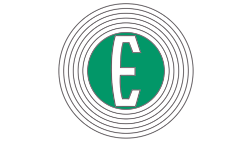
The artwork commonly circulated as the “Edsel logo” is a modern, flattened rendering: a white uppercase E on a green disc, encircled by gray concentric rings. The available period accounts do not identify it as the official 1957–1960 Edsel corporate logotype. The green and gray color scheme is not documented as period brand symbolism. Treat the image as a contemporary graphic interpretation of the marque, not as evidence of an officially specified 1950s color system.
What Edsel’s period identity actually looked like
The defining Edsel design element was the 1958 front end: a vertical, oval-shaped aperture that became known as the “horse-collar” grille. Ford described it internally as the “impact ring,” according to Hemmings. The shape was so distinctive that it overwhelmed other identity elements. A specialist emblem reference notes that on the 1958 car the word “Edsel” was displayed vertically within that grille, making the grille itself function as the marque’s most visible identifier.
Lettering also appeared elsewhere. The 1958 cars used a stand-up hood ornament that carried a decorative “E,” Hemmings reports. That E is the initial of Edsel B. Ford, Henry Ford’s only son and Ford’s president from 1919 until his death in 1943. The marque was named for him, although Henry Ford II initially objected to using his father’s name; the choice was settled at the suggestion of Ford president Ernest Breech, as the New York Times later recounted.
The 1958 model line included the Ranger, Pacer, Corsair, and Citation, plus the Roundup, Villager, and Bermuda wagons. Chief designer Roy Brown Jr. led the styling effort. An assistant stylist, Bob “Robin” Jones, is credited in a frequently cited account with proposing the vertical front-end motif. Whatever the internal attribution, the vertical grille and its E-related ornament gave Edsel its most recognizable face.
1959 and 1960: the badge replaces the horse collar
For 1959, the front end was restyled and the vertical grille was toned down but retained. Separate badges and nameplates carried more of the marque identification. For 1960, the horse-collar shape was abandoned altogether in favor of a split grille, comparable in layout to the 1959 Pontiac. Emblems and nameplates remained on the hood, body sides, and tail. In other words, Edsel’s identity shifted from one dominant grille form to a more conventional combination of lettering and small emblems.
Period advertising used a flowing, script-style “Edsel” wordmark. That wordmark is documented mainly by collector and reference sources, and it should be treated as an advertising signature rather than as proof of a formal corporate logotype system. The same caution applies to later digital redrawings. Edsel did not have a long identity program, so almost every surviving mark is tied to a specific model year, an emblem location, or a promotional context.
The E monogram and its afterlife
One of the clearest recurring symbols is the letter E used as a monogram. It appeared on hood ornaments and on smaller items such as keys. When Ford planned the Comet, which reused Edsel styling cues, the Comet key was reworked by turning the Edsel “E” emblem into a “C,” according to Wikipedia’s Edsel entry. That small detail is useful evidence: it shows that the E monogram, not the green disc or concentric rings, was the mark that carried over when Edsel’s tooling and styling language were repurposed.
Edsel’s commercial reputation as a famous failure can obscure a practical fact about its identity. At launch it was one of the largest new-car introductions to that point, yet it still lost money and was discontinued quickly. The marque lasted roughly 26 months of production, which explains why its visual identity is best documented through the 1958 horse-collar grille, the vertical “Edsel” nameplate, and the E ornament. A modern green-and-gray “E” badge may be tidy and recognizable, but it is not the same thing as a verified period Edsel logotype.
FAQ
Was the green Edsel logo with concentric rings the official 1950s badge?
Available period accounts do not identify a green disc with gray concentric rings as Edsel’s official corporate logotype. The design is best described as a modern digital rendering. Edsel’s documented period identity centered on the 1958 horse-collar grille, the vertical “Edsel” nameplate, and a decorative “E” ornament.
What does the “E” in the Edsel emblem stand for?
It stands for Edsel, the marque named after Edsel B. Ford, Henry Ford’s only son and Ford’s president from 1919 until his death in 1943. The same initial was used as a monogram on hood ornaments and keys.
Why is the 1958 Edsel grille so important to the logo history?
The 1958 front end used a vertical oval aperture nicknamed the “horse-collar” grille, with the word “Edsel” set vertically inside it. That made the grille itself the marque’s most visible identifier, more so than any separate emblem.
Disclaimer
This article is part of the educational resources provided by Logo Index, an independent archive covering logos, visual identities and graphic design history. Edsel and associated trademarks and brand assets remain the property of their respective rights holders where applicable.