Opel Performance Center, almost always shortened to OPC, is the performance division of the German automaker Opel, based in Rüsselsheim. It was established in 1997 as Opel Performance Center GmbH, initially to organise Opel’s motorsport activity across Europe, and it later became the badge applied to high-performance road cars (Wikipedia). Its identity is a three-letter wordmark, and the small number of documented changes to that wordmark map onto the division’s shift from racing department to performance sub-brand.
 Opel Performance Center Logo PNG
The OPC wordmark and its colours
The mark is a wordmark rather than a symbol. The letters O, P and C are the whole emblem: there is no figurative element, no crest and no animal. That makes colour and letterform the two things that carry its history, and both have moved.
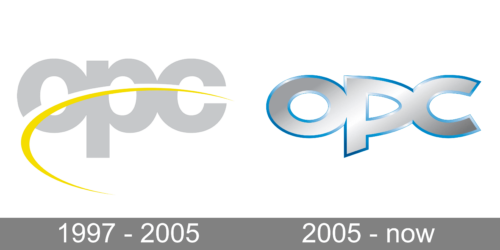
Before 2004 the letters were set in grey and crossed by a yellow curve. The yellow was borrowed from Opel’s motorsport colour, which the operation had used while it traded under the name Opel Motorsport, a name it kept until about 2000 (German Wikipedia, 2006 archive). Descriptions of that earlier badge consistently record the grey base with the yellow line running through it (bymycar).

Surviving artwork for the earlier stage of the identity is often filed under a 1997 date, but the design itself is not documented to that year. The 1997 date belongs to the founding of the division.
The 2004 redesign
In 2004 OPC changed its badge. The grey was kept, but the letters were redrawn in a narrower, more elongated typeface, and blue was introduced as the division’s own official colour (French Wikipedia mirror; Tencent News). The blue has been described as OPC marking out an identity of its own rather than continuing to borrow the yellow of Opel’s motorsport heritage, in much the way the GSi line had earlier adopted its own red.
The first car to wear the revised mark was the Vectra C V8 DTM racing car, followed on the road-car side by the Astra H OPC (French Wikipedia). The Astra H OPC reached the market at the end of 2005, which is likely how the redesign sometimes gets dated a year late. The badge change itself is placed in 2004.
No designer or agency credit for either version of the wordmark is documented in the available sources, and nothing published sets out a brief behind the stretched letterforms beyond the shift in emphasis that the new colour represents.
How the badge fits the brand
OPC began as a motorsport operation under managing director Volker Strycek, the 1984 DTM champion, and only later became a road-car label (Autogazette). The first road model to carry the name was the Astra G OPC in 1999, and the emblem has since appeared on a run of performance versions of the Corsa, Insignia and Astra lines, as well as on Opel’s Nürburgring 24 Hours entries (Opel media archive).
In the UK, Opel’s performance cars were badged VXR instead of OPC, so the same vehicles carry a different emblem depending on market (Wikipedia). Opel itself passed from General Motors to PSA Groupe in 2017 and then into Stellantis in 2021, meaning the badge has sat under several corporate owners without being redesigned to mark any of them.
Use of the OPC name on new performance models was wound down after the Insignia’s OPC Line, with Opel’s performance identity moving to the GSe, or Grand Sport electric, label (Wikipedia). For a mark built on three letters, the visual legacy is compact: grey lettering, a yellow motorsport line in the early years, and a bluer, more stretched wordmark from 2004 onward.
Interpretations that read ideas such as reliability, energy or aggression into the emblem’s colours are not tied to any documented treatment of the mark. Its colour logic is internal and traceable: yellow from Opel motorsport, blue as OPC’s own.
FAQ
When did the OPC logo change?
The wordmark was updated in 2004, when the grey lettering was redrawn in a more stretched typeface and blue was added as OPC’s official colour. The first car to use it was the Vectra C V8 DTM, followed by the road-going Astra H OPC.
What do the colours in the OPC logo mean?
The yellow curve of the earlier badge came from Opel’s motorsport colour, inherited from the years when the operation ran as Opel Motorsport. The blue introduced in 2004 was adopted as OPC’s own colour, distinguishing the division from that motorsport heritage.
Is there an OPC symbol or just lettering?
The identity is purely typographic. It consists of the letters O, P and C with no separate pictorial element, which is why colour and letterform are the main ways the badge has evolved.
Disclaimer
This article is part of the educational resources provided by Logo Index, an independent archive covering logos, visual identities and graphic design history. Opel Performance Center and associated trademarks and brand assets remain the property of their respective rights holders where applicable.