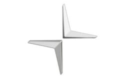
Polestar is a Swedish electric performance car brand. Its visual identity is built around a four-pointed star, often used without the wordmark. The brand’s history is distinct from the racing team that preceded it: Flash Engineering began in 1996, took the Polestar Racing name in 2005, and Polestar became a standalone electrified brand in 2017. Volvo Cars announced that change in June 2017 (Volvo Cars).
 Polestar Logo PNG
Meaning and history

The star represents the Polestar name. Stockholm Design Lab describes its symbol as an interpretation of the guiding Northern Star, and created the identity for the 2017 relaunch (Stockholm Design Lab). The change was a new identity, not simply a revision to the racing team’s badge.
1996 – 2017

This stage shows a blue rectangular badge with the Polestar name in pale lettering and a small star at the end. The badge’s existence is described in reporting on the later trademark dispute, which notes that the star symbol replaced the earlier blue badge (PerthNow). The 1996 date refers to the beginning of the racing lineage, not the Polestar name: Flash Engineering was founded that year, and the team became Polestar Racing in 2005.
2017 – 2020

The 2017 identity centers on two opposing chevron-like forms meeting as a four-pointed star. Stockholm Design Lab created the mark and wordmark; the new brand was introduced at a Shanghai event on October 17, 2017. The identity later received Red Dot’s Brand of the Year recognition and a Best of the Best award for brand identity in 2020 (Stockholm Design Lab; Red Dot).
The mark also became the subject of a dispute with Citroën and DS. A French court ruled in 2020 against Polestar on trademark infringement while dismissing the copyright claim; the companies settled in 2022 (Motor1; PerthNow).
2020 – Today

This stage presents the star in pale gray against a light background, rather than as a dark silhouette. The image’s lighter treatment is a visible difference in presentation, not evidence of a separately documented redesign. The star remains Polestar’s identity, according to the saved reporting on the brand’s later design direction (Financial Post Korea).
Typography and color
The wordmark uses Polestar Unica77, a customized version of Lineto’s Unica77 developed for the brand. Lineto identifies Stockholm Design Lab as the agency involved in the 2017 identity and Alphabet Type as the typeface engineer (Lineto). Paired with the separate star symbol, the wordmark gives the identity a typographic form as well as an emblem.
The logo is presented in restrained monochrome and gray treatments. The star’s simple, open silhouette works without a surrounding badge or decorative frame, while its pointed forms distinguish it from the earlier blue, lettered rectangle.
View the Polestar logo archive entry.
Disclaimer
This article is part of the educational resources provided by Logo Index, an independent archive covering logos, visual identities and graphic design history. Polestar and associated trademarks and brand assets remain the property of their respective rights holders where applicable.