 Nordic Ice Vodka Logo PNG
Meaning and history
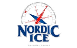
The Nordic Ice logo combines a large, stacked wordmark with a compass emblem above it. In the first image, the lettering is blue with a light outline, while the compass uses red and dark blue shapes. The name is the most prominent element; the emblem adds a distinct graphic above it. The visible compass suggests a navigational motif, but the images alone do not establish an official meaning for the symbol.
The second archive image shows a more fully legible treatment: a circular, graduated compass surrounds the red-and-blue pointer, and small directional letters appear around it. Beneath the wordmark, this version also includes the line “ORIGINAL RECIPE.” These differences are visible in the artwork, but they do not establish separate dates or a redesign sequence.
Nordic Ice is a Czech-market vodka. Retail listings identify STOCK Plzeň-Božkov s.r.o. as the manufacturer and list the spirit at 37.5% ABV; the listed ingredients are water, molasses spirit and sugar (Rohlik product listing). The brand was among three spirits brands Stock Spirits Group bought from Bohemia Sekt in October 2016 for CZK 135 million, as ČTK reported. Distribution under Stock Spirits began on 1 November 2016, according to Plzeňský deník; production moved to Plzeň in January 2017 (Investičníweb).
Today

The 2026 retail listings identify STOCK Plzeň-Božkov as the manufacturer of Nordic Ice. The image under this heading retains the compass ring, stacked name and “ORIGINAL RECIPE” line, making it useful alongside the opening image even though the two are not evidence of a dated logo evolution.
Disclaimer
This article is part of the educational resources provided by Logo Index, an independent archive covering logos, visual identities and graphic design history. Nordic Ice Vodka and associated trademarks and brand assets remain the property of their respective rights holders where applicable.