 PBR Logo PNG
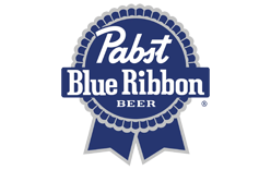
The PBR logo combines a script “Pabst” wordmark, prominent “Blue Ribbon” lettering and a blue ribbon emblem. Its round badge and hanging ribbon tails make the mark recognizable across different label and packaging treatments.
Meaning and History

The brewery that became Pabst Brewing Company began in Milwaukee in 1844. Frederick Pabst joined the business in 1864, and the company took the Pabst name in 1889. The beer’s naming history is less settled, so those company milestones should not be confused with a definitive launch date for the Pabst Blue Ribbon name. (The Oxford Companion to Beer; The Daily Meal)
Pabst began tying blue silk ribbons around bottles in 1882, before the beer won top honors at the 1893 World’s Columbian Exposition. The ribbon had already become associated with the beer; the award added a documented achievement to that association. Pabst Mansion notes that “Selected as America’s Best in 1893” was added to packaging in the 1950s, rather than appearing at the time of the exposition. (Smithsonian Magazine; Pabst Mansion)
A federal trademark filing from 1899 describes “BLUE-RIBBON” on an oblique line above a circular band marked “PABST” and “MILWAUKEE,” with a hop leaf, the letter B and barley details. The filing was registered in 1900. That description documents an early version of the diagonal-ribbon-and-roundel arrangement, not every detail of later artwork. (Trademark record)
Printed ribbon graphics replaced silk on cans after Prohibition, and the silk ribbons were phased out by the 1950s, according to Smithsonian Magazine. The emblem therefore carried the ribbon motif from a physical bottle decoration into printed packaging. The 1950s slogan linked the packaging back to the 1893 award. (Smithsonian Magazine; Pabst Mansion)
19?? – 19??

This stage shows a compact, dark-blue badge: “Pabst” in script sits above “Blue Ribbon,” with the lettering crossing the circular field. Its border is comparatively simple, and the ribbon tails extend below the badge. These features distinguish it visually from the more ornate roundel in the next stage; the image does not establish a calendar date for the design.
19?? – Today

This stage retains the script-and-serif lettering and blue ribbon structure, while showing a more decorative scalloped border and the added word “BEER” inside the roundel. The image presents this visual stage, and the current identity check identifies the core ribbon-and-roundel lockup as confirmed. Trademark records show that a circular-ribbon registration was renewed in 2021 and that Pabst Brewing Company, LLC made further beer-class filings in 2025. (Trademark record; Trademark filing)
Lettering and Color

The wordmark pairs flowing script for “Pabst” with bold, serif lettering for “Blue Ribbon”; “BEER” appears as a smaller line in the emblem detail. Blue is the defining color, with pale outlines and lettering providing contrast. These are visible characteristics of the identity, not evidence of a particular typeface or design credit.
The blue rosette and diagonal sash are described as long-standing brand assets by branding consultancy DDH. The consultancy also presents a gold-accented treatment for an international premium beer as a market-specific variation, not a global replacement for the blue identity. (DDH)
Disclaimer
This article is part of the educational resources provided by Logo Index, an independent archive covering logos, visual identities and graphic design history. PBR and associated trademarks and brand assets remain the property of their respective rights holders where applicable.