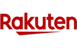
Rakuten’s identity is built around a wordmark and a compact graphic mark. Its current red “Rakuten” signature has a distinctive underline derived from the Japanese character 一 (ichi, “one”). The company announced the global logo renewal in 2018; its earlier identity paired the wordmark with a circled R.
 Rakuten Logo PNG
Meaning and history
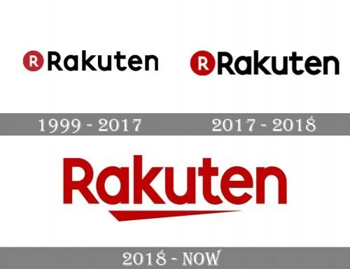
The composite places three versions side by side: a black wordmark with a red circular R, a similar pairing in a larger, bolder treatment, and the red wordmark with an underline. The change is from a separate circular badge to a graphic stroke integrated beneath the name. Rakuten’s 2018 announcement describes the stroke as based on 一, meaning “one,” and gives the motif four themes: A New Start, Unity, Be the Best, and Only One.
1999 — 2017
This stage shows “Rakuten” in black beside a red circle containing a white R. The badge and wordmark are separate, giving the name a two-part structure. The year range is the timeline label; Rakuten’s creative profile documents Kashiwa Sato’s first assignment for the company as a logo design in 2004, but does not establish that this pictured version began in 1999. Rakuten’s creative profile provides the design credit and background.
2017 — 2018
The next image retains the red circle and white R, now shown at a larger scale beside a bold black wordmark. Rakuten announced a unified global logo on June 26, 2018, with rollout beginning July 2. The company said the new identity had appeared on sports kits associated with its FC Barcelona partnership and affiliated teams before the broader rollout. The announcement describes that rollout and the shift to a unified mark.
2018 — Today
The current identity shown here uses a red wordmark with a long, angled stroke beneath it. The stroke comes from 一 (ichi, “one”). Rakuten announced a separate ichi-based brand symbol on September 8, 2018, to replace the Circle R, with rollout from October 1. The wordmark and symbol are included in Rakuten’s brand-symbol announcement and brand guidelines.
Typography and color
Rakuten introduced its custom Rakuten Font family on July 2, 2020. Developed with London type studio Dalton Maag under the supervision of Kashiwa Sato, the family includes Sans, Serif, Rounded, and Condensed styles in five weights. Rakuten’s announcement describes the type family and its development.
The corporate palette centers on crimson red, specified as RGB 191/0/0, HEX #BF0000, and Pantone 1805C. Black and white are also included in the brand guidelines. The palette supports the red wordmark as well as monochrome versions of the identity.
View the Rakuten logo archive entry.
Disclaimer
This article is part of the educational resources provided by Logo Index, an independent archive covering logos, visual identities and graphic design history. Rakuten and associated trademarks and brand assets remain the property of their respective rights holders where applicable.