
Meaning and history

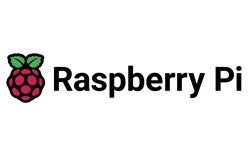
The Raspberry Pi logo centers on a stylised raspberry: rounded fruit segments beneath two green leaves. The full identity pairs the emblem with the “Raspberry Pi” wordmark; the berry can also appear on its own. Its clear, compact silhouette keeps the fruit recognizable even when the lettering is absent.
The mark was chosen through a public competition announced in August 2011. Six designs were shortlisted, and Paul Beech’s entry was announced as the winner that October. Raspberry Pi’s announcement identifies Beech as the winning designer and describes the logo’s development from the competition entry (Raspberry Pi’s competition announcement).
A contemporary report explained the judges’ interest in the berry’s buckyball structure: its 32 faces, with 11 visible in the chosen view, were connected to the first board’s 32-bit ARM11 processor. That is the reported design rationale, not a separate rule for interpreting the mark. The report also notes the aim of making the design work at roughly one centimetre and in monochrome (Geek.com’s report on the competition).
2012 – Today

This stage shows the raspberry emblem without the wordmark. The fruit is formed from distinct rounded segments, with two leaves above it; the emblem’s compact outline makes it suitable for use without the company name. The competition-winning design was associated with Raspberry Pi’s first board, which went on sale in February 2012 (The Guardian’s account of Raspberry Pi’s history).
2021 – Today

This stage pairs the same berry emblem with the “Raspberry Pi” wordmark. In 2021, Raspberry Pi Ltd adopted that company name, and the organisation described a split in its web presence: raspberrypi.com for products and raspberrypi.org for the Foundation (Raspberry Pi’s website announcement). These documented changes concern the company and its web presence; they do not establish a redesign of the berry mark. The Raspberry Pi identity continued to use the fruit emblem.
Emblem, wordmark and color

The emblem’s red fruit and green leaves provide its most immediate color contrast. In the full logo, dark lettering gives the name a strong visual presence beside the smaller fruit. The wordmark image and standalone emblem show two practical configurations: the name-and-symbol combination and the berry alone. The competition coverage describes the design as suitable for monochrome use, so the identity is not dependent on color to communicate its silhouette.
Disclaimer
This article is part of the educational resources provided by Logo Index, an independent archive covering logos, visual identities and graphic design history. Raspberry Pi and associated trademarks and brand assets remain the property of their respective rights holders where applicable.