 SanDisk Logo PNG
Meaning and history

SanDisk began as SunDisk in 1988 and adopted the SanDisk name in 1995. The company became part of Western Digital in 2016 and separated as Sandisk Corporation in February 2025, according to the company history and Sandisk’s separation FAQs. The current corporate wordmark is styled SANDISK.
1988 – 1991

This early SunDisk design places a striped, dimensional emblem above a widely spaced serif wordmark. The stacked layout and fine letterforms look markedly more traditional than the bold, compact marks that followed.
1991 – 1995

The next SunDisk mark uses a larger, outlined serif wordmark with stripe details and a small rectangular emblem at the right. Compared with the earlier stacked design, the name and emblem now form a single horizontal signature.
1995 – 2007

With the SanDisk name came a red wordmark paired with a sharp, angular emblem. The retail identity guidelines describe the emblem as a “starburst” and specify PMS 485 red, solid black or white for the logo (SanDisk retail branding guidelines). The serif lettering and separate emblem distinguish this version from the later wordmark-only design.
2007 – 2021

The redesign removed the starburst and retained the SanDisk name as a red wordmark. Designer commentary described the work as a step-by-step redraw of the earlier logo; the forward-angled dot over the “i” was intended as a progressive cue (Brand New’s designer Q&A). The heading’s 2021 endpoint does not mark the end of this design’s use: it remained the familiar identity until the 2024 rebrand began rolling out in 2025, as trade coverage reported.
2024 – Today

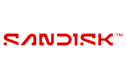
Sandisk previewed this all-caps wordmark on 17 December 2024 under the phrase “Mindset of Motion.” Its pixel-built S and open D give the letters a more modular, distinctive outline than the previous serif wordmark. The company says the pixel form reflects its digital-storage origins, while the open lines evoke flash-memory speed and efficiency and the D suggests collaboration and partnership (Sandisk’s announcement). VP Creative Joel Davis led the work, developed with ELA Advertising (KitGuru). The identity rolled out as the company separated from Western Digital in February 2025; legacy packaging continued to appear during the transition (Sandisk’s separation FAQs). This remains the corporate wordmark.
Wordmark and color
Red connects the starburst-era logo to the current identity, while the lettering has changed from serif forms to a cleaner, more geometric wordmark. The older guidelines specify PMS 485 red, with black and white alternatives. A separate product-brand announcement in January 2026 introduced SANDISK Optimus and its GX and GX PRO tiers; it changed SSD product naming, not the corporate wordmark (Sandisk’s announcement).
Disclaimer
This article is part of the educational resources provided by Logo Index, an independent archive covering logos, visual identities and graphic design history. SanDisk and associated trademarks and brand assets remain the property of their respective rights holders where applicable.