 Chanel Logo PNG
Meaning and history
The Chanel identity centers on two elements: a pair of interlocking Cs and the CHANEL wordmark, which can appear beneath the monogram or on its own. The letters are the initials of founder Gabrielle “Coco” Chanel, while the exact inspiration for the design is disputed. Stobbs’ account of the brand’s intellectual property describes the core mark as unchanged.
1910 – Today
The 1910 date marks the opening of Chanel’s millinery shop at 21 rue Cambon in Paris, not the established date of the CC logo. The trademark record places the logo’s documented history in the 1920s: Chanel, Inc. filed US applications for the CHANEL wordmark and a CC design on 18 November 1924, with registration following in 1925, according to the USPTO opposition filing. A reproduced registry record gives a first-use date of 1 January 1920 for the CC, earlier than the 1925 design date commonly cited in accounts such as L’Officiel’s history of the double C. These dates refer to different kinds of records and do not establish a single definitive design date.
Chanel No. 5, launched in 1921, is often discussed alongside the early history of the initials, but the trademark record does not establish that the logo was designed specifically for the perfume. Later, Karl Lagerfeld’s tenure as artistic director, beginning in 1983, helped make the CC a prominent accessory motif on clasps, buttons and jewellery, as L’Officiel reports. Matthieu Blazy was appointed artistic director in December 2024; recent collection-specific treatments have amplified the monogram without replacing the core identity, according to Stobbs.
Symbol
The symbol consists of two mirrored, interlocking Cs. Its letters correspond to Gabrielle Chanel’s initials, and the simple, balanced shape remains recognizable without the wordmark. Several stories propose an inspiration for the design, including geometric stained glass at Aubazine, where Chanel spent part of her childhood, and associations with Arthur “Boy” Capel or other double-C motifs. Channel NewsAsia presents the Aubazine account as one of several competing explanations; none establishes the design’s origin.
Font and color
The wordmark uses uppercase letters with open spacing and clean, geometric forms. It has been characterized as a custom sans serif in the Futura tradition; “Couture,” a 2012 typeface by Chase Babb, is a lookalike rather than Chanel’s own lettering, according to Made Good Designs. The familiar presentation is black on white, with a white-on-black reverse available for dark backgrounds. The image here places the wordmark above the monogram, while the commonly described arrangement puts the monogram above the wordmark.
Logo Earrings
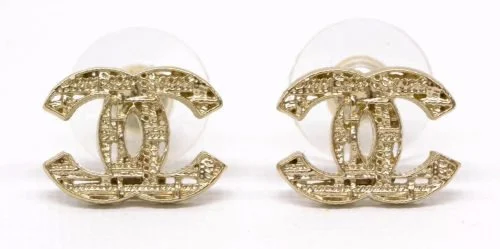
On earrings, the paired Cs carry the identity without a wordmark. The image shows the monogram rendered as a detailed, light-toned metal ornament, rather than as the flat black graphic used in the logo.
Logo Necklace
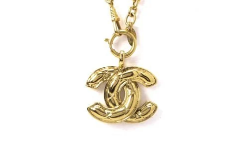
The pendant applies the same interlocking shape to jewellery. Its metallic finish and three-dimensional construction differ from the flat logo, but the two opposing Cs remain legible as the central motif.
Font and Color
Across its standard logo treatments, Chanel relies on a restrained black-and-white contrast: the mark can appear dark on a light field or reversed on a dark one. The monochrome presentation keeps the wordmark and CC visually consistent even when the mark is used without colour or without its accompanying letters. The core identity remains the interlocking CC and CHANEL wordmark, as Stobbs describes.
View the Chanel logo archive entry.
Disclaimer
This article is part of the educational resources provided by Logo Index, an independent archive covering logos, visual identities and graphic design history. Chanel and associated trademarks and brand assets remain the property of their respective rights holders where applicable.