 Chiara Ferragni Collection Logo PNG
Meaning and History
Chiara Ferragni Collection launched in 2013 as a footwear line, following the 2009 launch of Ferragni’s blog, The Blonde Salad. The logo’s best-documented feature is its eye motif, which became the subject of a European Union trademark dispute. FashionUnited’s brand profile describes the label’s beginnings and its later expansion beyond shoes.
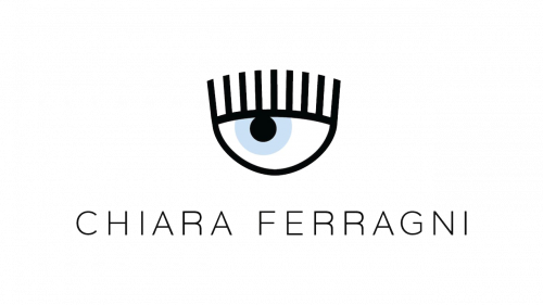
The composite mark pairs a sky-blue eye and long black lashes with the name “chiara ferragni” in black capitals. The lashes visually echo the letter “i” in the name, a detail noted in the General Court’s assessment of the mark. That relationship makes the eye and wordmark read together as one composition. Briffa’s account of the case describes the lettering and the court’s comparison of the lashes with the letter i.
The name was filed as an EU word mark on 24 May 2013. A separate figurative application, filed on 9 July 2015, covered the eye-and-wordmark design. The 2015 application was opposed by the holder of the Benelux word mark CHIARA. EUIPO’s Board of Appeal refused it in 2017 for certain class 18 goods and all class 25 goods on likelihood-of-confusion grounds, but the General Court annulled that decision on 8 February 2019 in case T-647/17. Bugnion’s trademark commentary records the filing details, while Irish Legal’s summary describes the court’s decision that the figurative eye was at least as distinctive as the word elements.
The eye also appeared in a different setting in the brand’s spring 2020 #Eyelike collection. WWD reported that the motif was enclosed in a rubber patch shaped like an Instagram notification and used on clothing and accessories. The variation changed the frame around the eye, adapting the recognizable motif for placement on garments. WWD’s report describes the collection and patch.
2013 – Today
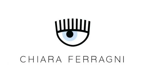
The eye-and-wordmark composition is shown here on a light background, in contrast with the dark-backed lead image above. Both images display the eye above the name; the background treatment differs, while the archive groups the stage under this open-ended heading. The logo’s documented history is primarily a story of the eye-and-name combination and its legal recognition, rather than a series of established redesigns.
The 2019 judgment focused on how the components work together: the eye was not merely an ornamental addition, and the lashes’ resemblance to the letter “i” connected the image to the name. That gives the logo a clear visual structure: a distinctive eye above a wordmark, with the lashes forming a link between the two.
Disclaimer
This article is part of the educational resources provided by Logo Index, an independent archive covering logos, visual identities and graphic design history. Chiara Ferragni Collection and associated trademarks and brand assets remain the property of their respective rights holders where applicable.