 Old Navy Logo PNG
Old Navy is a clothing retailer and a division of Gap Inc. The Old Navy name launched on March 11, 1994, after Gap Warehouse outlets began opening in 1993, according to the company history. Its graphics move from a Gap Warehouse badge and rough-edged framed lettering to oval wordmarks, a monogram and a standalone wordmark.
Meaning and history

The name came from a Paris café and bar called Old Navy that Gap CEO Millard “Mickey” Drexler had seen. Nexstar reported that a Gap Inc. spokesperson confirmed the story; the same report names Blue Indigo, Forklift and Monorail among the alternatives considered. The café reference, rather than a naval theme, also appeared in the Paris café setting recreated for Old Navy’s 2024 spring campaign, reported by LBBonline.
1993 – 1995

The image shows a circular, striped badge with “GAP WAREHOUSE” around “WITH QUALITY FIRST.” Gap Warehouse was the predecessor format; the Old Navy name followed in 1994. The badge’s fine blue striping and stacked lettering give it a different structure from the wordmarks in later stages.
1994 – 1995

This artwork places “OLD NAVY CLOTHING CO.” inside a rough rectangular frame, with a small GAP panel above it. Large serif capitals dominate the center, while the uneven border and textured field contrast with the cleaner oval badges that follow.
1995

The next image keeps the framed “OLD NAVY CLOTHING CO.” lettering but uses a pale blue border and a light field. Its rough-edged serif letters remain visually close to the preceding framed design.
1995 – 1997

Here the name and “CLOTHING CO.” sit in white inside a blue oval. Donald Fisher’s account records that “Old Navy Clothing Company” was shortened to “Old Navy” in May 1997 (Nexstar’s report also recounts the name’s origin). This stage therefore shows the longer company name in a compact badge before that documented shortening.
1997

The oval remains, but the smaller “CLOTHING CO.” line is gone. The image uses the same white, rough-edged serif lettering against blue, now with only “OLD NAVY” inside the badge.
1997 – 2006, 2009 – 2015

This stage changes the oval lettering to clean, bold sans-serif capitals. The white wordmark sits within a solid blue horizontal oval, replacing the earlier badge’s distressed serif treatment. The archive groups this version across two date ranges; separately, the company’s 2005 rebrand is reported to have included a new logo and store remodels (company history).
2006 – 2007

The displayed badge keeps the oval and sans-serif capitals, with visibly different letter proportions from the preceding image. The date range is an archive label; the image itself establishes the visual comparison, not when the version was used.
2006 – 2009

In this image the oval is absent, leaving the blue “OLD NAVY” capitals on their own. The standalone wordmark makes a sharper contrast with the enclosed oval treatments shown in the neighboring stages.
2007 – 2009

This image pairs a large “ON” graphic with a smaller “OLD NAVY” wordmark beneath it. NPR reported that Old Navy adopted the initials in a 2008 rebrand, alongside a move away from “quirky kitsch” toward “trendy sophistication.” The report supports the monogram-era change, though not the archive label’s exact start year.
2015 – Today

The image returns to a white sans-serif wordmark inside a solid blue oval, a format that recalls the earlier badge while using clean, evenly shaped capitals. The archive heading is retained, but this stage should not be read as the present identity: Old Navy described a new visual identity in its 2024 anniversary-year refresh, as Marketing Dive reported.
2024

The image shows a white serif wordmark within a blue oval outlined in red. Marketing Dive reported a 2024 “subtle evolution” and a new brand playbook and purpose. That coverage establishes a broader identity refresh, not that this particular red-outlined artwork was the adopted logo.
2024 – Today
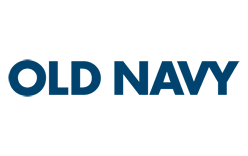
This stage shows “OLD NAVY” in dark blue capitals without an enclosing oval. The wordmark shares the pared-back, standalone format seen in the 2006 – 2009 image, but the artwork and the archive heading alone do not establish its current use. The documented 2024 change was described as a new visual identity and a “subtle evolution” of the brand by Old Navy’s CMO in Marketing Dive.
Wordmark and color
The archive images show recurring blue-and-white treatments, with the name rendered in both distressed serif lettering and cleaner sans-serif capitals. The oval became a prominent container for the wordmark in several stages, while other images remove the frame entirely. Old Navy’s 2024 identity refresh was also accompanied by the purpose statement “We invite everyone to come play with style,” reported by MediaPost.
View the Old Navy logo archive entry.
Disclaimer
This article is part of the educational resources provided by Logo Index, an independent archive covering logos, visual identities and graphic design history. Old Navy and associated trademarks and brand assets remain the property of their respective rights holders where applicable.