 Police Logo PNG
Police is De Rigo’s eyewear-led lifestyle brand, launched in 1983 with a full eyewear collection. De Rigo describes it as a brand whose core remains eyewear, alongside later licensed categories. De Rigo’s brand page outlines that identity.
Police logo history
Blue mirrored lenses helped establish Police’s visual identity before its eagle emblem appeared. De Rigo traces the signature blue to dark-blue painted glass on post-war school and public buildings; the brand’s timeline also links the colour to its on-the-road image. De Rigo and the Police brand timeline describe this history.
In 1993, Police set its name between an eagle’s outstretched wings. The brand’s timeline associates the eagle with freedom, far-sightedness and pride, making the bird a prominent emblem alongside the wordmark. Police’s published history documents the change.
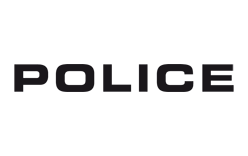
In the 2000s, the eagle gave way to a minimal, striking wordmark. The emphasis shifted toward the name itself, set in bold uppercase letters, rather than the earlier winged emblem. The brand timeline records this redesign.
A gothic phase followed in 2005, bringing darker lettering and a more provocative visual style. Police’s history also connects this period’s graphic vocabulary with a gothic “P” and the skull motif used on the 2011 To Be fragrance bottle. The brand timeline and ANSA’s anniversary coverage describe these motifs.
1983- Today

The supplied logo images show the same basic wordmark structure: bold, uppercase POLICE lettering. One appears dark against a black field, while the other places black lettering on white. These reproductions show the typographic side of the identity; Police’s documented history also includes the eagle emblem.
In its 2026 Unlocked collection, Police reinterpreted the eagle as a structural detail, using a wing form where the frame front joins the temples. Trade publication Optika describes the feature as a reinterpretation of the Police logo. It brings the eagle back into the design without simply repeating the 1993 emblem.
The wordmark and eagle therefore mark distinct, documented turns in Police’s visual history: an eagle-led identity in 1993, a minimal wordmark in the 2000s, a gothic phase from 2005, and a structural eagle detail in the 2026 Unlocked collection. The bold uppercase name remains the clearest feature in the two logo reproductions shown here.
Disclaimer
This article is part of the educational resources provided by Logo Index, an independent archive covering logos, visual identities and graphic design history. Police and associated trademarks and brand assets remain the property of their respective rights holders where applicable.