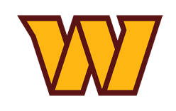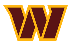
The Washington Commanders are an NFL team in the NFC East. Its primary logo is a stylized burgundy W outlined in gold, introduced when the team adopted the Commanders name on February 2, 2022. The team also uses a gold W with a burgundy outline. The name and logo announcement describes the mark and its color variants.
 Washington Commanders Logo PNG
Meaning and history.
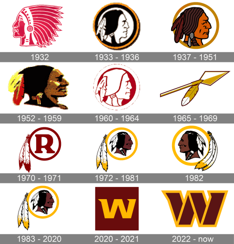
The franchise began as the Boston Braves in 1932, became the Boston Redskins in 1933 and moved to Washington in 1937. After the Redskins name and logo were retired in 2020, the team played as the Washington Football Team for the 2020 and 2021 seasons before adopting its current name and mark. The Boston Globe recounts the early name changes, while WJLA reports the 2020 transition.
The Commanders described the W’s angled cuts, strong strokes and serifs as signifying forward movement and progress. The accompanying wordmark uses two stripes associated in the team’s announcement with the D.C. flag; the announcement also connects slanted border elements to military rank insignia. The team retained burgundy and gold after an 18-month rebranding process that included more than 40,000 fan submissions.
The broader identity includes a crest with 1932 in two quadrants, three stars associated with the D.C. flag, a gold ring representing unity and a band listing five championship years: 1937, 1942, 1983, 1988 and 1992. These details are described in the team’s 2022 announcement.
1932
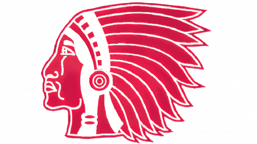
This archive stage shows a large right-facing profile in red and white, with a feathered headdress extending across the image. The franchise began in Boston as the Braves in 1932; the stage date comes from the archive sequence, not independent documentation of the logo’s introduction.
1933 – 1936
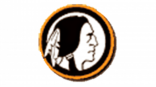
The image changes to a compact circular badge: a black-and-white profile faces right inside a dark field, with a narrow gold-toned outer edge. The Boston Braves became the Boston Redskins in 1933, according to the Boston Globe.
1937 – 1951
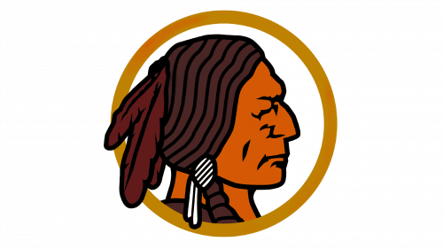
Here the badge has a white interior and a gold circular border; the right-facing profile is larger and rendered in dark hair and warm colors. The club moved from Boston to Washington in 1937, a franchise change documented by the Washington Post.
1952 – 1959
The circular frame gives way to a freestanding, heavily shaded profile facing right. Black hair and bright feather accents create a markedly darker, more textured look than the preceding badge.
1960 – 1964
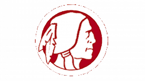
A white circular field and red outline return, surrounding a simplified red line drawing of a right-facing profile. The reduced palette and open interior contrast with the previous stage’s dense shading.
1965 – 1969
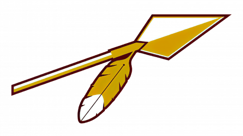
This stage replaces the portrait with an angular arrow-and-feather motif. Gold, white and dark red form a long diagonal shape, a sharp departure from the circular portrait badges nearby in the sequence.
1970 – 1971
A large red R inside a white circle becomes the central element, accompanied by a feather motif at the left. The archive image presents a monogram rather than a profile; its precise introduction date is not established by the cited historical sources.
1972 – 1981, 1983 – 2020
The profile returns, facing right within a gold-edged circle, with two long feathers positioned to its left. The Washington Post credits Walter “Blackie” Wetzel, a former Blackfeet Nation chairman, with persuading the club to replace the R mark and helping develop the profile. The source timeline dates the stage from 1972, while other accounts differ on the logo’s debut year; the mark appeared on helmets through the 2019 season.
1982
This image reverses the profile to face left and places the feathers on the right of the circular badge. Its mirrored arrangement distinguishes it from the right-facing version shown in the adjacent stages.
2020 – 2021

The transition-season mark is a plain gold W on a burgundy field, without the later gold outline. NFL.com reports that the team removed its previous logo and helmet stripes, used gold numbers on burgundy helmets and displayed “Washington” in place of a nickname. The team used the Washington Football Team name for the 2020 and 2021 seasons.
2022 – now
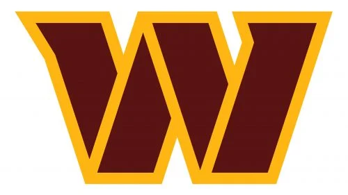
The current primary mark gives the W a burgundy interior and a thick gold outline. Its angular strokes and pointed details build on the simpler W used during the Washington Football Team period. The Commanders introduced this identity on February 2, 2022, and the team’s announcement explains the associated crest and design elements.
Helmet
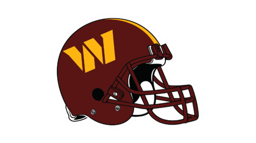
The documented 2022 primary helmet pairs a burgundy shell and facemask with a gold W on each side and a single gold center stripe. NFL.com also described a black alternate helmet with a gold W at the front and player numbers on the sides.
Uniform
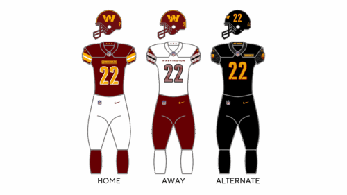
The 2022 uniform lineup included burgundy home, white road and black alternate sets. The black alternate, called “Black and Bold,” debuted in a game against the Dallas Cowboys on October 2, 2022, according to Fox43.
Home Ground
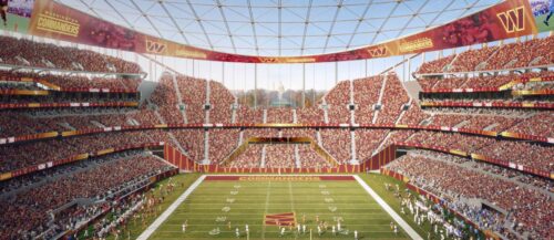
The team’s home venue is in Landover, Maryland. The stadium opened in 1997 and was renamed Northwest Stadium in 2024; the team announced an eight-year naming-rights agreement with Northwest Federal Credit Union. The venue’s current name is separate from the Commanders’ logo identity.
Disclaimer
This article is part of the educational resources provided by Logo Index, an independent archive covering logos, visual identities and graphic design history. Washington Commanders and associated trademarks and brand assets remain the property of their respective rights holders where applicable.