 Magneti marelli Logo PNG
Meaning and history
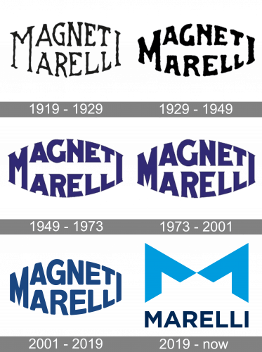
Magneti Marelli’s wordmark places “Magneti” above “Marelli” in a compact, arched arrangement. Across the historical stages shown here, the lettering shifts in weight, shape and colour while keeping the two-line composition. The company was founded in 1919 at Sesto San Giovanni as Fabbrica Italiana Magneti Marelli, an equal-capital joint venture between Fiat and Società Anonima Ercole Marelli & C., as the Fondazione ISEC archive records.
1919 – 1929
This version uses narrow, irregular serif lettering arranged on two slightly curved lines. Its thin strokes and small scale give it a delicate outline compared with the heavier designs shown in the later stages.
1929 – 1949
The second design keeps the stacked, arched layout but uses a more tightly packed, outlined treatment. The letters appear heavier than in the preceding stage, while the two-line structure remains recognizable.
1949 – 1973
Here the wordmark is filled and bold, with prominent serifs and a purple-blue appearance. This is a marked contrast with the thin, outlined lettering of the first two stages.
1973 – 2001
The lettering remains bold and serifed, and the arched block is still in place. Compared with the preceding image, the overall treatment looks very similar, with subtle differences in letter shapes and spacing.
2001 – 2019
This stage replaces the prominent serifs with broad, rounded sans-serif letters in dark blue. The wordmark remains stacked and arched, but the larger, more open forms make it visually distinct from the earlier designs.
2019 – Today
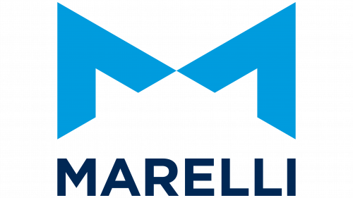
The image at this stage shows the Marelli identity, not the Magneti Marelli wordmark. In May 2019, Calsonic Kansei and Magneti Marelli united under the Marelli brand, according to Marelli’s brand announcement. The logo pairs the Marelli wordmark with a large, geometric M made from two upward-pointing arrow shapes. The announcement describes the arrows as representing engineering precision, progress and the union of the two companies; its colours combine Calsonic Kansei’s light blue with Magneti Marelli’s dark blue.
The Magneti Marelli name also continues in the aftermarket channel as Magneti Marelli Parts & Services. It is distinct from the corporate Marelli identity described in the 2019 announcement.
Disclaimer
This article is part of the educational resources provided by Logo Index, an independent archive covering logos, visual identities and graphic design history. Magneti Marelli and associated trademarks and brand assets remain the property of their respective rights holders where applicable.