 Aetna Logo PNG
Meaning and history
Aetna’s name comes from Mount Etna in Sicily, according to Aetna’s company history and the Hartford Courant. The business began in Hartford as Aetna Fire Insurance Co. in 1819; its annuity and life business was incorporated as Aetna Life Insurance Co. in 1853. Aetna has been part of CVS Health since the acquisition closed on November 28, 2018, and the company describes it as a standalone business and brand within CVS Health (Aetna history; CVS Health).
A recurring feature of Aetna’s identity is the joined “a” and “e.” Brand New’s review of the 2012 redesign reports that the ligature had been used for about 151 years, was dropped in 2001, and returned in the redesign. The dates are approximate, but the return of the ligature is a clear link between the newer wordmark and the company’s earlier visual identity.
1853 — 1908
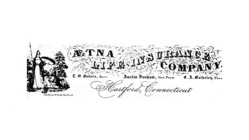
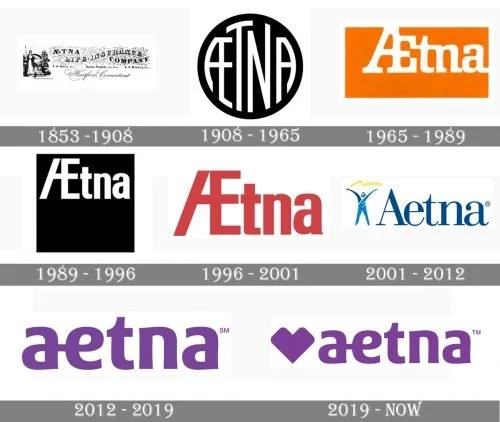
This early stage is represented by ornate lettering accompanied by an illustration, rather than by the compact standalone wordmark used today. Aetna’s first corporate seal is dated to 1904 in the company chronology (Aetna Inc. chronology), but that date does not establish the start date of every identity shown in this stage.
1908 — 1965
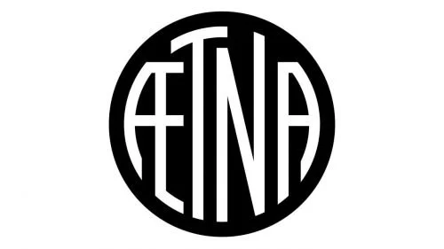
The circular black-and-white design replaces the elaborate lettering with a compact monogram. The period boundary differs in Business Insider’s 2012 logo chronology, which groups an earlier seal era through 1964; treat these timeline dates as stage labels rather than precise changeover dates.
1965 — 1989
The image shifts from the circular monogram to a wordmark set in white inside an orange rectangle. The company name is now the main element, with the colored block creating a strong rectangular frame.
1989 — 1996
Here the wordmark appears in white against a black rectangle. Compared with the preceding orange panel, the high-contrast treatment is retained while the surrounding shape becomes darker and more restrained.
1996 — 2001
The red wordmark removes the enclosing rectangle, leaving the name alone as the central graphic. These successive stage images show substantial changes in color and framing before Aetna adopted the blue serif identity that followed.
2001 — 2012
The blue serif wordmark is paired with a human-like figure. Business Insider described the outgoing design as a dark-blue serif wordmark with a painted figure. This arrangement contrasts with the simpler, lowercase wordmark introduced in 2012.
2012 — 2019
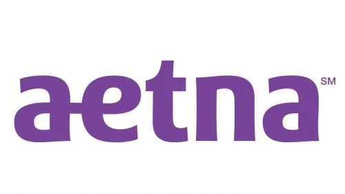
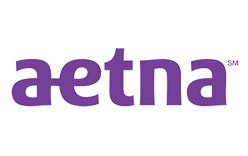
Siegel+Gale’s redesign, unveiled on January 18, 2012, brought back the joined “a” and “e” in a bold, rounded lowercase wordmark and shifted the palette to violet (Brand New; Business Insider). The redesign removed the figure from the preceding identity, making the lettering itself the focus.
2019 — Today
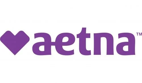
The later identity adds a heart before the lowercase wordmark. A trademark record describes a solid heart before the word “AETNA” and records first use on January 16, 2019; CVS Pharmacy, Inc. owns that registration (USPTO record). Aetna’s November 2023 partner guidelines show the heart-and-wordmark logo in violet, white, and black, and recommend using the violet version whenever possible.
Wordmark and color
The 2012 redesign’s lowercase lettering and joined “a” and “e” distinguish it from the earlier serif wordmark. The heart adds a separate graphic element before the name in the later design. Aetna’s partner guidelines specify violet, white, and black versions, with violet preferred where possible; the clear space around the logo is measured by the height of the heart.
View the Aetna logo archive entry.
Disclaimer
This article is part of the educational resources provided by Logo Index, an independent archive covering logos, visual identities and graphic design history. Aetna and associated trademarks and brand assets remain the property of their respective rights holders where applicable.