 Bosch Logo PNG
The Bosch logo pairs a red, uppercase wordmark with a circular symbol containing a stylised electric armature. The armature refers to a component of magneto ignition devices, a product line Bosch offered from 1887. The flat version of the emblem began appearing in digital applications in December 2017, while the three-dimensional version was initially retained in print, according to Design Tagebuch.
Meaning and history
Bosch’s logo history reflects its engineering origins. Robert Bosch opened a workshop for precision mechanics and electrical engineering in Stuttgart on 15 November 1886, and the company offered magneto ignition devices from 1887, according to Bosch’s company fact sheet and its history of magneto ignition.
The first Bosch trademark, filed on 3 March 1899, showed a flaming magnet. In later years, different pictorial marks also appeared: a sparking armature was used in France and Britain during the Simms joint venture, and a red devil was used in advertising and registered as a mark. Accounts place the red devil’s introduction between 1906 and 1910. Bosch describes these early marks and their dates in its account of the logo’s origins.
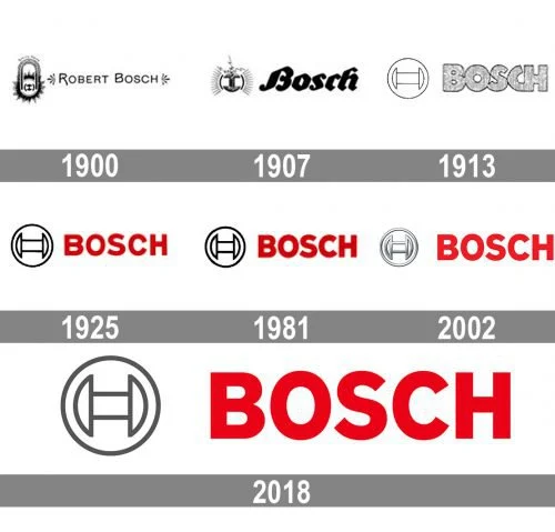
1900 — 1907
This stage shows the Bosch name beside a detailed oval emblem, with a flaming magnet inside. The paired layout differs from the simpler circular armature mark that later became the familiar symbol.
1907 — 1914
Here, the emblem is open and surrounded by radiating lines, while the Bosch name appears in a flowing script. The image contrasts with the oval badge and more restrained name treatment in the preceding stage.
1914 — 1925
This version places a horizontal armature inside a circle beside a large, uppercase Bosch wordmark. The pictured composition is monochrome. The stage label spans the period when chief engineer Gottlob Honold created the armature-in-circle mark in November 1918; it was registered as a trademark on 2 May 1919. Bosch says Honold’s brief called for a simple line mark without letters, suitable for small components and advertising, and intelligible internationally. Bosch’s history of the mark documents its creation and registration.
1925 — 1981
The red wordmark and dark armature symbol create a clear two-part signature on a light background. Red was introduced to the wordmark in 1925, according to DirectIndustry’s account of the Bosch logo.
1981 — 2001
In this stage, the circular symbol and uppercase lettering appear in a heavier, more compact arrangement than in the preceding image. The 1981 revision is reported in design coverage; Bosch’s documented logo history establishes the broader identity milestones rather than this specific redesign.
2001 — 2018
The emblem takes on a metallic, dimensional appearance, contrasting with the flatter red lettering. SpiekermannPartners records a Bosch corporate-design programme from 2001 to 2003 that included a three-dimensional armature, an in-house typeface, a colour concept and a layout system. The agency’s project record describes its role in that work.
Bosch announced a new corporate design in 2016 and rolled it out over roughly two years. The company said the red lettering, the “Invented for Life” claim and the armature in a circle would remain unchanged. Bosch’s announcement also discussed the wider visual identity.
2018 — Today
The flat mark pairs a grey armature-in-circle with the red Bosch wordmark. The simpler emblem was introduced to digital applications from December 2017, with the three-dimensional version initially retained for print; Design Tagebuch reported that the change addressed legibility on screens. wirDesign has led the Bosch brand identity since 2018, including work on digital use and accessibility. The flat symbol and red wordmark remain the current master logo.
Wordmark and color
The identity’s main visual contrast is between the red uppercase name and the circular armature symbol. Across the historical images, the emblem shifts from a detailed flaming-magnet device to a spare line symbol, then to a dimensional treatment and a flat grey version. Bosch’s 2016 design announcement confirms that the red lettering and armature-in-circle remained central to the identity.
Disclaimer
This article is part of the educational resources provided by Logo Index, an independent archive covering logos, visual identities and graphic design history. Bosch and associated trademarks and brand assets remain the property of their respective rights holders where applicable.