Modern Logo Design 2026: Trends and Best Practices
 Modern logo design in 2026 is less about adopting one fashionable visual style and more about building an identity that can work across many environments. A logo may appear as a tiny app icon, an animated interface element, packaging, signage, video or a large physical installation.That pressure is producing an interesting combination of simplicity and experimentation. Adobe’s 2026 logo research points to continued simplification alongside kinetic logos and tactile digital design, while Canva’s broader 2026 forecast highlights intentionally imperfect, more human-looking creative work. [1] [2]
What Does Modern Logo Design Mean in 2026?
A modern logo is not simply one that follows the latest aesthetic trend. It needs to remain recognizable, legible and useful across digital and physical applications.Adobe surveyed 285 professional graphic designers in 2026 and found that memorability, creativity and legibility were among the most important characteristics of successful logos. More than 30% of the designers surveyed had simplified a logo during the previous year to improve digital adaptability. [1]Modern identity systems therefore tend to balance three needs:- Recognition: the mark should remain identifiable across formats.
- Adaptability: different versions may be required for different contexts.
- Distinctiveness: simplification should not remove everything unique about the brand.
1. Minimalism With a Distinctive Detail
 Minimalism remains highly relevant in 2026 because simple marks generally adapt well to small screens, apps and digital interfaces. Adobe describes a continuing process of logo simplification driven partly by screen-first branding. [3]The challenge is avoiding excessive simplification. A clean geometric icon or sans-serif wordmark may be functional, but it can become generic if every unusual feature is removed.A stronger approach is to maintain a simple foundation while preserving one recognizable element, such as:
- a distinctive letterform;
- an unusual proportion;
- a custom ligature;
- a memorable negative-space detail;
- an asymmetrical shape;
- a characteristic color relationship.
2. Responsive Logo Systems
Modern branding increasingly uses several related versions of the same identity rather than one artwork file for every situation.A responsive system might contain:- a complete logo with symbol and wordmark;
- a reduced horizontal or vertical lockup;
- a standalone symbol;
- a small-size version with simplified details;
- a motion version for digital environments.
3. Animated and Kinetic Logos
Motion is becoming another layer of identity design. Adobe specifically identifies kinetic logos as an important 2026 direction, particularly for brands that live primarily in digital environments. [1]A logo may animate when an app launches, react to interaction, transition between a symbol and wordmark or become part of a video sequence.Motion Should Support Recognition
The strongest animated logos retain a recognizable anchor. A characteristic letter, shape, color or proportion should remain identifiable even while other elements move.A useful identity also needs a static version. Business cards, documents, products, favicons and many accessibility contexts cannot depend on animation.Animation and Website Performance
An animated logo is not inherently better for SEO. Search engines do not reward a brand simply because its logo moves.Animation can contribute to a richer interface, but unnecessarily large video, JavaScript or animation assets can also increase loading and rendering work. Web implementations should therefore be lightweight, responsive and respectful of users who enable reduced-motion accessibility settings.4. Tactile and Imperfect Digital Design
 Perfectly smooth vectors are no longer the only definition of contemporary design. Adobe describes a 2026 trend toward tactile digitalism, where digital graphics incorporate surfaces and details that feel more physical or handmade. [1]Examples include:
- grain and subtle noise;
- irregular line weights;
- brush-like edges;
- paper or material textures;
- soft dimensional surfaces;
- slightly imperfect geometry.
5. Expressive Typography
Typography is becoming a stronger source of differentiation as brands look for alternatives to interchangeable geometric sans-serif wordmarks.Adobe’s broader 2026 design forecast identifies exaggerated and playful lettering as a major visual direction. [4]In logo design, this can appear as custom lettering, altered proportions, unusual terminals, condensed or expanded forms and unexpected combinations of serif and sans-serif characteristics.The important principle is ownership. A modified or custom wordmark can make the company name itself recognizable without requiring a separate icon.6. Dimensionality Without Returning to Old 3D Logos
Depth is also returning, but modern dimensional branding looks different from the highly polished chrome and glass effects common in the 2000s.Current approaches tend to use:- subtle gradients;
- soft shadows;
- translucent layers;
- material-inspired surfaces;
- limited 3D treatments;
- motion-driven depth.
7. Organic Shapes and Earthier Color Systems
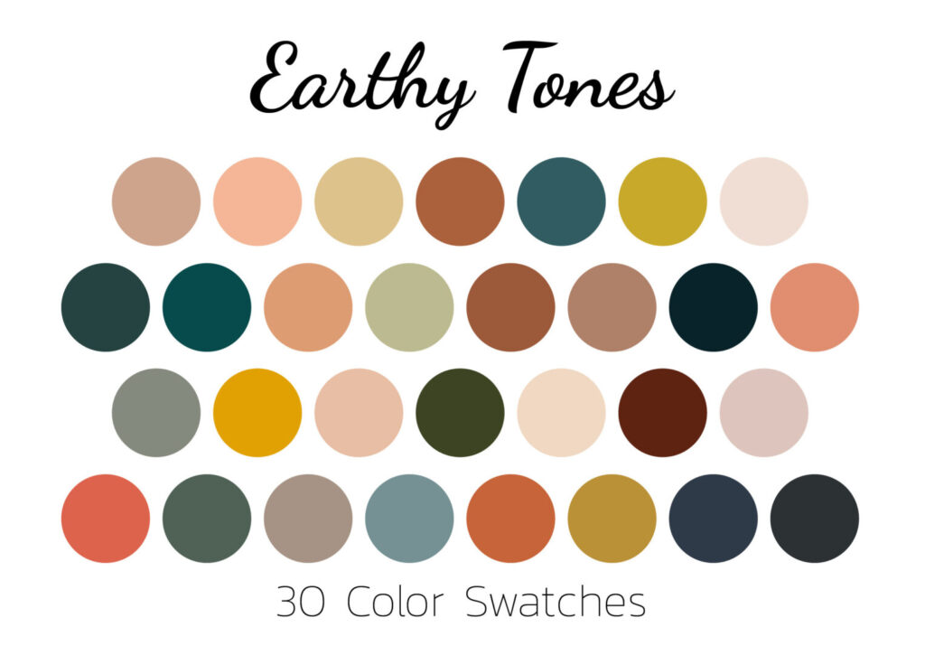 Organic forms and muted natural palettes continue to appear across contemporary branding. Adobe highlights moss green, terracotta, sand and deep teal among the colors associated with an eco-conscious visual direction in 2026. [1]But there is an important distinction between looking natural and being sustainable.A green logo, leaf icon or earthy palette does not provide evidence that a company has environmentally responsible practices. Visual identity should support genuine brand positioning rather than imply environmental credentials the business cannot substantiate.
8. AI as Part of the Design Workflow
AI is influencing modern logo design primarily through the creative process rather than by creating one recognizable “AI style.”Designers can use generative tools to produce rough directions, test visual concepts, expand mood boards or explore variations before manually refining the most useful ideas.Canva’s 2026 research found that 77% of creators surveyed described AI as an essential creative partner, while the same forecast emphasized a growing desire for more human and individual visual expression. [2]This combination is important. Faster generation does not eliminate the need to evaluate:- originality;
- trademark conflicts;
- typography;
- scalability;
- brand relevance;
- reproducibility;
- consistency across the identity system.
What Makes a Logo Look Modern?
A modern logo does not require animation, gradients or an experimental typeface. Some of the most contemporary identities are extremely simple.What matters more is whether the system has been designed for how brands operate today.A modern logo should ideally:- remain recognizable at very small sizes;
- work in both light and dark environments;
- have an effective one-color version;
- support horizontal, vertical and icon-only applications where needed;
- remain legible on screens and physical materials;
- work with motion without depending on it;
- have enough distinctive character to avoid looking generic.
How to Test a Modern Logo
Before approving a logo, test the actual design rather than judging it only on a presentation board.Test It Small
Reduce the symbol to the smallest realistic digital application. Fine details that disappear at this size may require a simplified variant.Test It in One Color
If the entire identity depends on a gradient, shadow or texture, check whether the underlying form still works without those effects.Test Different Backgrounds
Prepare clear rules for light, dark and photographic environments.Test Real Applications
Place the mark on the actual surfaces the company uses: website headers, apps, packaging, signage, documents, merchandise or vehicle graphics.Test Recognition, Not Just Preference
When user testing is appropriate, do not ask only which logo people “like.” More useful questions include which they remember, which they associate with the intended company and whether they can distinguish it from competing brands.Should You Redesign a Logo Because It Looks Outdated?
Not necessarily.Recognition accumulated over many years can be more valuable than appearing perfectly aligned with the aesthetics of 2026. A redesign makes more sense when the existing mark has a functional or strategic problem, such as poor small-size performance, an outdated company name, weak differentiation or difficulty working across modern media.Trends can influence how a redesign is executed, but they should not be the sole reason for redesigning a recognizable identity.FAQ
What are the main modern logo design trends in 2026?
Major directions include simplified but distinctive logos, responsive identity systems, kinetic logos, tactile textures, intentionally imperfect design, expressive typography, subtle dimensionality and AI-assisted workflows. [1]
Are minimalist logos still modern in 2026?
Yes. Minimalism remains important for digital scalability, but modern minimalist identities increasingly retain distinctive typography, texture, negative space or another recognizable feature instead of removing every unusual element. [3]
Are animated logos better for SEO?
No. Animation itself does not provide an SEO advantage. Animated branding can improve the visual experience in appropriate contexts, but it should be implemented efficiently so it does not unnecessarily increase page weight or interfere with accessibility.
What is a responsive logo?
A responsive logo is part of a visual system that adapts to different spaces and applications. A full wordmark might be used on a desktop website, while a simplified symbol is used for an app icon or small mobile interface.
Can AI be used to design a modern logo?
AI can be useful for concept exploration and generating variations, but final logo development still requires decisions about originality, typography, trademark risk, scalability and brand strategy. Canva’s 2026 research shows AI becoming deeply integrated into creative workflows while creators simultaneously seek more individual and human-looking results. [2]
Disclaimer
This article is part of the educational resources provided by Logo Index, an independent archive covering logos, visual identities and graphic design history. Design trends describe observed creative directions rather than fixed rules and may vary by industry, audience and market.